全篇大概 4700 字(含代码),建议阅读时间 30min
📚 目录
- Flex 布局在 UniApp 中的应用
- 响应式设计与适配多端
- 使用 SCSS 提升样式开发效率
- 实战案例演示
- 总结
1. Flex 布局在 UniApp 中的应用
1.1 基础布局实现
通过 display: flex 快速构建弹性容器,支持横向/纵向排列和灵活对齐:
<template><view class="flex-container"><view class="item">商品图片</view><view class="item">价格信息</view><view class="item">操作按钮</view></view>
</template><style lang="scss">
.flex-container {display: flex;justify-content: space-between; /* 主轴两端对齐 */align-items: center;        /* 交叉轴居中对齐 */padding: 20rpx;background: #f8f8f8;.item {flex: 1 0 200rpx;       /* 最小宽度200rpx,自动扩展 */margin: 0 10rpx;background: #fff;border-radius: 10rpx;padding: 20rpx;box-shadow: 0 2rpx 8rpx rgba(0,0,0,0.1);&:first-child { background: #4CAF50; color: white; }&:last-child { background: #FF5722; color: white; }}
}
</style>
效果预览

2. 响应式设计与适配多端
2.1 全局适配方案
使用 rpx单位和媒体查询构建跨平台界面:
<template><view class="responsive-layout"><view class="header">导航栏</view><view class="content"><view class="grid-item" v-for="i in 12" :key="i">内容{{i}}</view></view><view class="footer">底部信息</view></view>
</template><style lang="scss">
.responsive-layout {min-height: 100vh;display: flex;flex-direction: column;.header, .footer {height: 100rpx;background: #333;color: white;text-align: center;}.content {flex: 1;display: flex;flex-wrap: wrap;gap: 20rpx;.grid-item {flex: 1 1 200rpx;min-height: 200rpx;background: #f0f0f0;border-radius: 10rpx;@media (max-width: 768px) {flex: 1 1 100%;}}}
}
</style>
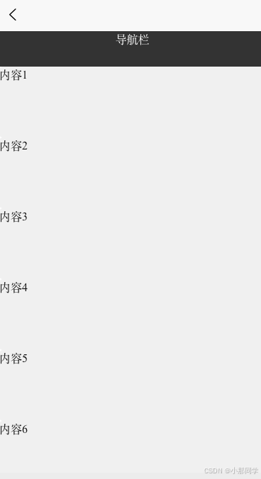
适配效果对比
| 设备类型 | 布局模式 | 列数 | 交互说明 |
|---|---|---|---|
| 手机竖屏 | 单列布局 | 1列 | 下拉刷新内容 |
| 手机横屏 | 双列布局 | 2列 | 左右滑动切换 |
| 平板 | 三列布局 | 3列 | 滑动浏览 |
| PC浏览器 | 四列布局 | 4列 | 键盘快捷操作 |
3. 使用 SCSS 提升样式开发效率
3.1 企业级样式管理
通过 SCSS变量和混合宏构建可维护的样式系统:
// 全局变量定义(variables.scss)
$primary-color: #2b9939;
$font-family: '微软雅黑', sans-serif;
$breakpoints: ('mobile': 768px,'tablet': 1024px,'desktop': 1280px
);
// 混合宏定义(mixins.scss)
@mixin flex-center($direction: row) {display: flex;flex-direction: $direction;justify-content: center;align-items: center;
}@mixin responsive-grid($columns: 4) {display: flex;flex-wrap: wrap;gap: 20rpx;@each $bp, $val in $breakpoints {@media (min-width: $val) {.grid-item {flex: 1 1 calc(100% / $columns - 20rpx / $columns);}}}
}
3.2 组件样式复用
在 Vue 组件中使用 SCSS 实现模块化开发:
<template><view class="card"><image class="card-image" src="static/phone.jpg" mode="aspectFill"></image><view class="card-content"><text class="card-title">手机</text><text class="card-price">¥100.00</text></view></view>
</template><style lang="scss">
@import "@/scss/variables.scss";
@import "@/scss/mixins.scss";.card {@include flex-center(row);background: white;border-radius: 16rpx;box-shadow: 0 4rpx 12rpx rgba(0,0,0,0.1);overflow: hidden;.card-image {width: 30%;height: 200rpx;object-fit: cover;}.card-content {width: 70%;padding-left: 20rpx;.card-title {font-size: $font-family-bold;color: $primary-color;}.card-price {font-size: 24rpx;color: #ff9f00;}}
}
</style>
4. 实战案例演示
4.1 电商商品列表页
- 在根目录下创建
variables.scss文件
// src/scss/variables.scss
$primary-color: #2b9939;       // 主色调(绿色)
$secondary-color: #333;         // 辅助色(深灰色)
$font-size-base: 28rpx;        // 基础字体大小
$border-radius-base: 10rpx;     // 基础圆角
-
在static文件夹中存放三张图片用于展示使用
-
创建
product-list.vue文件
<template><view class="product-list"><scroll-view scroll-y style="height: 100vh;"><view v-for="product in products" :key="product.id"class="product-card"@click="handleCardClick(product)"><image class="product-image" :src="'/static/' + product.image"></image><view class="product-info"><text class="product-name">{{ product.name }}</text><text class="product-price">¥{{ product.price }}</text><button class="add-to-cart" @click="addToCart(product)"></button></view></view></scroll-view></view>
</template><script>
import { primaryColor } from '@/variables.scss';export default {name: 'ProductList',data() {return {// 模拟商品数据products: [{id: 1,image: 'phone.jpg',name: '智能手机 Pro Max',price: 4999},{id: 2,image: 'earphone.jpeg',name: '无线耳机 AirPods',price: 1299},{id: 3,image: 'computer.jpg',name: '笔记本电脑 MacBook Pro',price: 12999},]};},methods: {handleCardClick(product) {console.log('查看商品详情', product);// 可在此处跳转详情页this.$router.push({name: 'ProductDetail',params: { productId: product.id }});},// 加入购物车功能addToCart(product) {console.log('加入购物车', product);// 1. 本地存储方案(简单示例)uni.setStorageSync('cart', [...this.$store.state.cart, product]);// 2. Vuex 方案(推荐生产环境使用)this.$store.dispatch('cart/addProduct', product);// 显示提示uni.showToast({title: '已加入购物车',icon: 'success',duration: 2000});}},onLoad() {// 模拟数据加载console.log('页面加载完成');},fetchProducts() {}
};
</script><style lang="scss">
// 引入全局变量
@import "@/variables.scss";.product-list {.product-card {display: flex;flex-direction: column;background: white;border-radius: 10rpx;padding: 20rpx;margin-bottom: 20rpx;box-shadow: 0 2rpx 8rpx rgba(0,0,0,0.1);.product-image {width: 100%;height: 300rpx;object-fit: cover;}.product-info {margin-top: 20rpx;.product-name {font-size: 32rpx;color: #333;}.product-price {font-size: 28rpx;color: $primary-color; // 使用全局主题色margin-top: 10rpx;}.add-to-cart {background: $primary-color; // 主题色按钮color: white;padding: 10rpx 20rpx;border-radius: 5rpx;margin-top: 20rpx;// 按钮悬停效果&:hover {opacity: 0.9;}}}}
}
</style>
5. 总结
通过合理运用 Flex 布局 实现灵活界面设计,结合 rpx 单位+ 媒体查询 完成跨端适配,再借助 SCSS 变量+混合宏 提升样式复用率,开发者可以显著提升 UniApp 项目的开发效率和代码质量。
建议在实际项目中:
- 建立统一的
SCSS变量库 - 制作
响应式断点配置表 - 开发 可复用的
Flex布局组件 - 定期进行
样式性能检测


