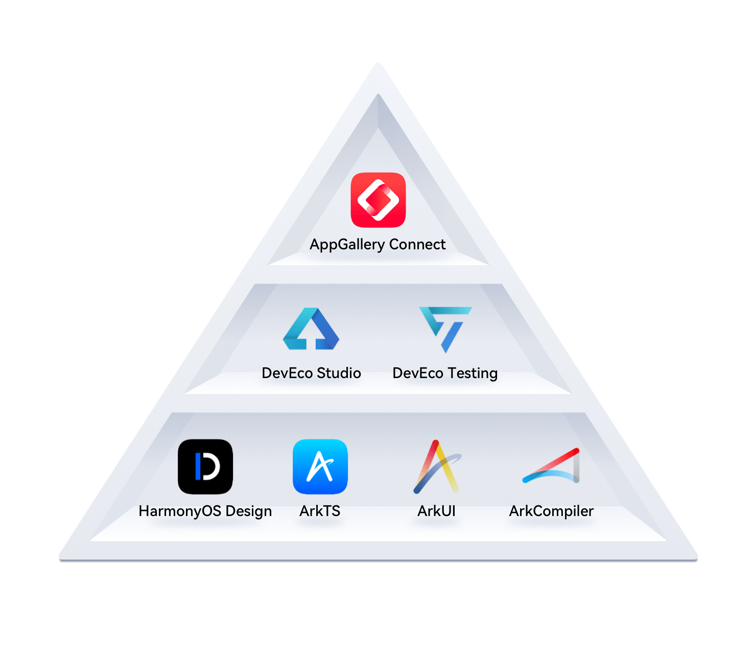
鸿蒙基础-基础环境-ArkTS-组件-样式
DevEcoStudio编辑器下载链接
链接: https://pan.baidu.com/s/18C9i35YPh4GsHpbSif8KQw?pwd=d6e9 提取码: d6e9
安装教程
下载对应的版本
- windows
- mac英特尔
- mac Arm
API12 的编辑器
API12的模拟器(mac英特尔安装API11)
- Mac Arm芯片版本安装
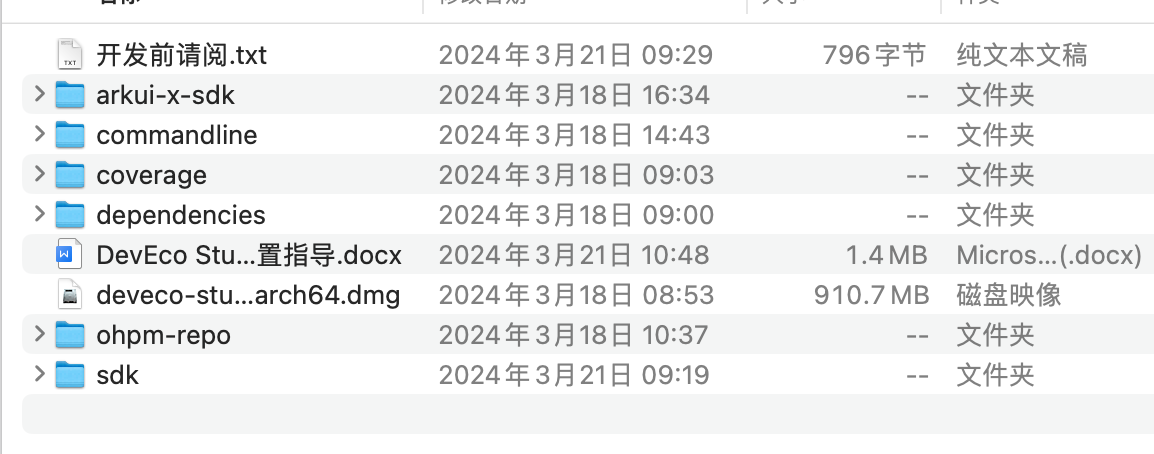
解压编辑器版本
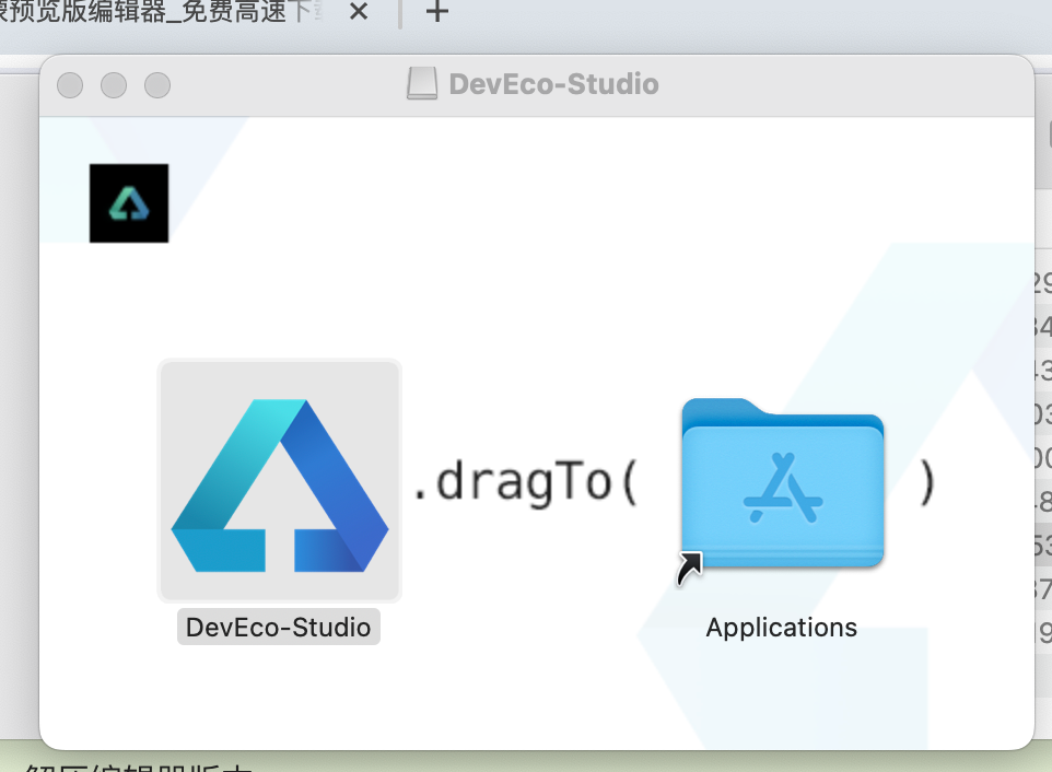
将左侧内容拖入
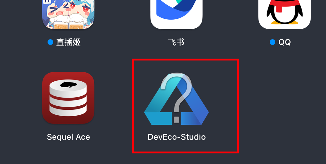
点击打开
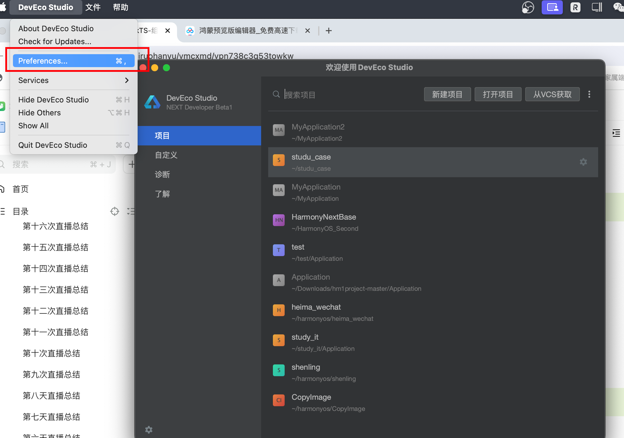
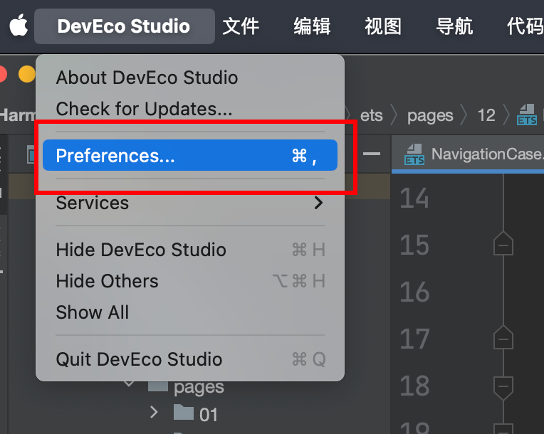
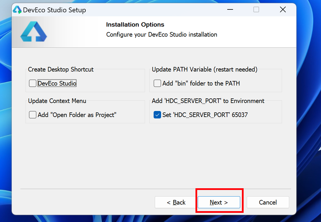
- 打开项目的配置项

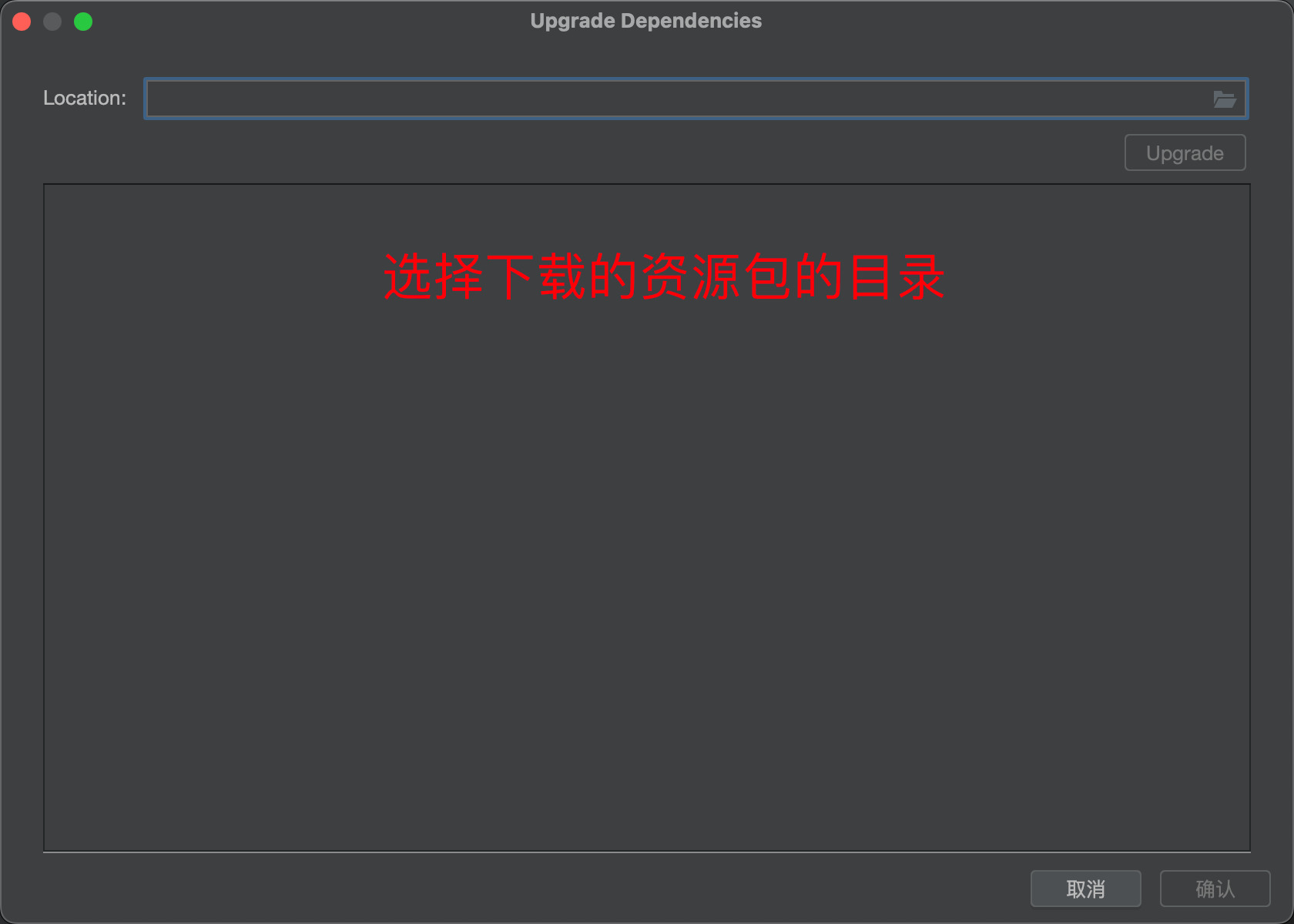
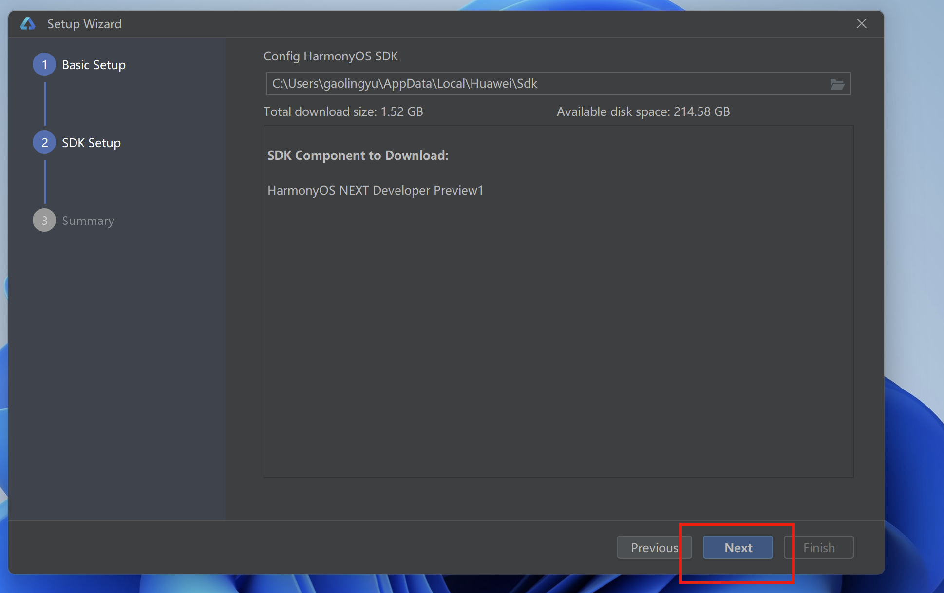
新建一个路径 HarmonyOS-SDK
将资源下载包中的sdk的内容进行解压,放入到刚刚新建的目录
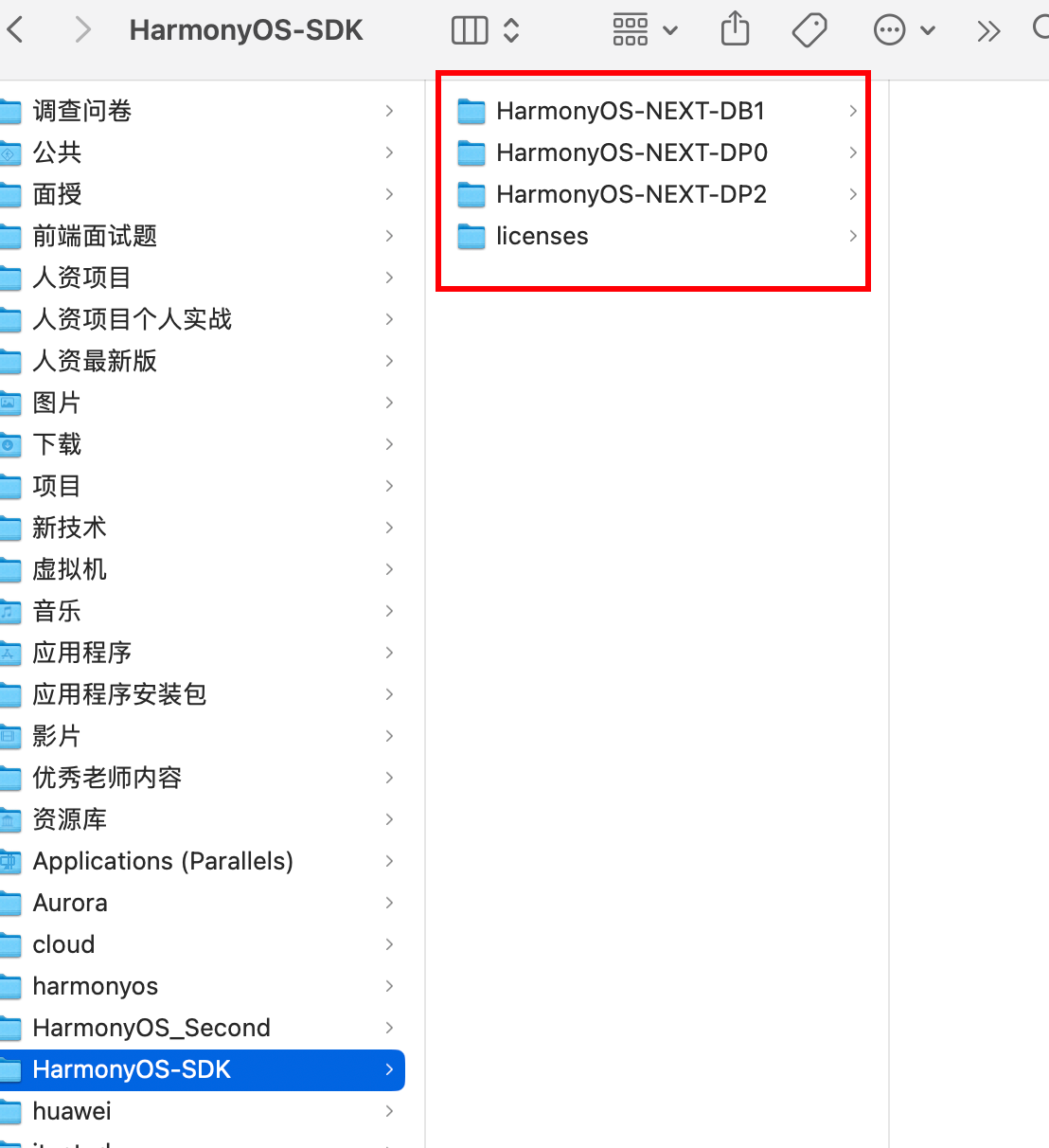
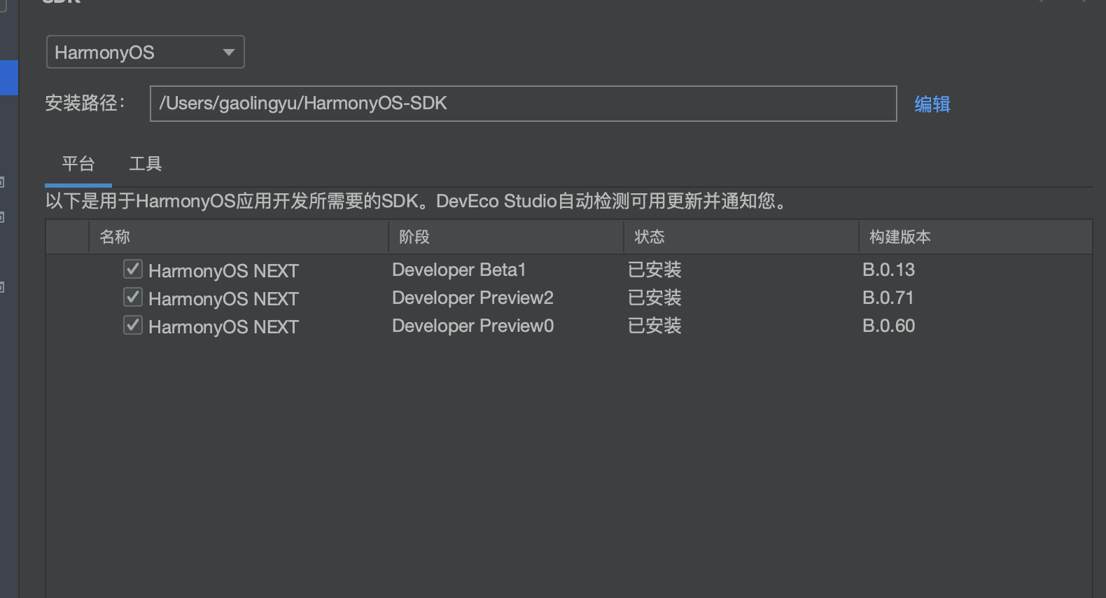
将设置中的安装路径改变成新建的目录,最终点击确认,sdk就安装好了
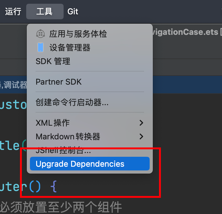
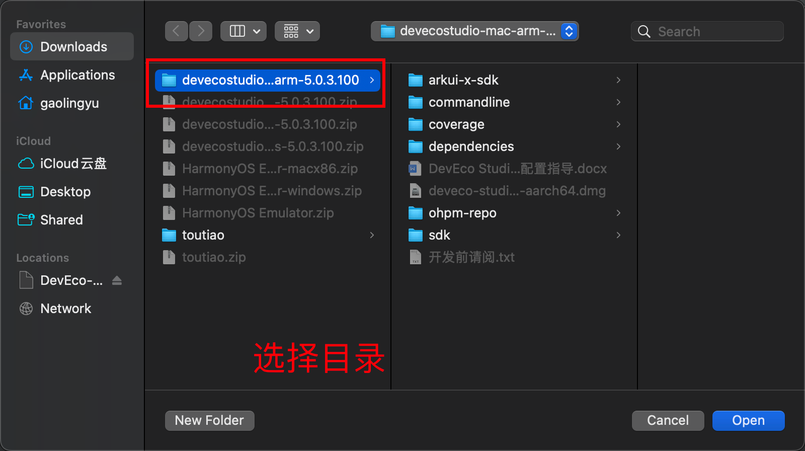
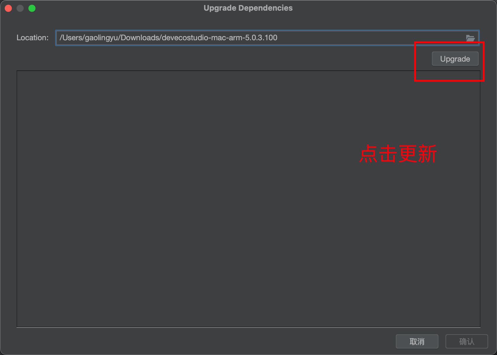
打开原有项目发现
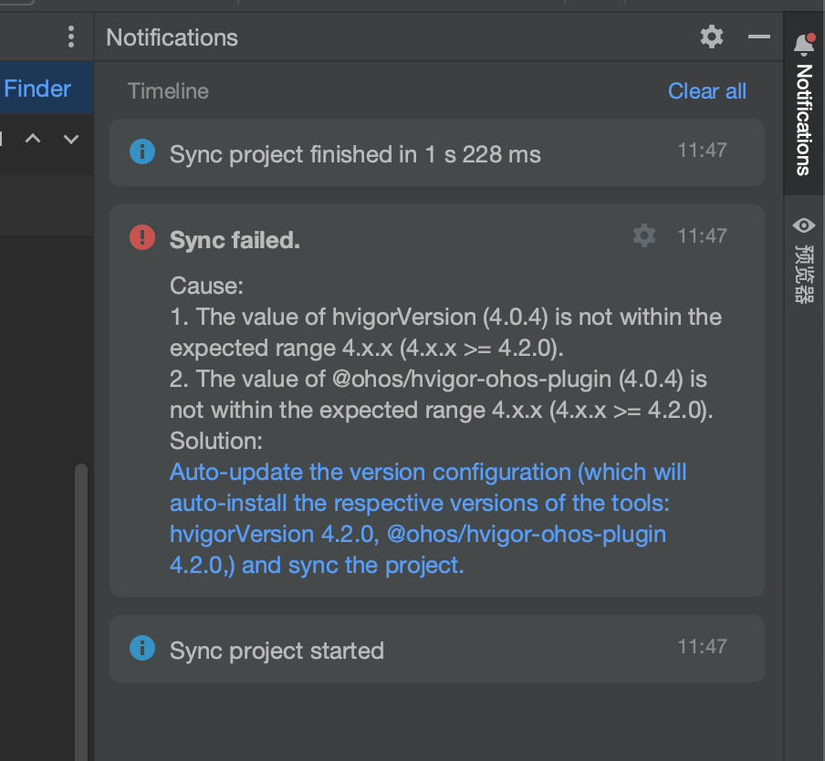
一个配置文件的依赖,线上没有提供云下载地址,只能采用离线的版本 。hvigor
下载资源包中,还有提供一个dependencies, 这就是我们需要替换的版本
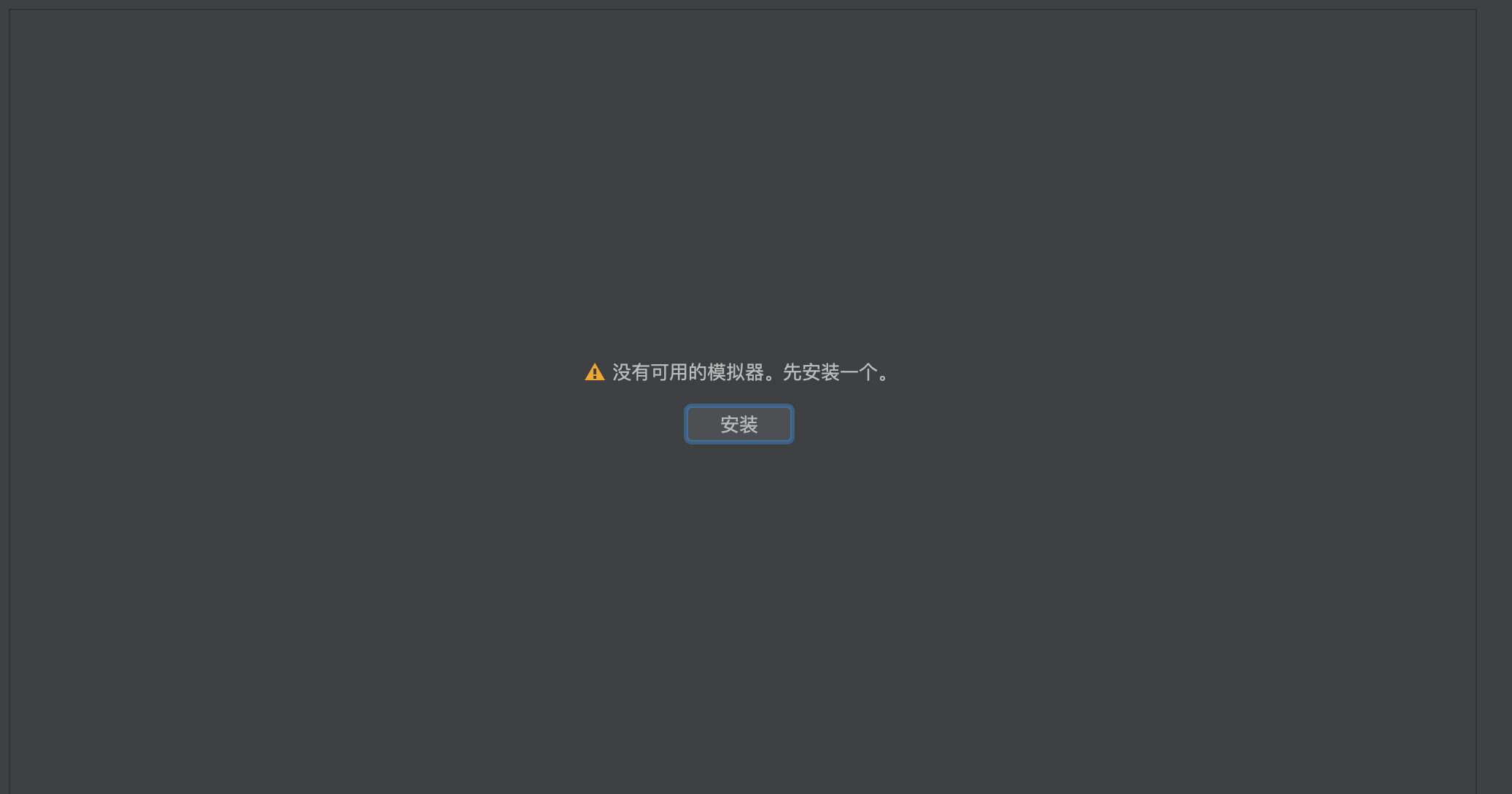
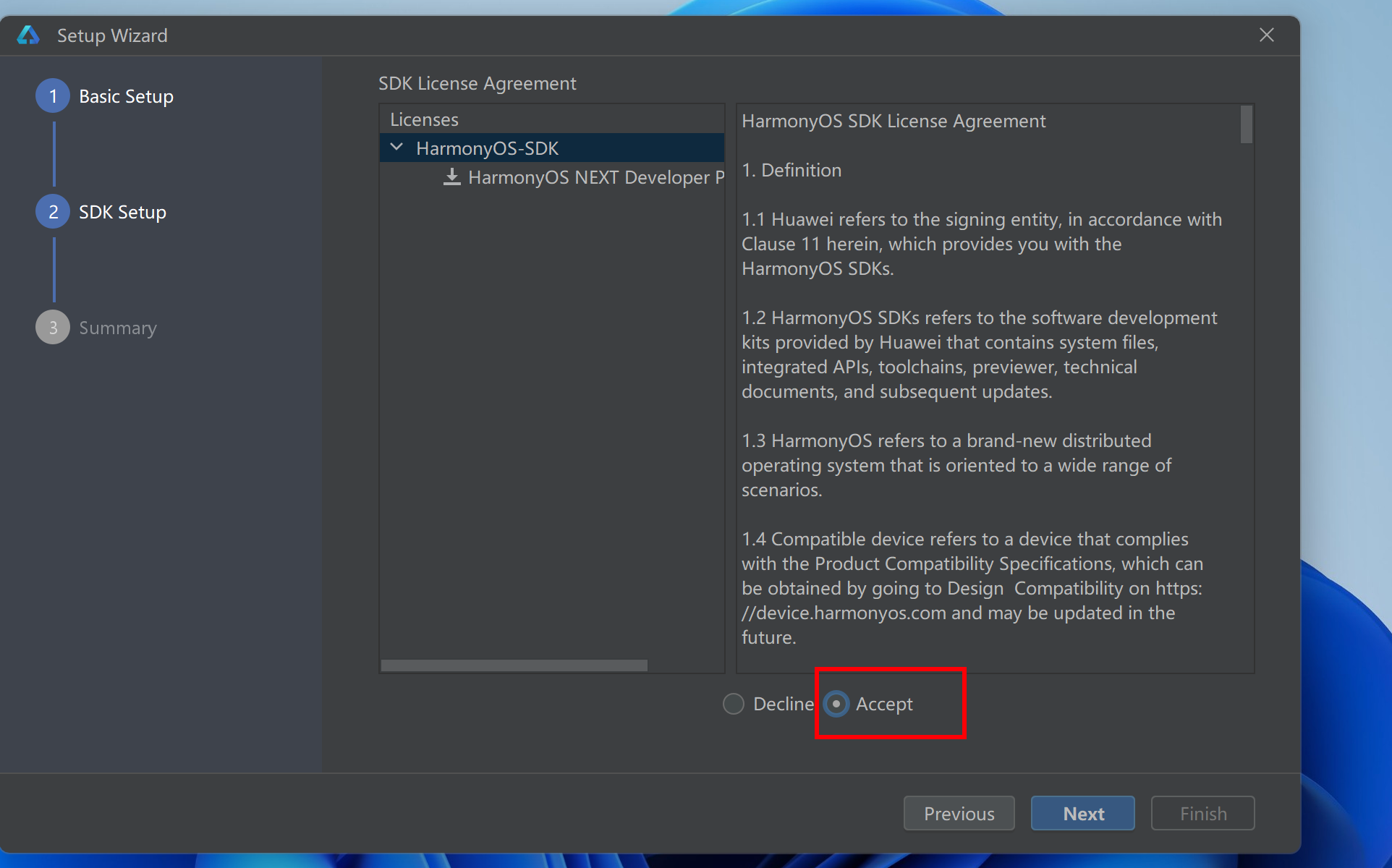
安装模拟器
- 需要实名登录
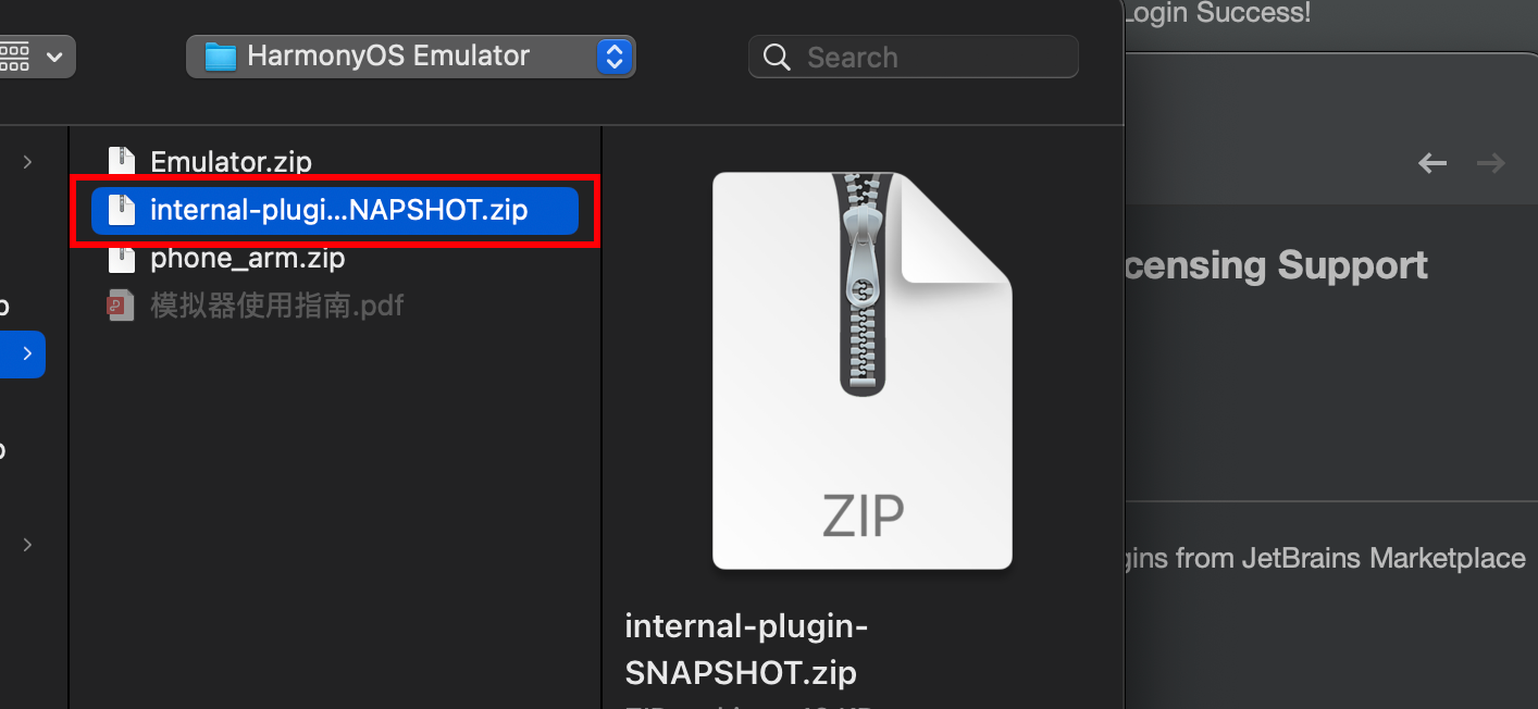
- 安装插件
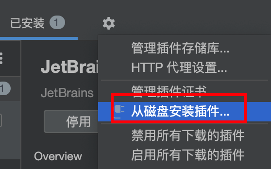
internal-plugin-SNAPSHOT.zip
如果大家的mac安装不上 这个插件,可以采用文档中提供的,下载之后安装即可
下载资源中的模拟器,拷贝到sdk的目录
注意: 模拟器的名字是小写的
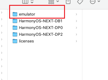
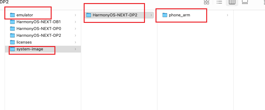
- 创建镜像目录
注意
** 如果用的是API12的模拟器,需要把镜像放入到HarmonyOS-NEXT-DB1 目录下。**
** 如果用的是API11的模拟器,需要把镜像放入到HarmonyOS-NEXT-DP2 目录下。**
system-image
HarmonyOS-NEXT-DB1
phone_arm/phone_x86
HarmonyOS-NEXT-DP2
phone_arm/phone_x86
Windows安装模拟器
- DevEcoStudio快捷键
起步
起步-鸿蒙简介
- HarmonyOS 是新一代的智能终端操作系统,为不同设备的智能化、互联与协同提供了统一的语言。带来简洁,流畅,连续,安全可靠的全场景交互体验。
历程:
| 时间 | 事件 |
|---|---|
| 2019 | HarmonyOS 1.0,华为在东莞举行华为开发者大会,正式发布操作系统鸿蒙 OS,主要用于物联网 |
| 2020 | HarmonyOS 2.0,基于开源项目 OpenHarmony 开发的面向多种全场景智能设备的商用版本 |
| 2021 | HarmonyOS 3.0,先后优化游戏流畅度、地图三维体验、系统安全,另外系统的稳定性也得到了增强 |
| 2023.2 | HarmonyOS 3.1,系统纯净能力进一步提升,对后台弹窗、 隐藏应用、后台跳转等情况 |
| 2023.7 | 华为 Mate 50 系列手机获推 HarmonyOS 4.0 |
| 2024 | HarmonyOS Next 开发者预览版发布,将不在兼容安卓应用 |
起步-DevEco Studio
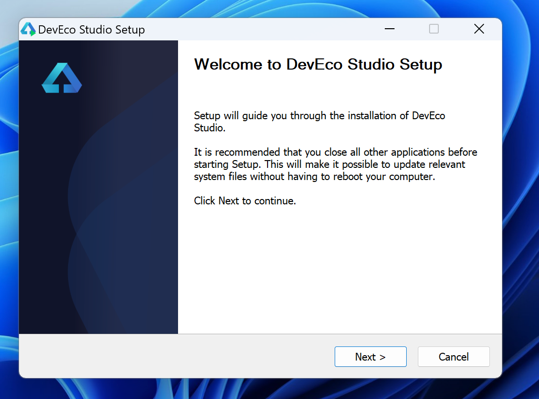
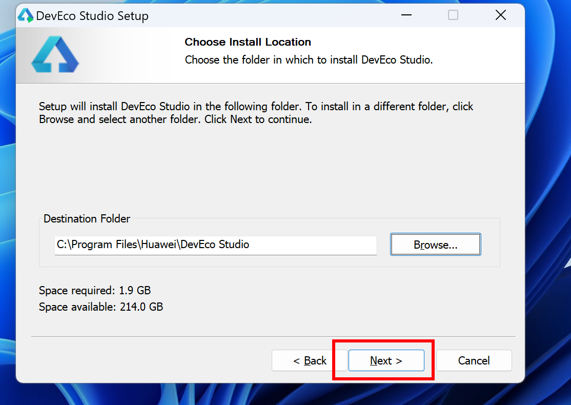
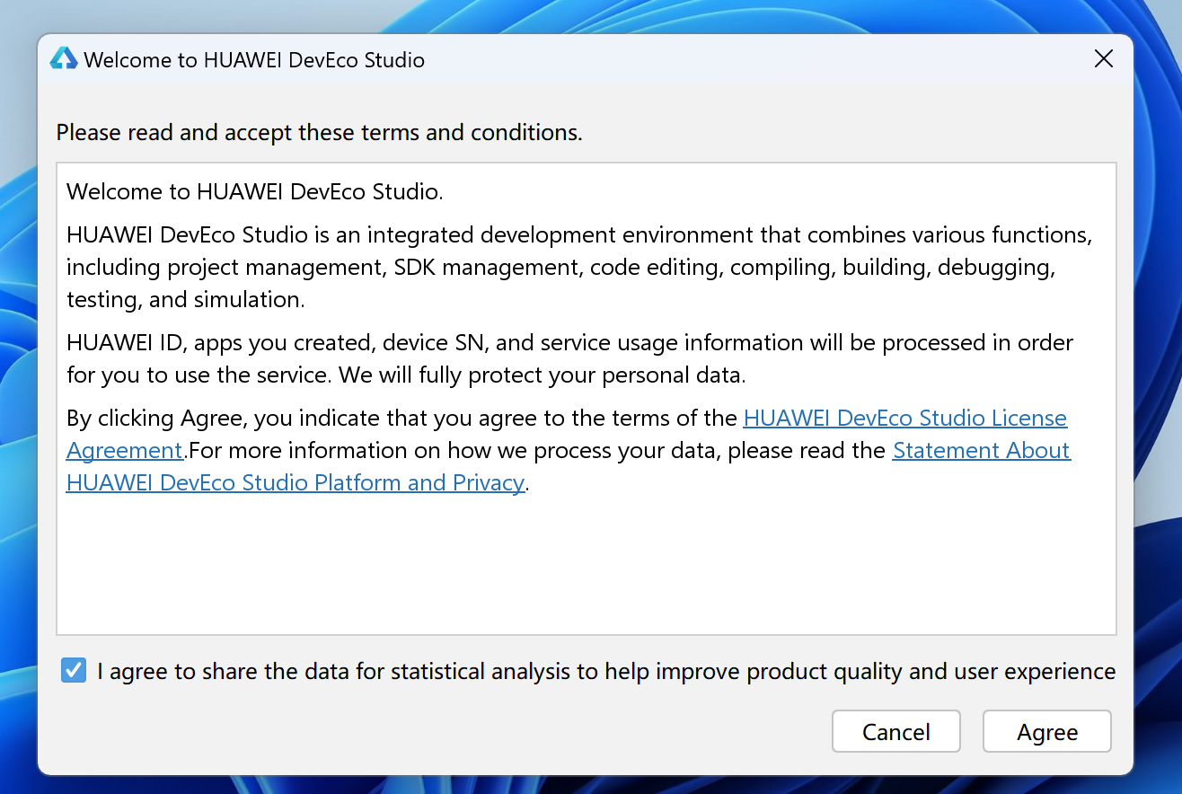
安装 DevEco Studio 编辑器
DevEcoStudio编辑器下载链接
链接: https://pan.baidu.com/s/1TyrmbTkrOEsTB8HcaMR4og?pwd=fjjw 提取码: fjjw
- 安装:DevEco Studio → 一路 Next(只演示windows)
- 运行: 选择not import System Img
这里最好别选在C盘
- 下一步
- 下载sdk
- 安装完成
- 安装完成
- 创建一个新项目
- 填写信息
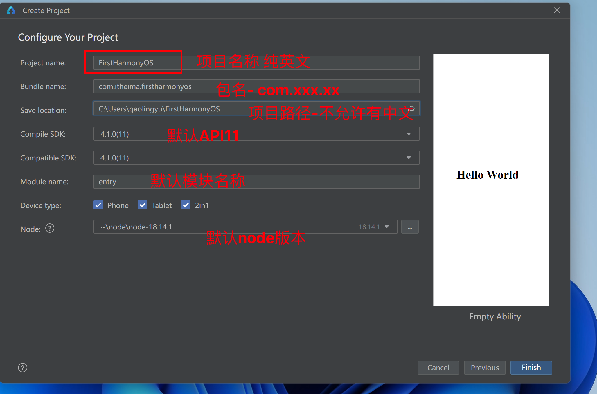
等待创建完成
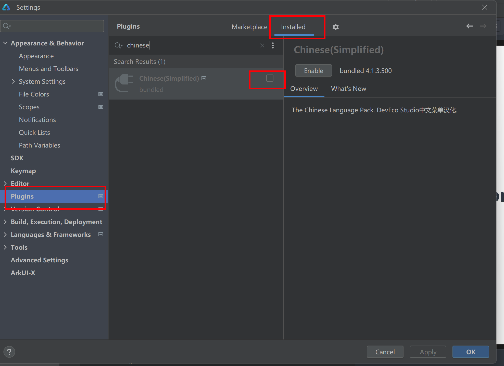
- 安装中文插件(windows)
- Mac的选择
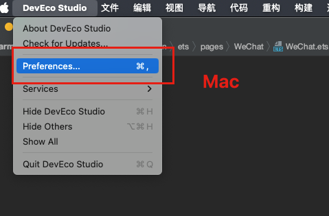
- 选择Plugins
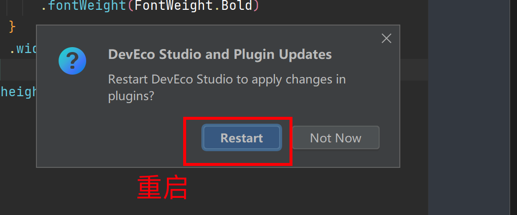
- 点OK重启
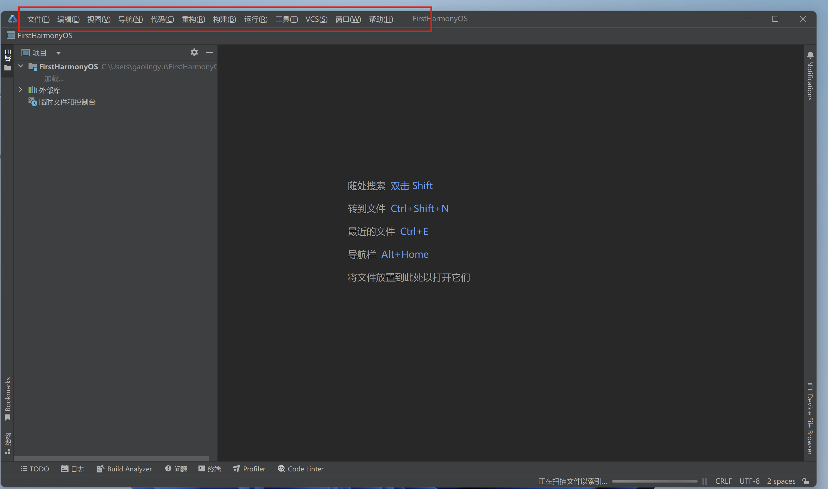
- 看到效果
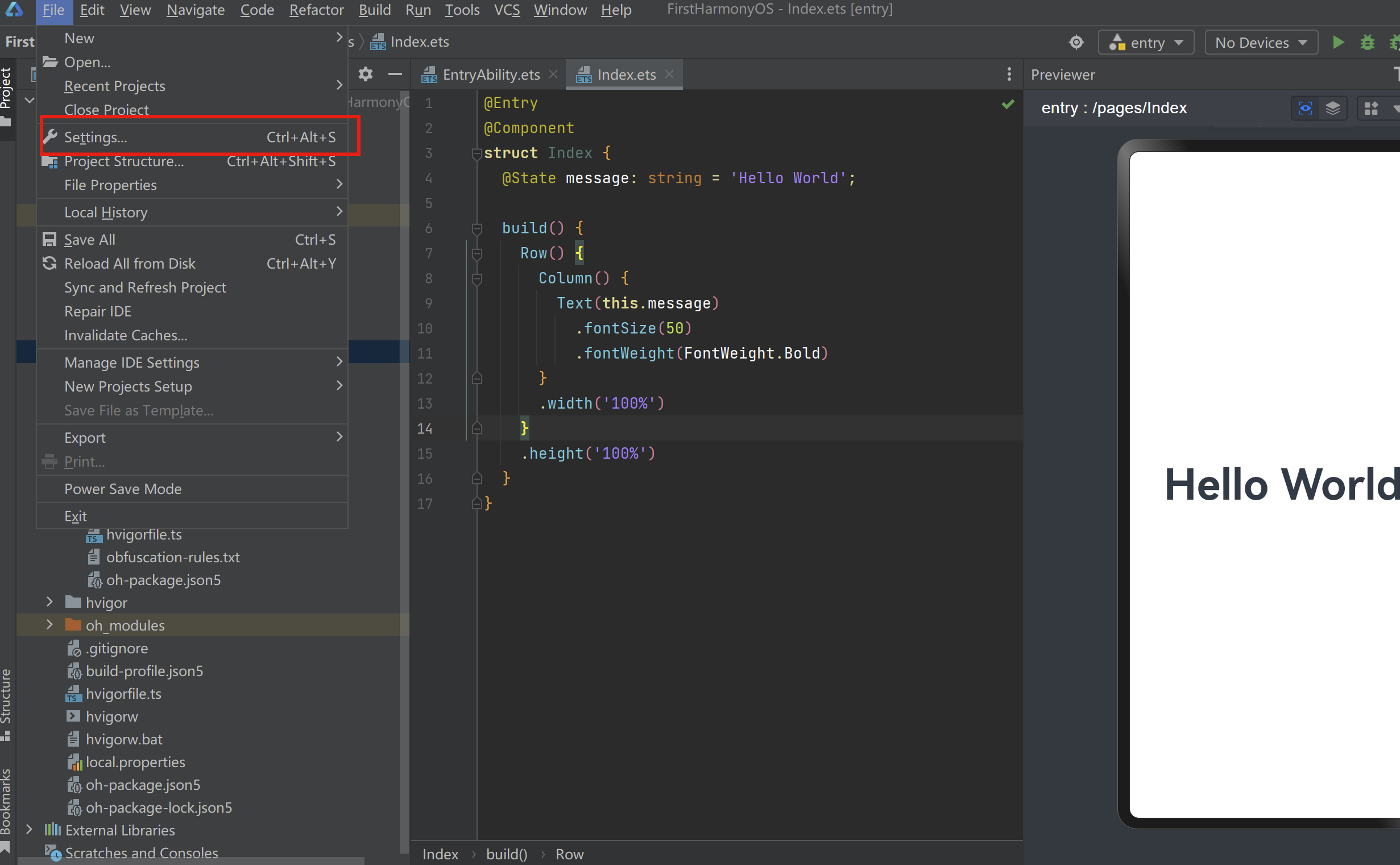
起步-认识工作区
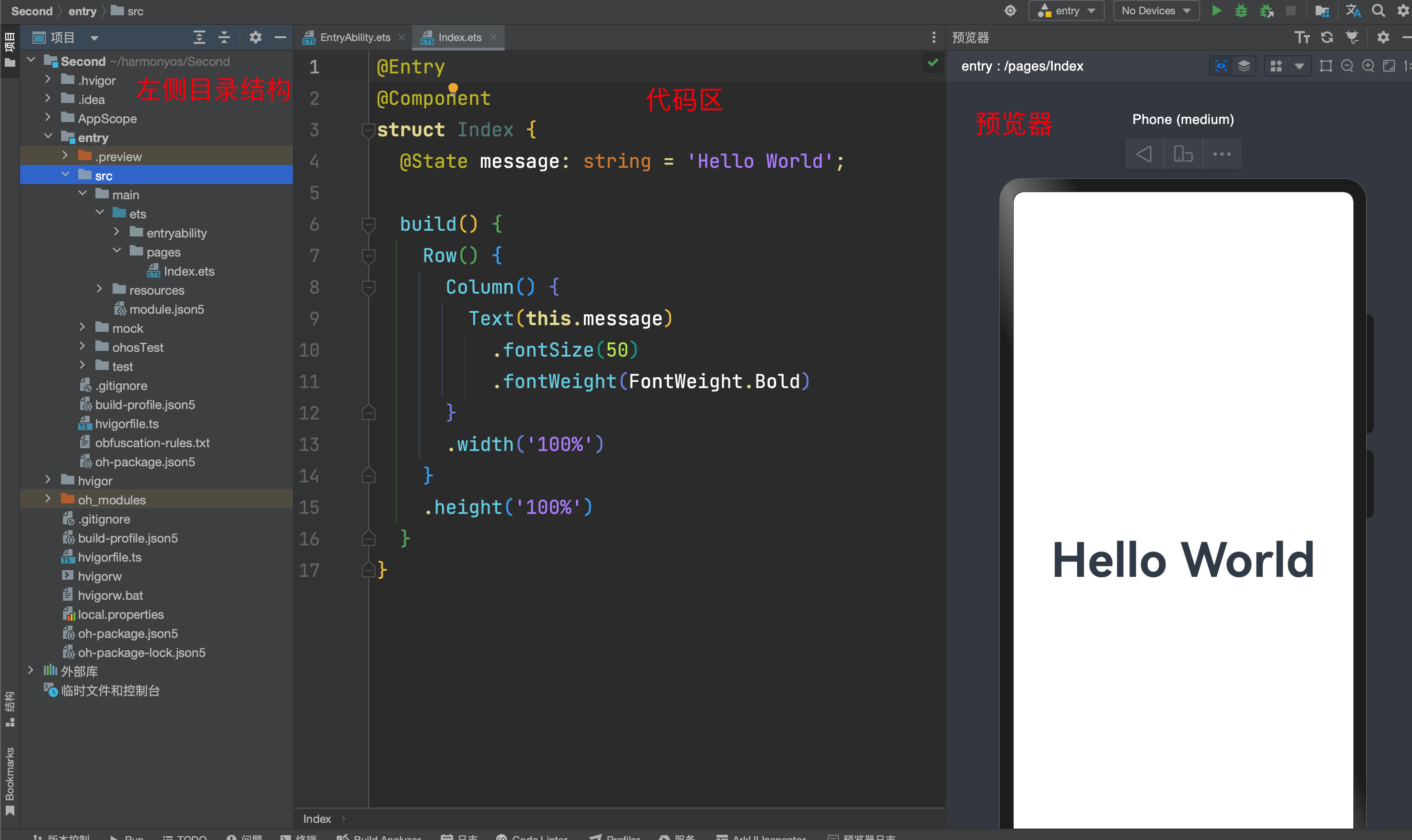
- 通过左侧目录找到对应的应用文件,在编辑区进行代码编写,在右侧看预览效果
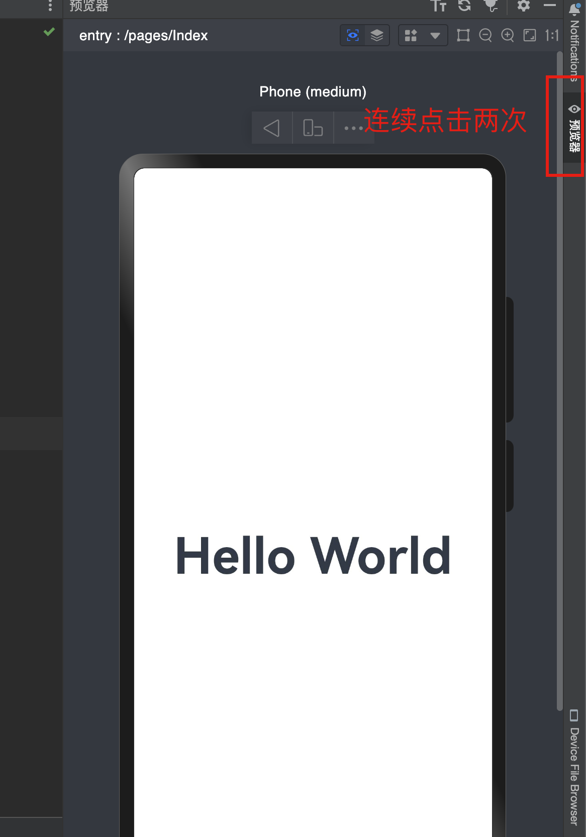
- 连按两下shift,可以快速寻找文件
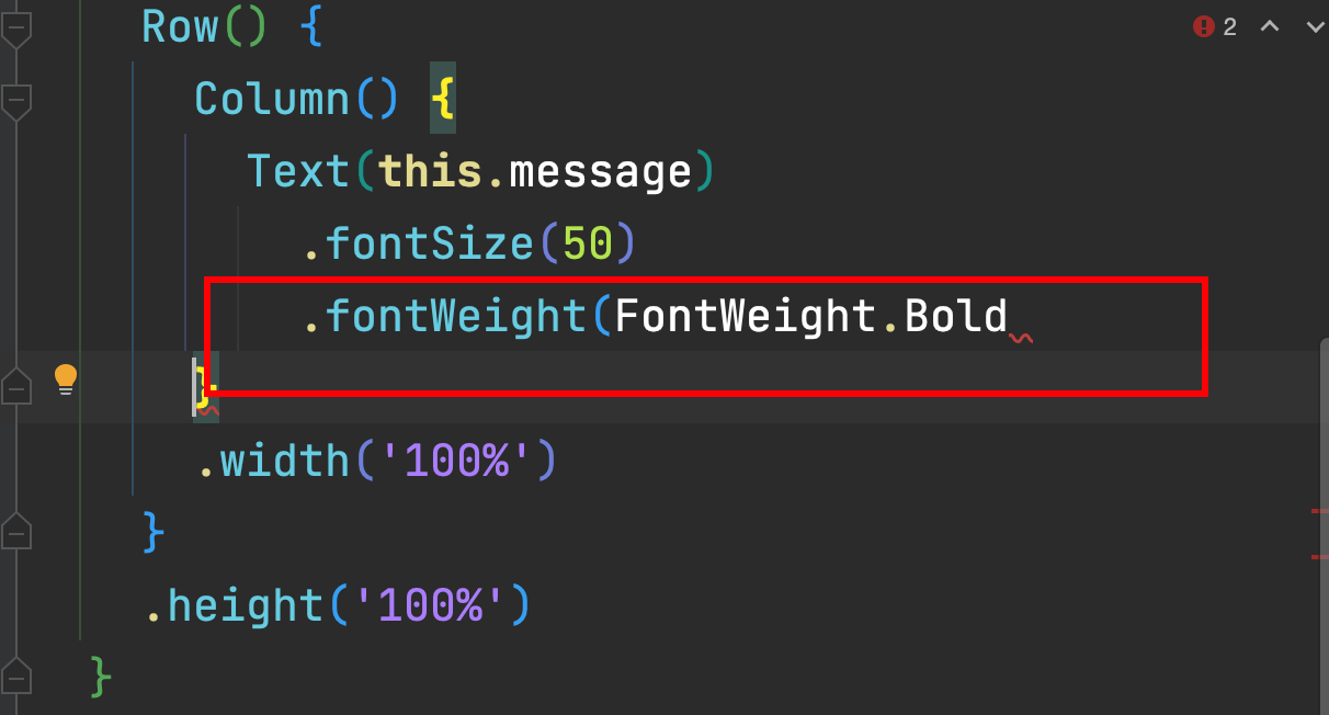
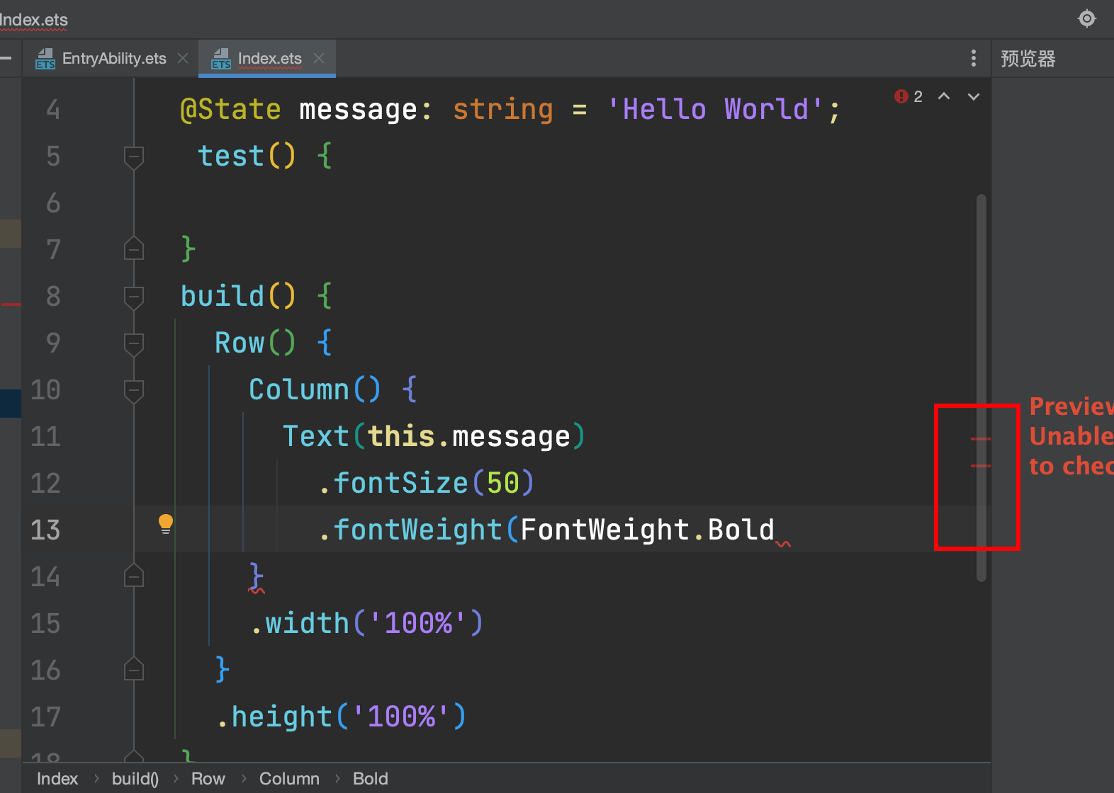
起步-如何排错
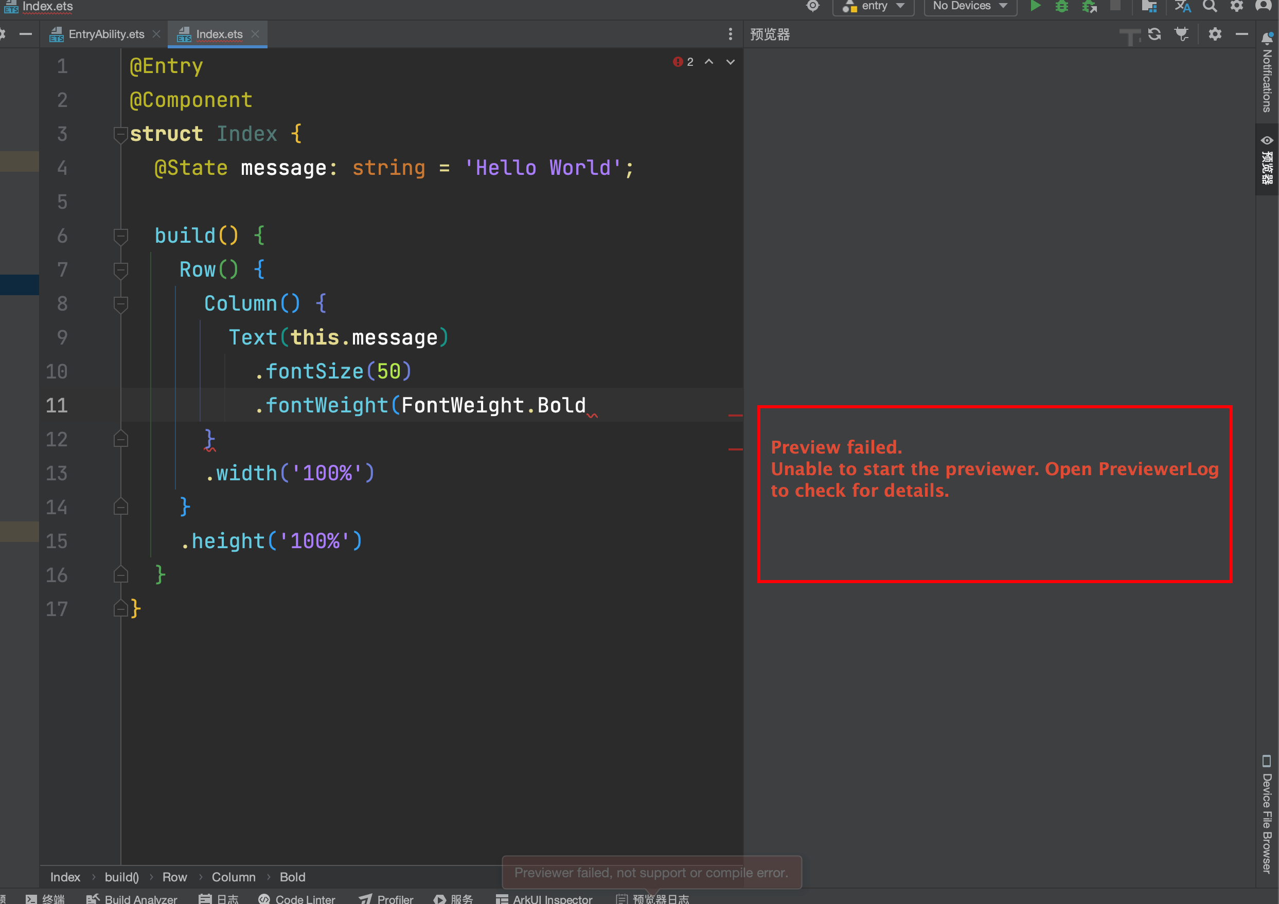
写代码时,我们会经常遇到这种情况,右侧出现不能够开启预览器的提示,让我们打开预览器日志看错误
- 解决该问题的思路 1. 按照编辑器提示的,打开预览器日志
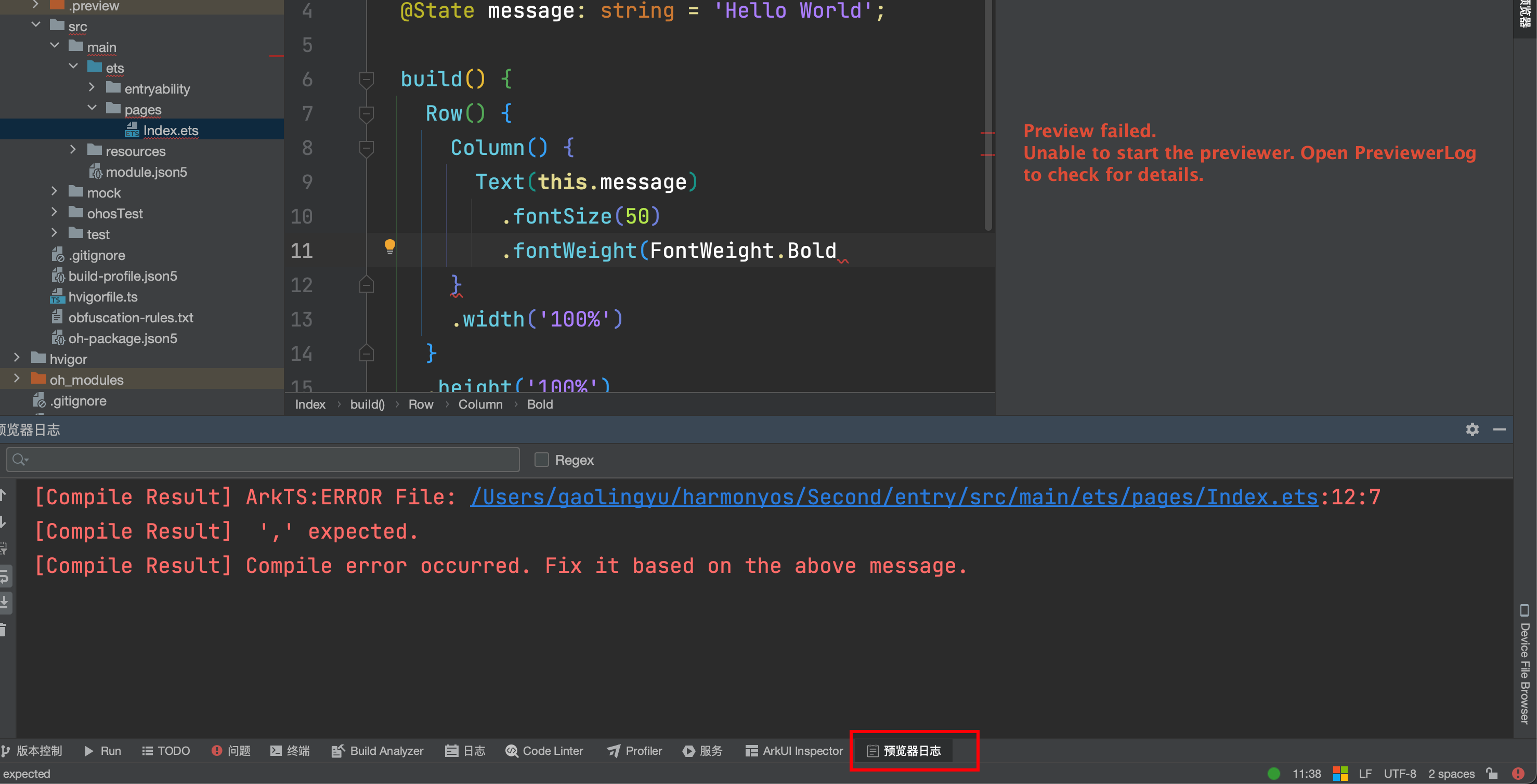
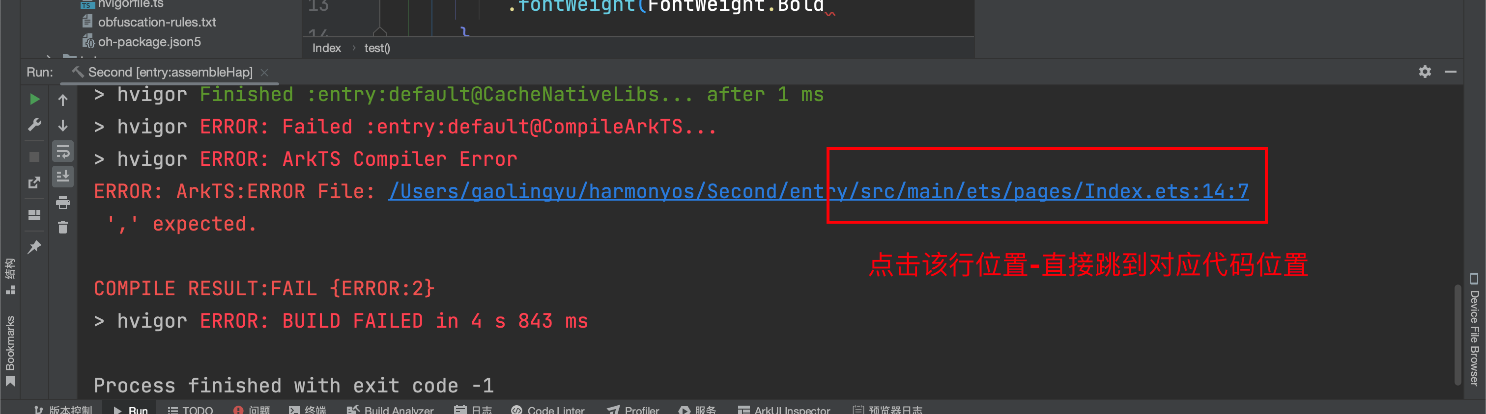
- 如果是明确的语法错误或者api错误,编辑器会指出我们代码的行数,我们可以点击提示的代码行,直接跳到对应位置,直接检查代码的问题
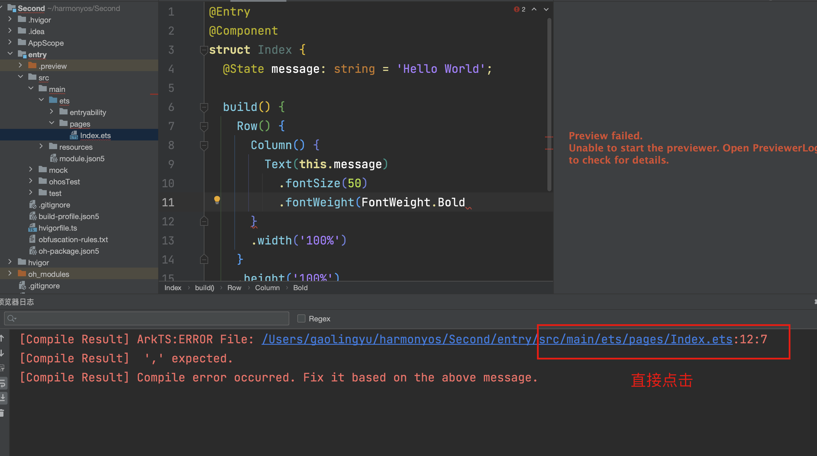
- 跳到对应的位置
解决思路2: 如果当前文件不多,可以点开你创建的所有文件,查看文件中是否有报错的地方,文件报错,在右侧以及代码区会有明显的报错提示
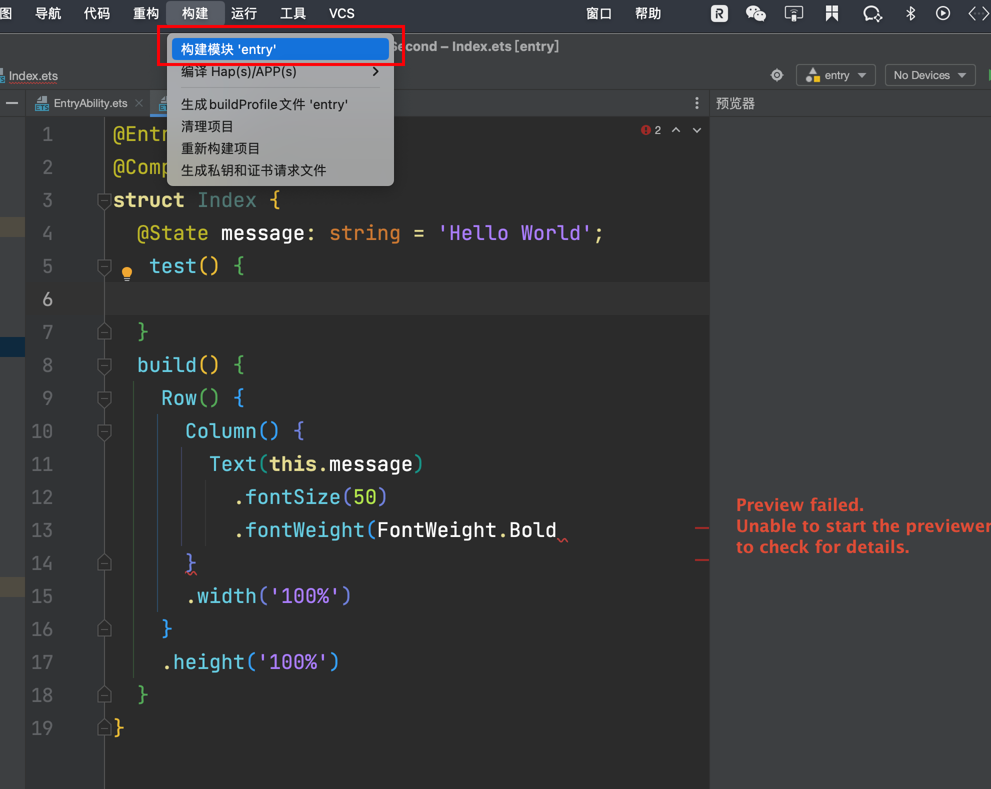
解决思路3: 通过统一构建,暴露哪些文件及代码无法编译通过
如何刷新看效果
预览器是有热更新的
- 原则上写完右侧自动更新
- 如果不自动刷新- 语法错了,编辑器卡住了
- 直接点击刷新按钮
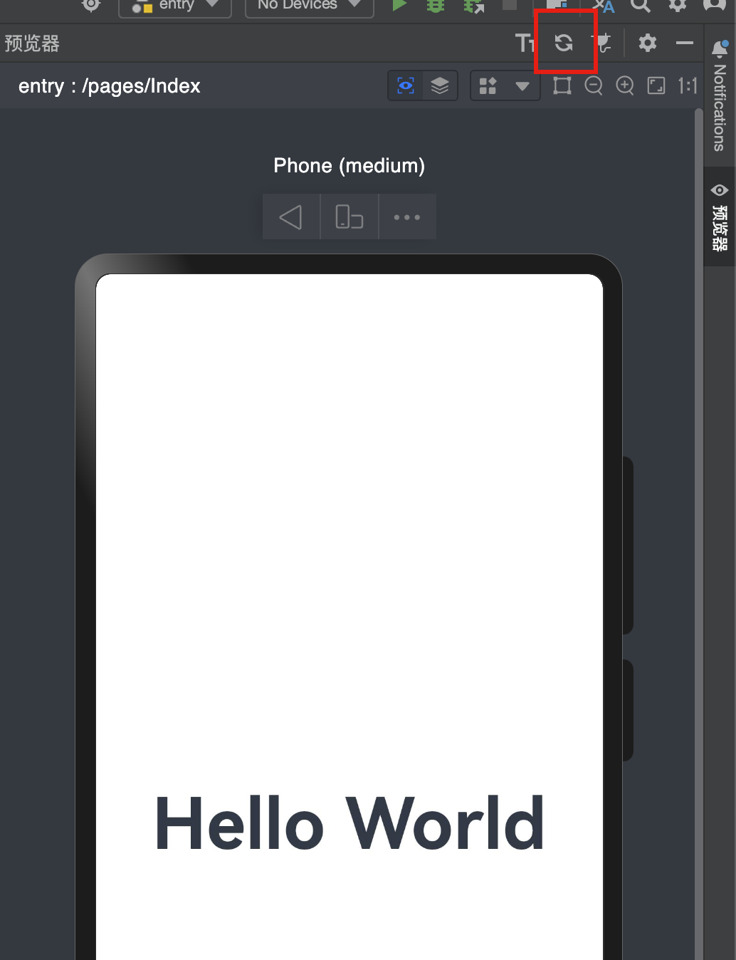
- 刷新只能针对 带有@Entry和@Preview的文件,否则无法看到效果
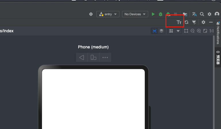
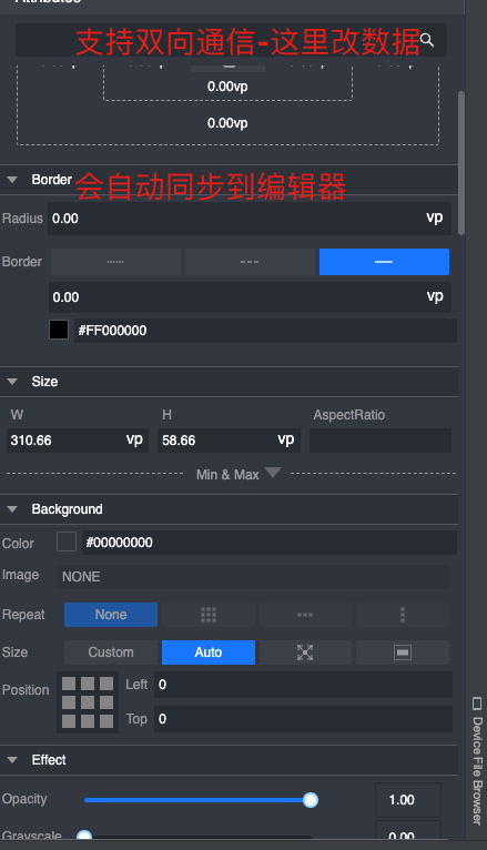
起步-审查和多设备预览
效果预览方法:
info
- Preview(预览器)
- 本地模拟器(只有Mac(ARM)芯片)
远程模拟器云手机(需要审核及申请,暂无消息)- 本地真机(Meta60-Meta60Pro X5或者是装载OpenHarmony的工程机(价格较低,但是依然存在一些问题))
danger
只有装了Next预览版系统的手机才可以进行真机调试和预览,目前Next预览器系统装机量有限,需要申请和审核,小道消息Q2季度会进一步扩大开放名额
- 预览器的多设备预览
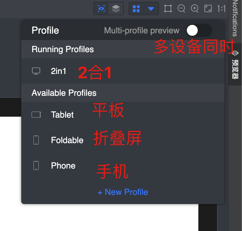
danger
2in1的意思是 平板电脑二合一的状态
- 审查元素
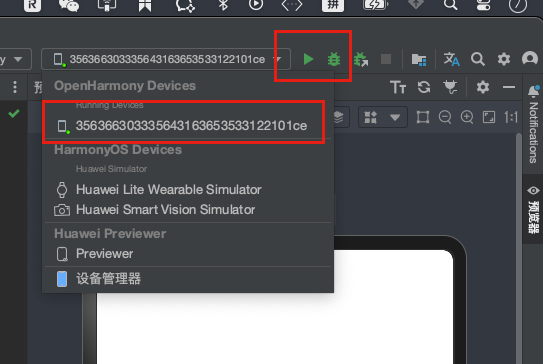
- 真机预览调试
info
-
刷了Next预览版本的手机插上数据线,连接到电脑之后(注意:这里需要开启手机的usb调试,设置中搜索usb调试,打开,并且处理开发者模式,打开手机设置-关于手机,连续点击手机系统的版本号,直到出现您已处于开发者模式的提示未知)
-
运行
info
点击绿色三角- 运行到真机 -
debugger模式
info
点击小虫子-断点调试到真机(4.0版本中真机不支持断点调试-next真机支持断点调试)
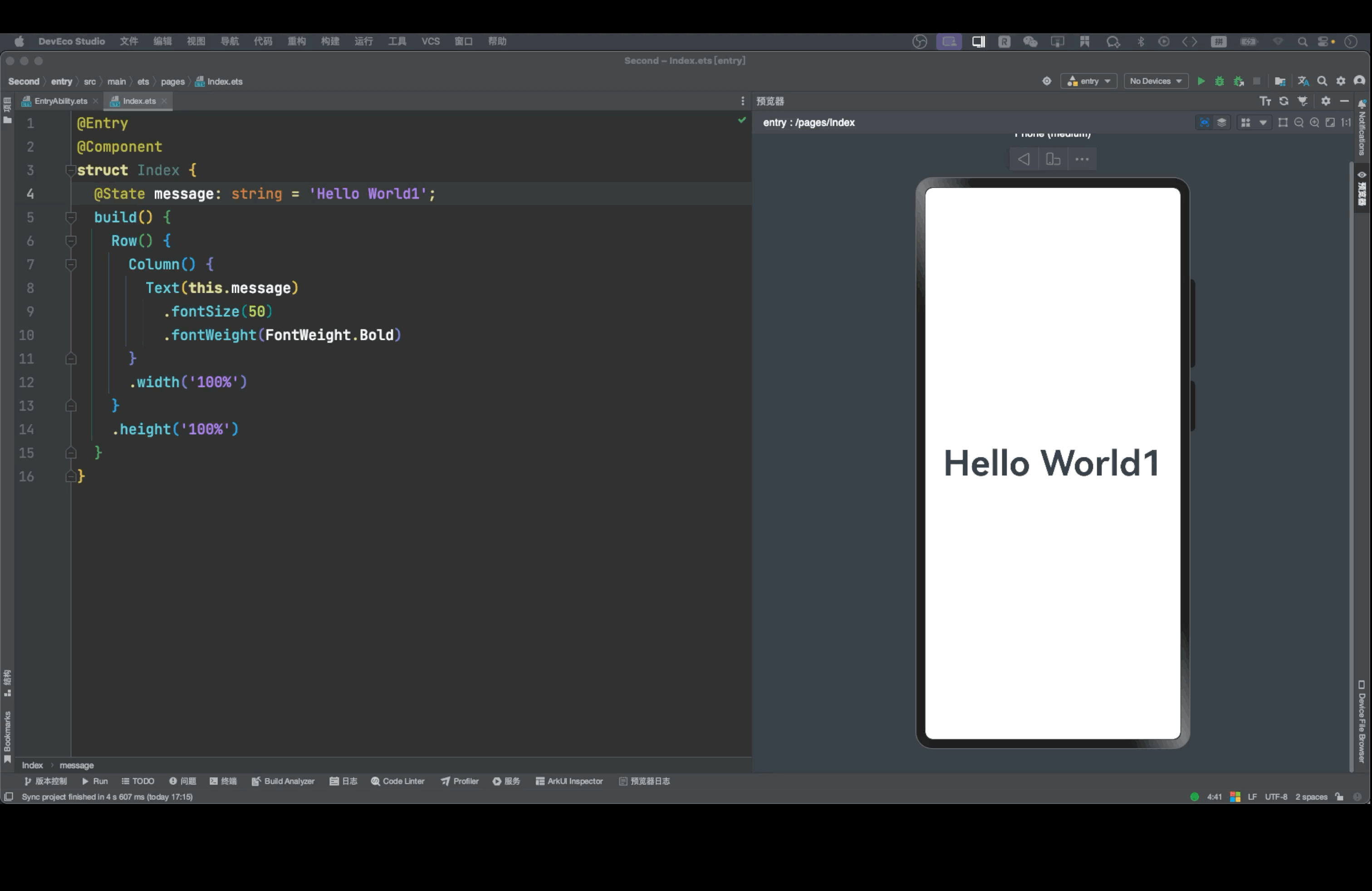
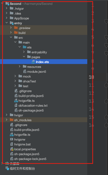
起步-工程目录结构
info
我们详解下目录结构
-
AppScope > app.json5:应用的全局配置信息。
-
**entry:**应用/服务模块,编译构建生成一个HAP。
- src > main > ets:用于存放ArkTS源码。
- src > main > ets > entryability:应用/服务的入口。
- src > main > ets > pages:应用/服务包含的页面。
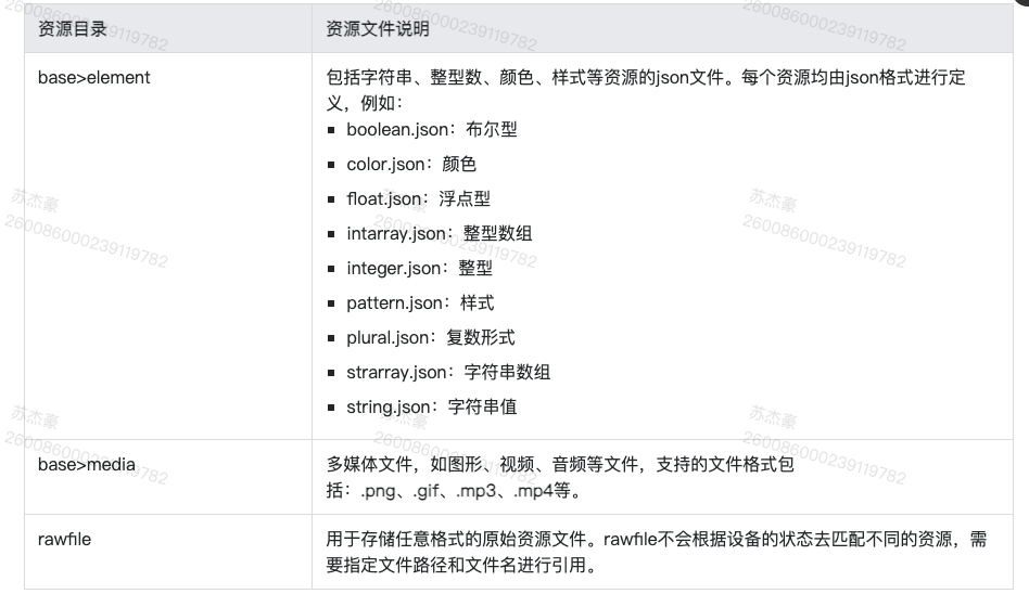
- **src > main > resources:**用于存放应用/服务模块所用到的资源文件,如图形、多媒体、字符串、布局文件等。
- src > main > module.json5:Stage模型模块配置文件,主要包含HAP的配置信息、应用在具体设备上的配置信息以及应用的全局配置信息。
-
**entry > build-profile.json5:**当前的模块信息、编译信息配置项,包括buildOption、targets配置等。
-
entry > hvigorfile.ts:模块级编译构建任务脚本。
-
entry >oh-package.json5:配置三方包声明文件的入口及包名。
-
oh_modules:用于存放三方库依赖信息,包含应用/服务所依赖的第三方库文件。关于原npm工程适配ohpm操作,请参考历史工程适配OHPM包管理。
-
**build-profile.json5:**应用级配置信息,包括签名、产品配置等。
-
**hvigorfile.ts:**应用级编译构建任务脚本。
-
资源目录结构
什么是Stage模型
info
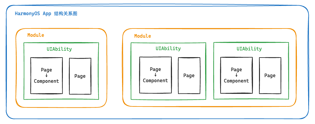
通过上层的目录结构我们要分析出如下关系
State
-Module(模块-对应Hap包)
-ability(应用服务入口)
-pages(页面)
-component(自定义组件)
-resources(资源)
应用模型Stage&FA
鸿蒙的战略 兼容安卓-把java + 前端拉入到开发阵容中-FA模型
官方介绍
- 应用模型是HarmonyOS为开发者提供的应用程序所需能力的抽象提炼,它提供了应用程序必备的组件和运行机制。有了应用模型,开发者可以基于一套统一的模型进行应用开发,使应用开发更简单、高效。
换言之- 应用模型是鸿蒙开发一切的基础,因为只有基于该应用模型我们才可以开发对应的应用和业务。
应用模型包含几个要素**应用组件-**应用进程-应用线程-应用任务管理-应用配置文件
提问:应用模型是只有一个吗?
回答:鸿蒙前后推出了两种应用模型- FA(,Stage,目前FA已经不再主推。Feature Ability
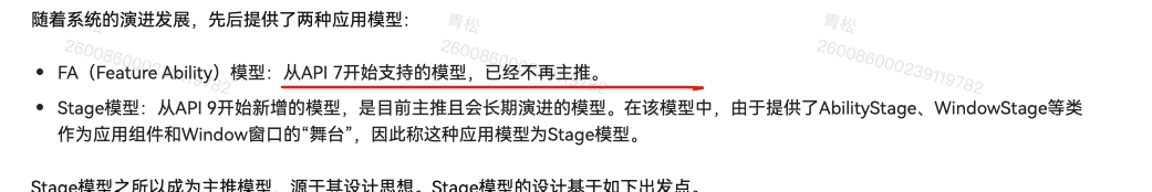
- HarmonyOS Next也将Stage模型作为主推模型,所以我们本次训练营将学习Stage模型相关的应用开发能力。
下面是官方的Stage模型概念图
总结:应用模型是开发鸿蒙应用的基础底座,但是鸿蒙先后推出了FA和Stage,鸿蒙4.0和鸿蒙Next都将Stage作为主推方向,所以我们主要基于Stage模型来学习和开发我们目前的应用。
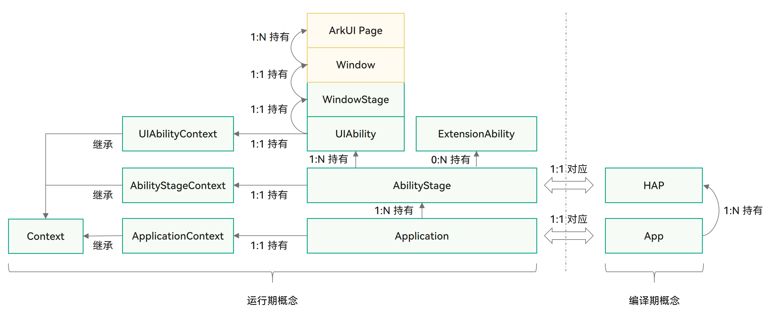
什么是UIAbility-(界面能力组件)
从上一个小节中,我们发现Stage模型提到了UIAbility组件包含UI界面绘制,主要和用户交互。
- UIAbility组件是一种包含UI界面的应用组件,主要用于和用户交互。
官网介绍-UIAbility是系统调度的基本单元,可以给应用提供绘制界面的窗口。
info
UIAbility的设计理念:
- 原生支持应用组件级的跨端迁移和多端协同。
- 支持多设备和多窗口形态。
UIAbility组件是系统调度的基本单元,为应用提供绘制界面的窗口。一个应用可以包含一个或多个UIAbility组件。例如,在支付应用中,可以将入口功能和收付款功能分别配置为独立的UIAbility。
每一个UIAbility组件实例都会在最近任务列表中显示一个对应的任务。
对于开发者而言,可以根据具体场景选择单个还是多个UIAbility,划分建议如下:
如果开发者希望在任务视图中看到一个任务,则建议使用一个UIAbility,多个页面的方式。
如果开发者希望在任务视图中看到多个任务,或者需要同时开启多个窗口,则建议使用多个UIAbility开发不同的模块功能。
场景- 支付/小程序/鉴权
为使应用能够正常使用UIAbility,需要在module.json5配置文件的abilities标签中声明UIAbility的名称、入口、标签等相关信息。
{"module": {..."abilities": [{"name": "EntryAbility", // UIAbility组件的名称"srcEntry": "./ets/entryability/EntryAbility.ets", // UIAbility组件的代码路径"description": "$string:EntryAbility_desc", // UIAbility组件的描述信息"icon": "$media:icon", // UIAbility组件的图标"label": "$string:EntryAbility_label", // UIAbility组件的标签"startWindowIcon": "$media:icon", // UIAbility组件启动页面图标资源文件的索引"startWindowBackground": "$color:start_window_background", // UIAbility组件启动页面背景颜色资源文件的索引...}]}
}
warning
上述文件不用我们手动填写,我们新建ability的时候,会自动填入
组件基础
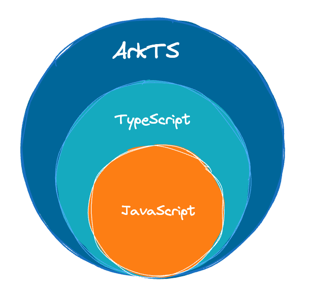
组件-什么是ArkTS
info
ArkTS提供了语言运行时相关能力
ArkTS是HarmonyOS优选的主力应用开发语言。ArkTS围绕应用开发在TypeScript(简称TS)生态基础上做了进一步扩展,保持了TS的基本风格,同时通过规范定义强化开发期静态检查和分析,提升程序执行稳定性和性能。
特别注意:尤其是学过鸿蒙4.0的,Next版本极大增强了TS语言中动态类型的限制,几乎不再支持动态类型
从API version 10开始,ArkTS进一步通过规范强化静态检查和分析,对比标准TS的差异可以参考从TypeScript到ArkTS的适配规则:
- 强制使用静态类型:静态类型是ArkTS最重要的特性之一。如果使用静态类型,那么程序中变量的类型就是确定的。同时,由于所有类型在程序实际运行前都是已知的,编译器可以验证代码的正确性,从而减少运行时的类型检查,有助于性能提升。
- 禁止在运行时改变对象布局:为实现最大性能,ArkTS要求在程序执行期间不能更改对象布局。
- 限制运算符语义:为获得更好的性能并鼓励开发者编写更清晰的代码,ArkTS限制了一些运算符的语义。比如,一元加法运算符只能作用于数字,不能用于其他类型的变量。
- 不支持Structural typing:对Structural typing的支持需要在语言、编译器和运行时进行大量的考虑和仔细的实现,当前ArkTS不支持该特性。根据实际场景的需求和反馈,我们后续会重新考虑。
- 由于文档权限的限制,这里有一份openHarmony的 上的Next版本的ts类型的迁移说明 地址 (内容基本一致)
openHarmony 和HarmonyOS的关系和区别
OpenHarmony是指鸿蒙(HarmonyOS)的开源版本,由华为官方开源,遵循Apache 2.0许可证。OpenHarmony包含了HarmonyOS的核心代码库,但并不包括商业版HarmonyOS中的一些特有功能和技术。
HarmonyOS是华为自主研发的分布式操作系统,旨在打造一个全场景、全终端的智能生态系统。它支持多种设备类型,包括手机、平板、智能手表、智能音箱、电视、汽车、家居等,可以实现设备之间的协同工作和资源共享。
OpenHarmony和HarmonyOS的关系就像是Java和Android的关系一样。可以将OpenHarmony看作是HarmonyOS的底层技术和代码库的一部分,而HarmonyOS则是在此基础上进行了更多的开发和扩展,添加了更多的功能和应用。相比之下,OpenHarmony更加开放和自由,可以被开发者用于构建各种类型的设备和应用,而HarmonyOS则更加注重整合、统一和优化整个生态系统。
- ArkTS的特性-扩展能力
- **基本语法 **
- 定义声明式UI、自定义组件、动态扩展UI元素;
- 提供ArkUI系统组件,提供组件事件、方法、属性;
- 共同构成 UI 开发主体
- **状态管理 **
- 组件状态、组件数据共享、应用数据共享、设备共享;
- **渲染控制 **
- 条件渲染、循环渲染、数据懒加载;
ArkTS以声明方式组合和扩展组件来描述应用程序的UI,同时还提供了基本的属性、事件和子组件配置方法,帮助开发者实现应用交互逻辑。
- 命令式UI- document.createElement(“div”)-
- 声明式UI
下图是关于ArtTS的一个整体的应用架构(官网)

info
总结:
- AktTS提供原有前端范畴内的一切TypeScript和JavaScript的类型及方法支持
- Next版本加了很多限制-要看迁移指南
- ArkTS采用声明式UI的方法来绘制页面,设置属性,绑定事件
ArkTS重点迁移说明
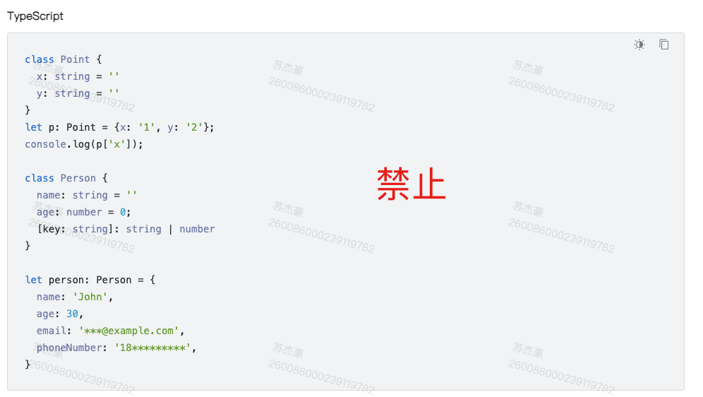
- 对象字面量不能用于类型声明
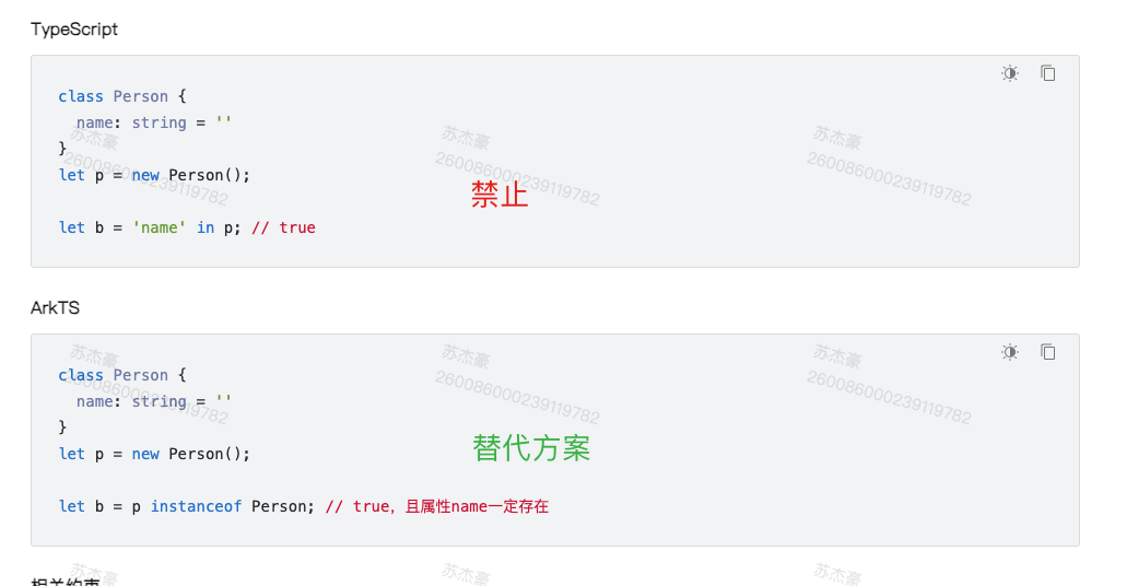
- 不支持in操作符
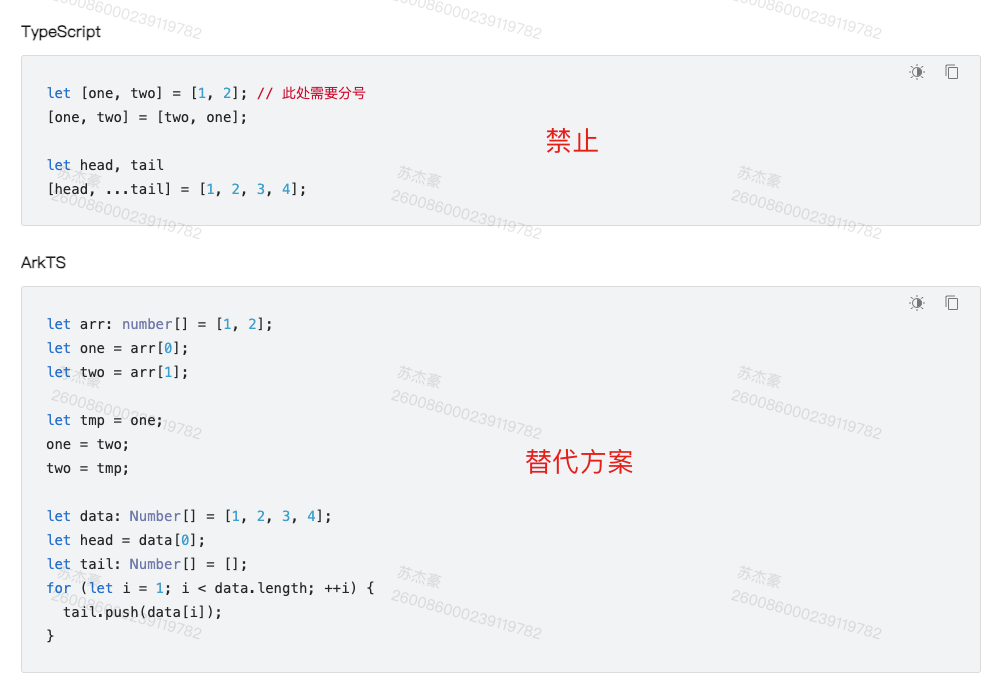
- 不支持解构赋值
- 不支持通过索引访问字段
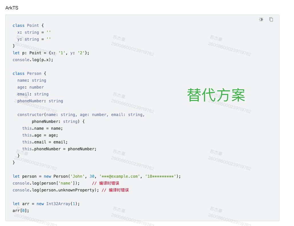
有一种情况下,可以通过索引访问字段,即传入的参数类型为object, 但是传入时必须用class的类型传入,如下
@Entry
@Component
struct Index {@State message: string = 'Hello World1';test (obj: object) {console.log(Object.keys(obj).map(item => `${item}=${obj[item]}`).toString())}aboutToAppear(): void {let o = new TestObj()this.test(o)}build() {Row() {Column() {Text(this.message).fontSize(50).fontWeight(FontWeight.Bold)}.width('100%')}.height('100%')}
}
class TestObj {a: number = 0b: string = "123"
}
以上场景一般用作请求封装时,无法确定侦测传入参数的类型时使用
- 部分支持延展运算符
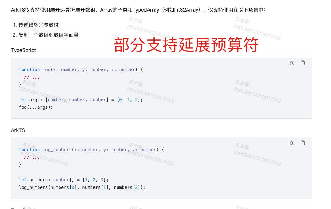
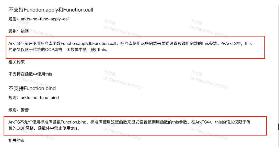
- 不支持bind/call/apply改变this指向
this始终指向调用者。谁调用这个方法,this指向谁
基础-组件结构
info
接下来,我们来解析我们的UI的结构
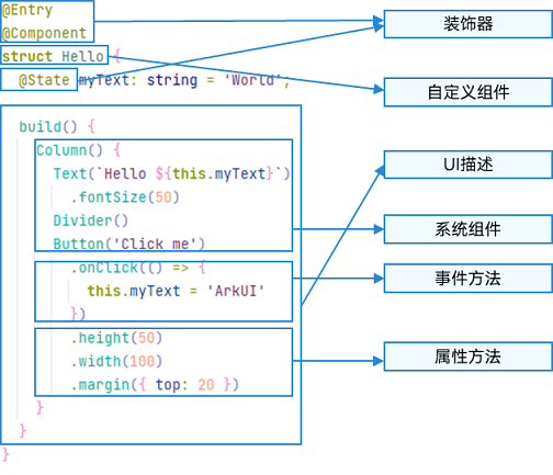
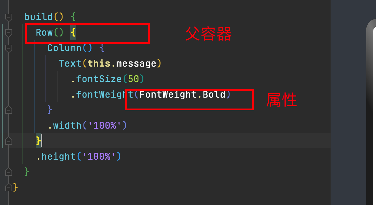
ArkTS通过装饰器 @Component 和 @Entry 装饰 struct 关键字声明的数据结构,构成一个自定义组件。
自定义组件中提供了一个 build 函数,开发者需在该函数内以链式调用的方式进行基本的 UI 描述,UI 描述的方法请参考 UI 描述规范。
- struct-自定义组件基于struct实现
要想实现一段UI的描述,必须使用struct关键字来声明- 注意不能有继承关系-组件名不能系统组件名重名
语法: struct 组件名 {}
@Component
struct Index {}
@CustomDialog
struct Index2 {}
info
struct关键字声明的UI描述-必须被@Component或者@CustomDialog修饰
- Component修饰符
Component装饰器只能修饰struct关键字声明的结构,被修饰后的struct具备组件的描述(渲染)能力
- build函数
用于定义组件的UI描述,一个struct结构必须实现build函数
@Component
struct MyComponent {build() {}
}
info
注意:
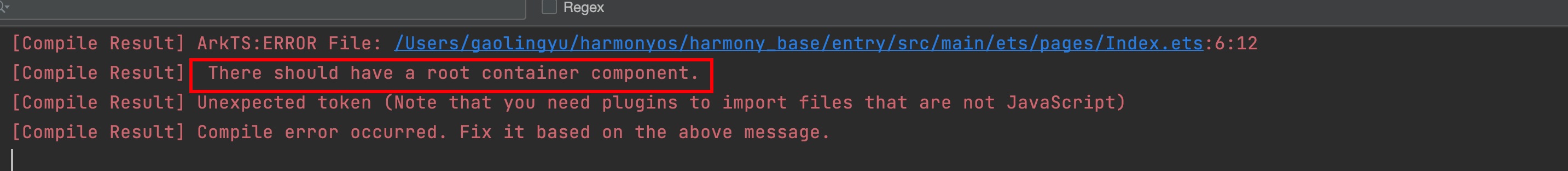
1.build函数是组件(Component)必须提供以及实现的一个函数,build函数可以没有内容,如果有的话,必须有且只有一个容器组件(可以放置子组件的组件)- 只有entry里面有限制- component里面没有限制
2.Component的组件build函数 可以放没有子组件的组件
-
常见容器组件- Flex-Column-Row-List-Grid-Panel
-
entry修饰符
entry将自定义组件定义为UI页面的入口,也就是我们原来前端常说的一个页面,最多可以使用entry装饰一个自定义组件(在一个ets文件中)-如下面的代码就是不被允许的
@Entry
@Component
struct Index {build() {}
}
@Entry
@Component
struct Index2 {build() {}
}
info
entry修饰的组件,最终会被注册,具体文件位置-main/resources/base/profile/main_pages.json
- 自动注册-新建组件时,采用新建Page的方式
- 手动注册-新建一个ets文件,自己在main_pages.json中手动添加路径
注意:
如果你手动删除了某一个带entry的组件,你需要手动去main_page中去删除该路径,否则编译会报错
- 组件复用
在很多情况下,由于业务的复杂度,我们经常会将一个大的业务拆成若干个组件,进行组装,这里我们非常灵活的复用组件,比如
info
- 我们可以把上图抽象成三个组件- Header- Main- Footer
代码
import { MeiTuanFooter } from '../views/MeiTuan/MeiTuanFooter';
import { MeiTuanHeader } from '../views/MeiTuan/MeiTuanHeader';
import { MeiTuanMain } from '../views/MeiTuan/MeiTuanMain';@Entry
@Component
struct MeiTuan {@State message: string = 'Hello World';build() {Column() {MeiTuanHeader()  // 60MeiTuanMain().layoutWeight(1).backgroundColor(Color.Green)MeiTuanFooter()  // 60}.height('100%')}
}@Preview
@Component
struct MeiTuanHeader {build() {Row () {Text("美团头部").width('100%').textAlign(TextAlign.Center)}.width('100%').height(60).backgroundColor(Color.Pink)}
}
export { MeiTuanHeader }
@Component
struct MeiTuanMain {build() {Row() {Text("美团中部").fontColor(Color.Red)}.justifyContent(FlexAlign.Center).width('100%')}
}export { MeiTuanMain }@Component
struct MeiTuanFooter {build() {Row () {Text("美团底部").fontColor(Color.White)}.justifyContent(FlexAlign.Center).width('100%').height(60).backgroundColor(Color.Blue)}
}
export  { MeiTuanFooter  }
info
总结:
- 一个UI描述必须使用struct来声明,不能继承
- struct必须被Component或者CustomDialog修饰
- struct必须实现build方法,build方法可以没有元素,但是有的话有且只有一个可容纳子组件的容器组件(entry修饰的组件)
- entry修饰符表示该组件是页面级组件,一个文件中只允许修饰一个struct组件
- 采用分拆组件的形式可以有效解解耦我们的业务
基础-系统组件(ArkUI)
ArkUI: Ability Kit在UIAbility组件可以使用ArkUI提供的组件、事件、动效、状态管理等能力。
这里所指的Kit其实是Next版本中,鸿蒙将各个能力集进行了统一的分类
ArkUI将组件大概分为这么几类
- 基础组件
- 容器组件
- 媒体组件(只有一个Video)
- 绘制组件
- 画布组件
- 高级组件 额外新增
- 安全组件 额外新增
大家关心的地图功能在Next版本中以API形式呈现
基本组件使用
- Text 文本组件-(Span子组件 ImageSpan组件)
- Column 列组件,纵向排列,Flex布局主轴是Y (任意子组件)
- Row 行组件,横向排列,Flex布局主轴是X (任意子组件)
- Flex 以弹性方式布局子组件的容器组件。(存在二次布局,官方推荐有性能要求,使用Column和Row代替) (任意子组件)
- Button 按钮组件 (单子组件)
- TextInput 输入框组件 (无子组件)
- Image (无子组件)
- Button (单个子组件)
- List (仅支持ListItem子组件)
- Scroll (仅支持单个子组件)
- Stack(堆叠容器,子组件按照顺序依次入栈,后一个子组件覆盖前一个子组件)
- Grid(网格容器,由“行”和“列”分割的单元格所组成,通过指定“项目”所在的单元格做出各种各样的布局。仅支持GridItem组件)
- GridRow(栅格容器组件,仅可以和栅格子组件(GridCol)在栅格布局场景中使用。)
- GirdCol(栅格子组件,必须作为栅格容器组件(GridRow)的子组件使用。)
组件使用
info
- 使用组件采用 **组件名() **的语法
- 有构造参数采用 **组件名(参数)**的语法
- 组件里放置子组件采用 **组件名() { 子组件的语法 } **的链式语法
- 组件设置属性采用 **组件名().width().height() **的语法
- 组件又有属性又有子组件采用 **组件名(){ … 子组件 }.width().height() **的语法
基础布局
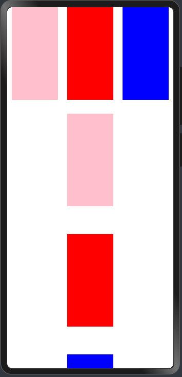
横向布局-采用Row
百分比说明: 鸿蒙的里面的百分比指的是相对当前父容器,并不是当前的手机屏幕
在写宽度高度时,直接写数字默认单位为vp虚拟像素,屏幕会进行适配。
Row组件默认情况下,子组件内容会垂直方向居中-** 内容超出不会换行**
@Entry
@Component
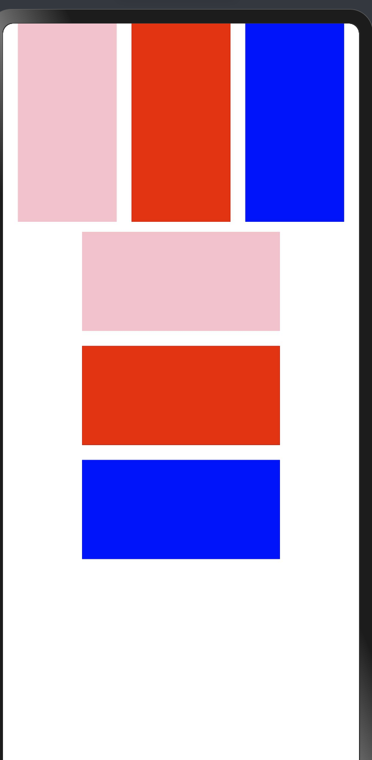
struct ComponentCase {@State message: string = 'Hello World'build() {Column() {// css 支持调整布局Row({ space: 15 }) {Column().width(100).height(200).backgroundColor(Color.Pink)Column().width(100).height(200).backgroundColor(Color.Red)Column().width(100).height(200).backgroundColor(Color.Blue)}.width('100%')// .justifyContent(FlexAlign.Start).justifyContent(FlexAlign.Center)// .justifyContent(FlexAlign.End)// .justifyContent(FlexAlign.SpaceBetween)// .justifyContent(FlexAlign.SpaceAround)// .justifyContent(FlexAlign.SpaceEvenly)}.width('100%').height('100%')}
}
纵向布局
@Entry
@Component
struct ComponentCase {@State message: string = 'Hello World'build() {Column({ space: 10 }) {// css 支持调整布局Row({ space: 15 }) {Column().width(100).height(200).backgroundColor(Color.Pink)Column().width(100).height(200).backgroundColor(Color.Red)Column().width(100).height(200).backgroundColor(Color.Blue)}.width('100%')// .justifyContent(FlexAlign.Start).justifyContent(FlexAlign.Center)Column({ space: 15 }) {Column().width(200).height(100).backgroundColor(Color.Pink)Column().width(200).height(100).backgroundColor(Color.Red)Column().width(200).height(100).backgroundColor(Color.Blue)}.width('100%').justifyContent(FlexAlign.Center)}.width('100%').height('100%')}
}
自定义组件应用
@Entry
@Component
struct Layout {build() {Column() {RowCase()ColumnCase()}.height('100%').backgroundColor(Color.Grey)}
}@Component
struct RowCase {build() {Row() {Column().height(150).width(100).backgroundColor(Color.Pink)Column().height(150).width(100).backgroundColor(Color.Red)Column().height(150).width(100).backgroundColor(Color.Blue)}.width('100%').alignItems(VerticalAlign.Top).justifyContent(FlexAlign.SpaceAround)}
}@Component
struct ColumnCase {build() {Column() {Column().height(100).width(150).backgroundColor(Color.Pink)Column().height(100).width(150).backgroundColor(Color.Red)Column().height(100).width(150).backgroundColor(Color.Blue)}.height(400).width('100%').justifyContent(FlexAlign.SpaceEvenly)}
}
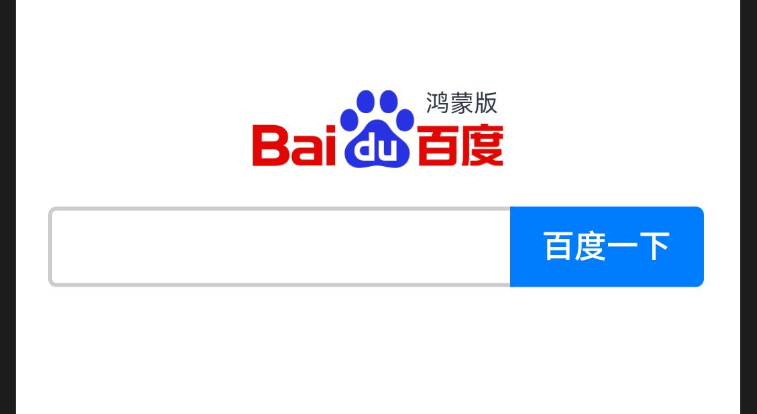
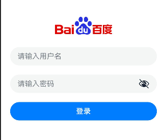
- 百度的小案例
@Entry
@Component
struct Baidu {build() {Column({ space: 20 }) {Image("https://www.baidu.com/img/PCtm_d9c8750bed0b3c7d089fa7d55720d6cf.png").width(160)Row() {TextInput().borderRadius({topLeft: 6,bottomLeft: 6}).height(40).layoutWeight(1).backgroundColor(Color.White).border({color: "#c4c7ce",width: 2})Button("百度一下").type(ButtonType.Normal).backgroundColor("#516aee").padding({left: 10,right: 10,top: 6,bottom: 6}).translate({x: -2}).borderRadius({topRight: 6,bottomRight: 6})}.padding({left: 10,right: 10}).width('100%')}.justifyContent(FlexAlign.Center).width('100%').height('100%')}
}
warning
Row 和Column的布局方式成为线性布局- 不是横向排列就是纵向排列
- 线性布局中永远不会产生换行
- 均不支持出现滚动条
- 横向排列的垂直居中,总行排列的水平居中
- 主轴-排列方向的轴
- 侧轴-排列方向垂直的轴
堆叠布局
info
只要在Stack内部-后者永远会覆盖前者
@Entry
@Component
struct Baidu {build() {Column({ space: 12 }) {//   图片Row() {Stack({alignContent:Alignment.TopEnd}) {Image('https://www.baidu.com/img/PCtm_d9c8750bed0b3c7d089fa7d55720d6cf.png').width(160)Text('鸿蒙版').fontSize(12).offset({x:-20,y:30})}}.width('100%').justifyContent(FlexAlign.Center)//   输入框+按钮Row() {TextInput().layoutWeight(1).border({width: 2,color: '#ccc'}).height(40).borderRadius({topLeft: 4,bottomLeft: 4}).backgroundColor('#fff')Button('百度一下').type(ButtonType.Normal).translate({x: -2}).borderRadius({topRight: 4,bottomRight: 4})}}.width('100%').height('100%').padding(16).justifyContent(FlexAlign.Center)}
}
info
Stack的参数 可以设置子组件的排列方式-alignContent
- Top(顶部)
- TopStart(左上角)
- TopEnd(右上角)
- Start(左侧)
- End(右侧)
- Center(中间)
- Bottom(底部)
- BottomStart(左下角)
- BottomEnd(右下角)

@Entry
@Component
struct FontJump {build() {Row() {Stack() {Text('抖音').fontSize(50).fontWeight(FontWeight.Bold).fontColor('#ff2d83b3').translate({x:-2,y:2}).zIndex(1)Text('抖音').fontSize(50).fontWeight(FontWeight.Bold).fontColor('#ffe31fa9').translate({x:2,y:-2}).zIndex(2)Text('抖音').fontSize(50).fontWeight(FontWeight.Bold).fontColor('#ff030000').translate({x:0,y:0}).zIndex(3)}.width('100%')}.height('100%')}
}
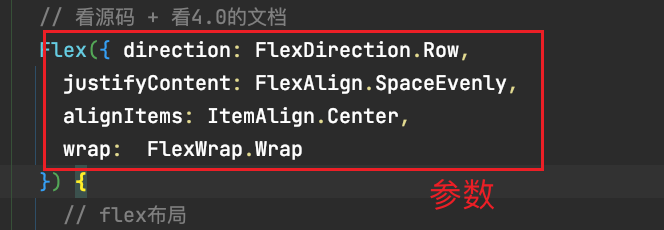
弹性布局
@Entry
@Component
struct ComponentCase {@State message: string = 'Hello World'build() {Scroll() {Row() {Column() {Flex({ direction: FlexDirection.Row, justifyContent: FlexAlign.SpaceAround }) {Column().width(100).height(200).backgroundColor(Color.Pink)Column().width(100).height(200).backgroundColor(Color.Red)Column().width(100).height(200).backgroundColor(Color.Blue)}.margin({top: 200})}.width('100%')}}}
}
warning
Flex布局设置属性设置方向 是通过参数的,并非通过属性
- 属性?
- 参数?
网格布局
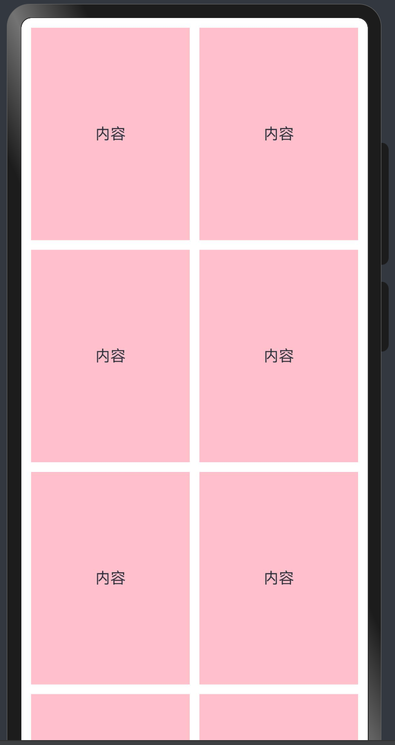
Grid布局
- 想要控制屏幕的分栏 分几列, 怎么分 特别像前端的栅格布局
- Row组件默认情况下,里面的元素的纵向是居中的
- Column组件默认横向是居中的
info
Grid组件下只能放置GridItem组件
Grid可以设置columnsTemplate和rowsTemplate
columnsTemplate是设置横向的分配,如果设置 1fr 1fr 表示,等分为两份, 如果设置1fr 2fr表示左边一份,右边两份, 在设置columnsTemplate不设置rowsTemplate的情况下,如果内容超出容器区域,会自动出现滚动条 columnsGap设置列和列之间的间距,rowsGap设置行和行之间的间距
@Entry
@Component
struct GridCase {build() {Grid() {GridItemCase()GridItemCase()GridItemCase()GridItemCase()GridItemCase()GridItemCase()GridItemCase()GridItemCase()GridItemCase()GridItemCase()GridItemCase()GridItemCase()GridItemCase()GridItemCase()GridItemCase()GridItemCase()GridItemCase()}.width("100%").height("100%").columnsTemplate("1fr 1fr").columnsGap(10).rowsGap(10).padding(10)}
}@Component
struct GridItemCase {build() {GridItem() {Row() {Column() {Text("内容")}.width('100%')}.height(200).borderRadius(4).backgroundColor(Color.Pink)}}
}
滚动条说明
在基本的布局组件 Column/Row/Flex/Stack中不论内容超出与否,皆不会出现滚动条
- 出现滚动条的组件
- Grid
- List(列表)
- Scroll(滚动条)
- Swiper(轮播)
- WaterFlow(瀑布流)
出现滚动条的前提条件是- 上述组件中的子组件的内容超出了父容器组件的宽度或者高度
- 使用最基本的Scroll组件出现一个滚动条
- 先实现基本的布局
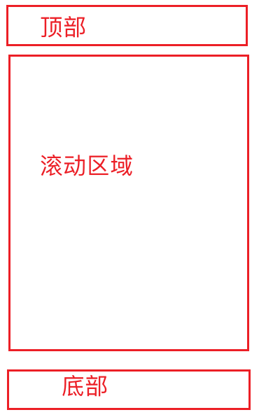
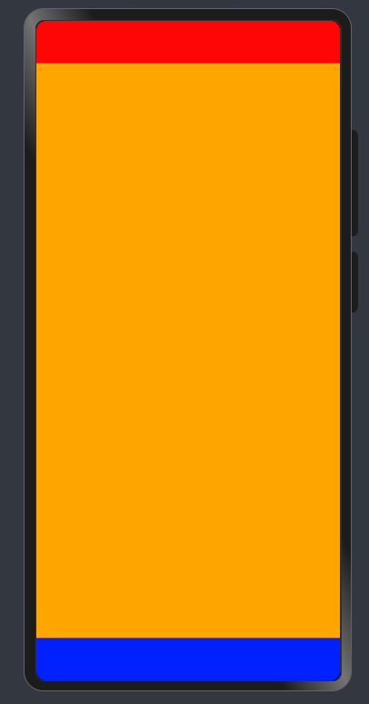
@Entry
@Component
struct ScrollCase {build() {Column() {Row().width('100%').height(50).backgroundColor(Color.Red)Column() {}.width('100%').layoutWeight(1).backgroundColor(Color.Orange)Row().width('100%').height(50).backgroundColor(Color.Blue)}.justifyContent(FlexAlign.SpaceBetween).width('100%').height('100%')}
}
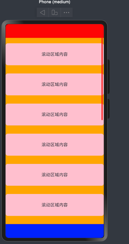
- 实现区域滚动
@Entry
@Component
struct ScrollCase {build() {Column() {Row().width('100%').height(50).backgroundColor(Color.Red)Scroll(){Column() {ScrollItem()ScrollItem()ScrollItem()ScrollItem()ScrollItem()ScrollItem()ScrollItem()ScrollItem()ScrollItem()ScrollItem()ScrollItem()ScrollItem()ScrollItem()ScrollItem()}.width('100%').backgroundColor(Color.Orange)}.layoutWeight(1)Row().width('100%').height(50).backgroundColor(Color.Blue)}.justifyContent(FlexAlign.SpaceBetween).width('100%').height('100%')}
}
@Component
struct ScrollItem {build() {Row() {Text("滚动区域内容")}.width('100%').height(80).backgroundColor(Color.Pink).borderRadius(8).margin({top: 20,bottom: 10}).justifyContent(FlexAlign.Center)}
}
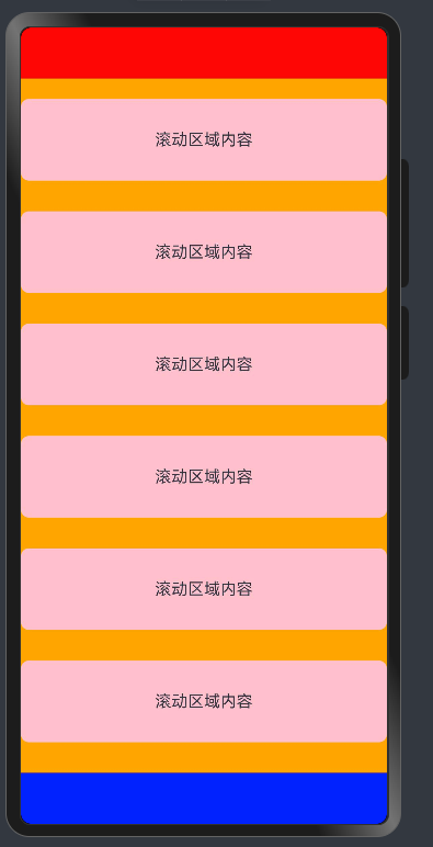
-
如何控制滚动
info
Scroll的滚动一般由用户的手指触发 -
我们也可以使用一个对象来控制滚动条 scroller
@Entry
@Component
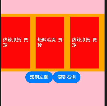
struct ScrollCase02 {scroller: Scroller = new Scroller()build() {Row() {Column() {// 有且只有一个组件Scroll(this.scroller) {Row({ space: 20 }) {Actor()Actor()Actor()Actor()Actor()Actor()Actor()Actor()Actor()Actor()Actor()Actor()Actor()Actor()Actor()}}.height(200).scrollable(ScrollDirection.Horizontal).width('100%').backgroundColor(Color.Orange)Row() {Button("滚到左侧").onClick(() => {this.scroller.scrollEdge(Edge.Start)})Button("滚到右侧").onClick(() => {this.scroller.scrollEdge(Edge.End)})}}}.width('100%').height('100%').backgroundColor(Color.Pink)}
}@Component
struct Actor {build() {Row() {Text("热辣滚烫-贾玲").fontColor(Color.White)}.backgroundColor(Color.Red).justifyContent(FlexAlign.Center).width(100).height(180)}
}
-
横向滚动
info -
只需要将Scroll的滚动方向调节成横向即可
@Entry
@Component
struct ScrollCase02 {@State message: string = 'Hello World';scroller: Scroller = new Scroller()build() {Row() {Column() {// 有且只有一个组件Scroll(this.scroller) {Row({ space: 20 }) {Actor()Actor()Actor()Actor()Actor()Actor()Actor()Actor()Actor()Actor()Actor()Actor()Actor()Actor()Actor()}}.height(200).scrollable(ScrollDirection.Horizontal).width('100%').backgroundColor(Color.Orange)Row() {Button("滚到左侧").onClick(() => {this.scroller.scrollEdge(Edge.Start)})Button("滚到右侧").onClick(() => {this.scroller.scrollEdge(Edge.End)})}}}.width('100%').height('100%').backgroundColor(Color.Pink)}
}@Component
struct Actor {build() {Row() {Text("热辣滚烫-贾玲").fontColor(Color.White)}.backgroundColor(Color.Red).justifyContent(FlexAlign.Center).width(100).height(180)}
}
在arkUI中,我们的内容如果超过了屏幕显示,则不会显示滚动条,需要使用Scroll来包裹
需要注意的是: 该组件滚动的前提是1.设置或使用了默认的滚动方向,2.子组件大与容器Scroll大小,否则不能滚动
组件-事件监听
监听原生组件的事件和设置属性的方式是一样的都是链式调用,值得注意的是,我们注册事件必须使用箭头函数的写法,Next版本禁止使用匿名函数的形式来给组件注册事件
- 匿名函数 function () {} (ES5函数声明方式的一种,在鸿蒙中属于弃用语法)
- 组件外部函数 function () {} (组件内可以使用组件外的声明的函数,但需要注意this指向)
- 尝试给一个TextInput注册一个值改变事件和提交事件,给登录按钮注册点击事件
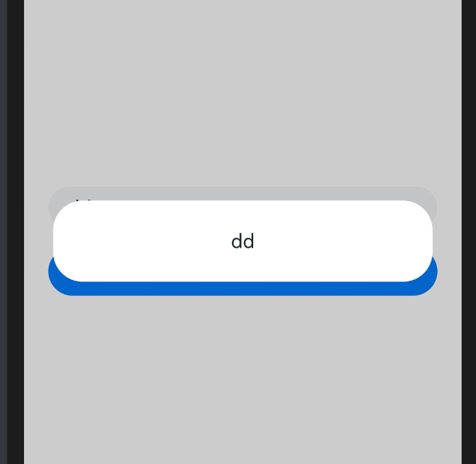
danger
- promAction.showToast()轻量级提示,需要引入一个包才可以使用的,自动消失
- promAction.showDialog()弹层级提示,需要引入一个包才可以使用的,点击消失
- AlertDialog.show() 弹层级提示,不需要引入包使用的,点击消失
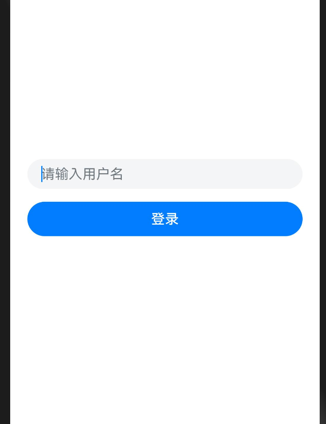
import { promptAction } from '@kit.ArkUI';
@Entry
@Component
struct Event {build() {Row() {Column({ space: 15 }) {Row() {TextInput({ placeholder: '请输入用户名' }).backgroundColor('#f4f5f6').width('100%').onChange((value) => {promptAction.showToast({ message: value })}).onSubmit(() => {AlertDialog.show({message:'登录失败'})})}.padding({left: 20,right: 20})Row() {Button("登录").width('100%').onClick(() => {promptAction.showDialog({message: '登录成功'})})}.padding({left: 20,right: 20})}.width('100%')}.height('100%')}
}
info
请注意:在注册事件中的逻辑必须使用箭头函数 () => {}
- 因为function中this指向为undefind
- 箭头函数中的this指向当前struct实例,可以方便的调用方法和获取属性
info
当我们事件处理逻辑比较复杂,写在UI描述中无法抽提的时候,我们可以在struct结构体中定义
如
struct Event {login () {AlertDialog.show({message: '登录成功'})}...buile(){Button("登录").width('100%').onClick(() => {this.login()})}}
- 为什么说一定要用箭头函数?
import { promptAction } from '@kit.ArkUI';
@Entry
@Component
struct FunctionCase {@State message: string = 'Hello World';showThis(){promptAction.showToast({message:this.message})}build() {Row() {Column() {Text(this.message).fontSize(50).fontWeight(FontWeight.Bold)//报错//.onClick(this.showThis)//推荐.onClick(()=>{this.showThis()})}.width('100%')}.height('100%')}
}
info
关于箭头函数和this的说明:
1.推荐使用箭头函数
2.call和apply是错误级别不支持,bind是警告,能用也别用!
3.this是当前上下文,一般指函数调用者
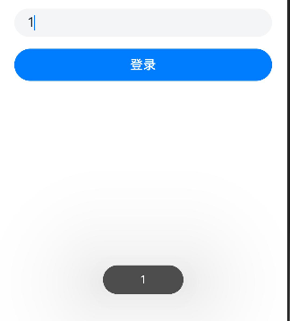
- 尝试获取组件的大小-组件区域变化事件onAreaChange
info
如何获取某个组件的大小呢?比如获取下面百度图片的大小
import { promptAction } from '@kit.ArkUI';@Entry
@Component
struct EventCase {// 登录方法login() {promptAction.showToast({ message: '登录成功' })}loginToButton(){promptAction.showToast({ message: '登录失败' })}build() {Row() {Column({ space: 20 }) {Image('https://www.baidu.com/img/PCtm_d9c8750bed0b3c7d089fa7d55720d6cf.png').width(160).onAreaChange((oldValue:Area,newValue:Area)=>{AlertDialog.show({message:`oldValue:${JSON.stringify(oldValue)}newValue:${JSON.stringify(newValue)}`})})TextInput({ placeholder: '请输入用户名', text:'' }).height(40).onChange((value) => {// 监听系统组件的事件的话  回调函数的参数都是有具体类型  一般的话不用给类型promptAction.showToast({ message: value })})TextInput({ placeholder: '请输入密码', text: '' }).height(40).onChange((value) => {// 监听系统组件的事件的话  回调函数的参数都是有具体类型  一般的话不用给类型promptAction.showToast({ message: value })}).type(InputType.Password).onSubmit(() => {this.login()})Button("登录").width('100%').onClick(this.loginToButton)}.padding({left: 20,right: 20}).width('100%')}.height('100%')}
}
基础-组件状态
info
当我们需要在组件中记录一些状态时,变量应该显示的在struct中声明,并注明类型
比如-登录账户和密码
username: string = "admin"password: string = "123456"
- 实现一个简单的登录页面
- @State修饰符的作用
如果没有@State修饰符,改变状态后,页面不会进行状态更新
info
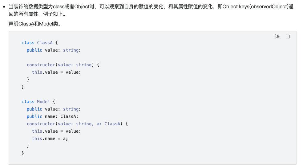
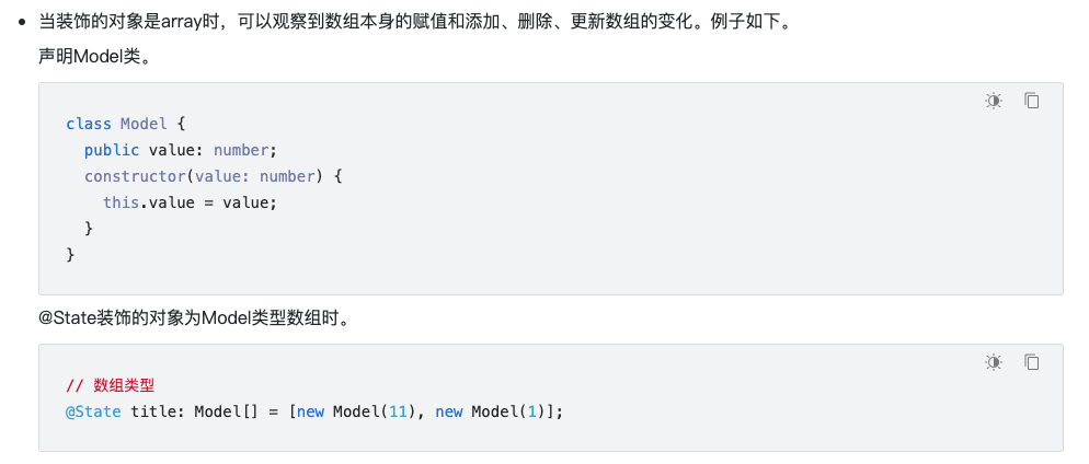
1.State修饰的类型:Object、class、string、number、boolean、enum类型,以及这些类型的数组。
2.类型必须被指定,嵌套类型的场景请参考观察变化。
3.不支持any,不支持简单类型和复杂类型的联合类型,不允许使用undefined和null。
加上该修饰符后,你惊奇的发现按钮随着数据的变化在变化,因为我们在值改变的时候赋值,造成了build的重新执行,来保证我们状态的变化。
可以理解成没有@State修饰符,数据只会作用页面一次!!!
interface myObjType {age:number
}
interface moreStepType {info:myObjType
}
@Entry
@Component
struct ThisCase {noStateMessage: string = '6666666666666666666'@Statemessage: string = '999999999999999999999'@StatemyObj:myObjType = { age: 18 };noStateObj:myObjType = { age: 19 };@StatemoreStepObj:moreStepType = {info:{age:20}}innerFunction: () => void = () => {this.myObj = { age: 19 }}build() {Row() {Column() {Text(JSON.stringify(this)).fontWeight(FontWeight.Bold).onClick(() => {this.innerFunction()})}.width('100%').padding(20)}.height('100%')}
}
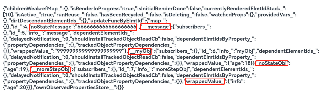
info
改变状态:引用数据类型只能检测到自身和第一层变化
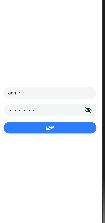
- 添加一个登录验证的需求 :账号admin密码123456时登录提示登录成功,否则提示用户名或者密码错误
import { promptAction } from '@kit.ArkUI';@Entry
@Component
struct EventCase {@State message: string = 'Hello World';@Stateusername: string = ""@Statepassword: string = ""// 登录方法login() {if(this.username.trim()  === 'admin' && this.password === '123456') {// promptAction.showToast({ message: '登录成功' })AlertDialog.show({ message: '登录成功' })return}promptAction.showToast({ message: '用户名或者密码错误' })}build() {Row() {Column({ space: 20 }) {TextInput({ placeholder: '请输入用户名', text: this.username }).height(40).onChange((value) => {// 监听系统组件的事件的话  回调函数的参数都是有具体类型  一般的话不用给类型console.log(value)})TextInput({ placeholder: '请输入密码', text: this.password }).height(40).onChange((value) => {// 监听系统组件的事件的话  回调函数的参数都是有具体类型  一般的话不用给类型console.log(value)}).type(InputType.Password).onSubmit(() => {this.login()})Button("登录").width('100%').onClick(() => {this.login()})}.padding({left: 20,right: 20}).width('100%')}.height('100%')}
}
- 再加一个小需求,当用户名和密码为空时,不让用户点按钮
danger
可用enable设置按钮是否启用
getBtnEnable () {return !!this.username && !!this.password}Row() {Button("登录").width('100%').onClick(() => {this.login()})// 隐士转化 "".enabled(this.getBtnEnable())
接下来,我们来完成一个嵌套数据修改的案例,来观察State修饰符的特性
- 声明一个关于人的接口
interface IAddress {province: stringcity: stringarea: string
}
interface IPerson {name: stringage: numbersex: "男" | "女"address: IAddress
}
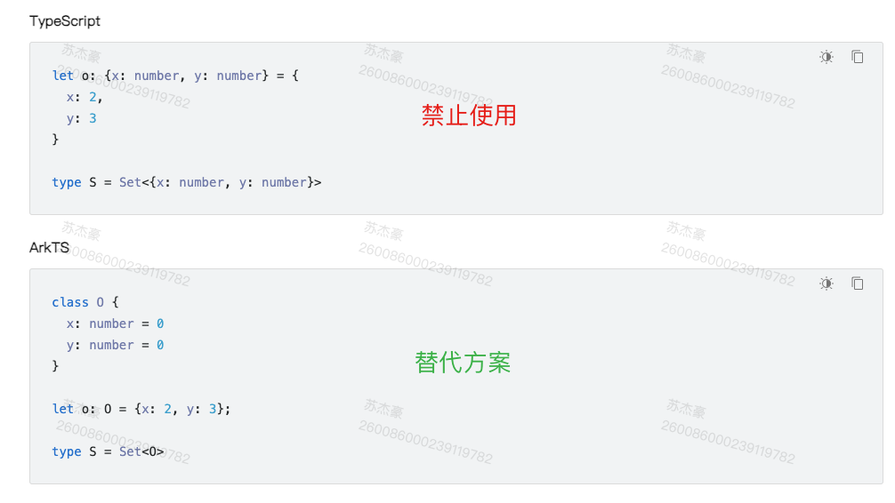
可能比较疑惑,为什么这里还需要声明两个接口,因为Next版本不支持对象字面量类型声明,所以这里需要,用interface代替
- 类型怎么赋值呢?
- 使用npm全局安装插件
$ npm i -g interface2class # 特别注意 $符号不用输入,$符号表示它是一个命令行命令
danger
npm config get registry
- 设置淘宝镜像
$ npm config get registry
$ npm config set registry https://registry.npmmirror.com/
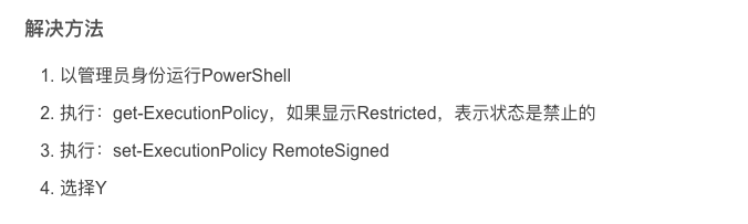
- 脚本禁用-只针对windows
info
解决方法
- 以管理员身份运行PowerShell
- 执行:get-ExecutionPolicy,如果显示Restricted,表示状态是禁止的
- 执行: set-ExecutionPolicy RemoteSigned
- 选择Y
info
脚本策略-操作系统允许npm包的命令可执行
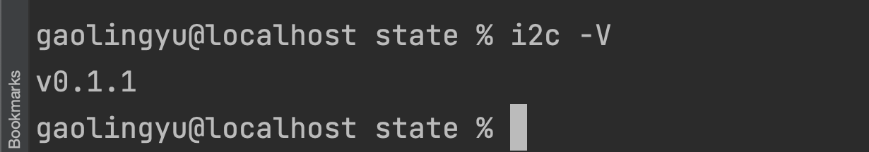
- 测试是否安装成功
$ i2c -V
- 执行带有interface的文件

- 自动生成实现类
- 声明一个State类型
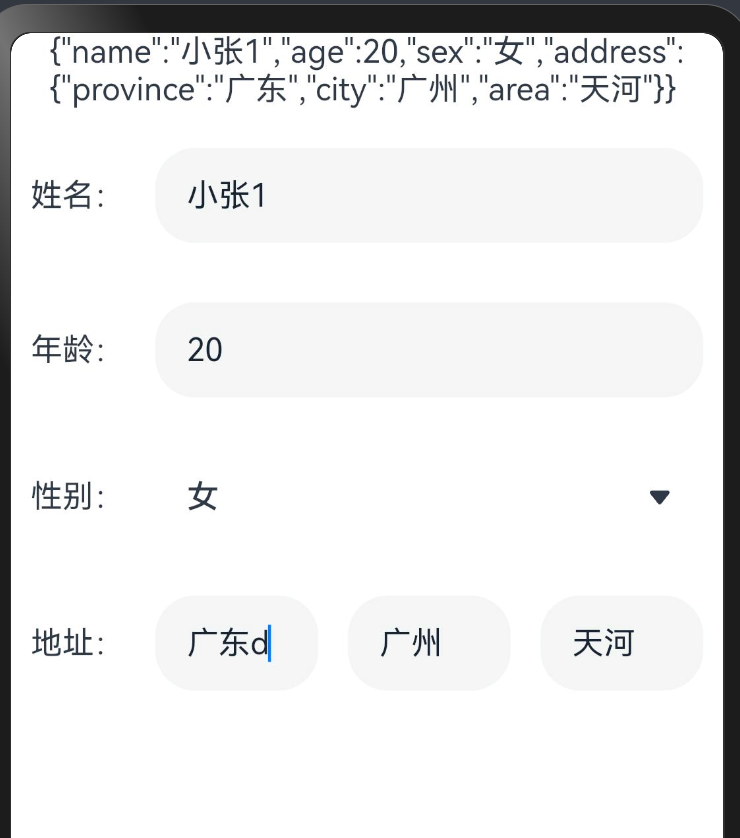
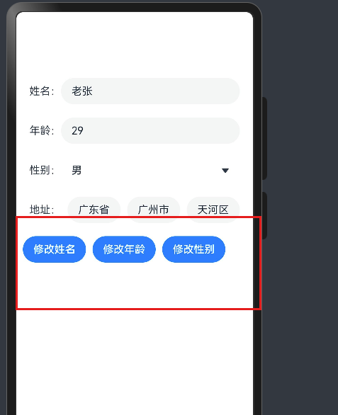
@Statep: IPersonModel = new IPersonModel({name: '小张',age: 20,sex: "女",address: {province: '广东',city: '广州',area: '天河'}})
- 使用UI组件实现双向绑定
@Entry
@Component
struct StateCase {@Statep: IPersonModel = new IPersonModel({name: '小张',age: 20,sex: "女",address: {province: '广东',city: '广州',area: '天河'}})build() {Column({ space: 10 }) {Text(JSON.stringify(this.p))Row({ space: 15 }) {Text("姓名:")TextInput({ text: this.p.name }).layoutWeight(1).onChange(value => {this.p.name = value})}.padding(10)Row({ space: 15 }) {Text("年龄:")TextInput({ text: this.p.age.toString() }).layoutWeight(1).onChange(value => {this.p.age = parseInt(value)})}.padding(10)Row({ space: 15 }) {Text("性别:")Select([{ value: '男' }, { value: '女' }]).layoutWeight(1).value(this.p.sex).onSelect((index: number, value: string) => {this.p.sex = value as "男" | "女"})}.padding(10)Row({ space: 15 }) {Text("地址:")TextInput({ text: this.p.address.province }).layoutWeight(1).onChange((value) => {this.p.address.province = value})TextInput({ text: this.p.address.city }).layoutWeight(1).onChange((value) => {this.p.address.city = value})TextInput({ text: this.p.address.area }).layoutWeight(1).onChange((value) => {this.p.address.area = value})}.padding(10)}}
}
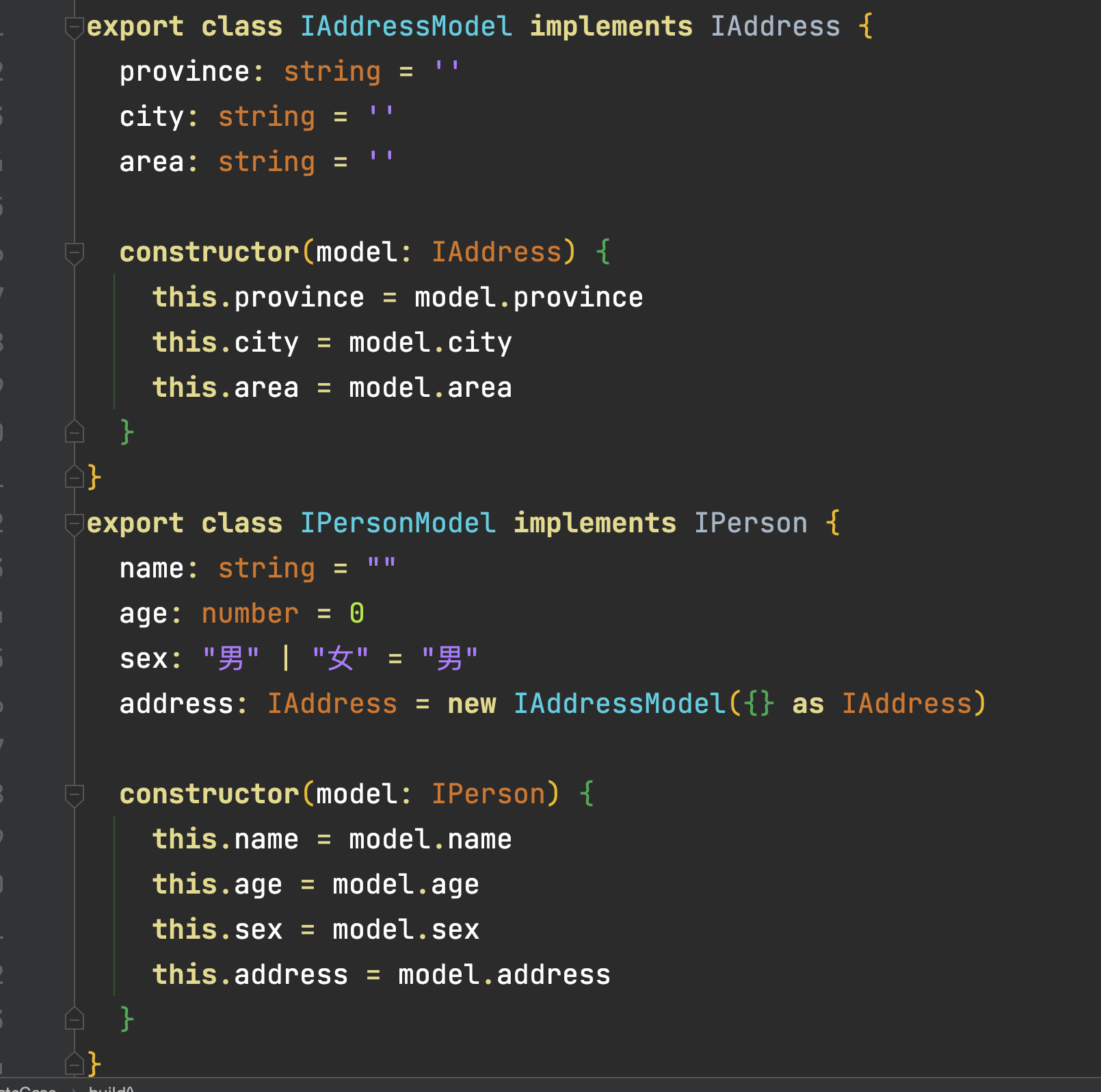
interface IAddress {province: stringcity: stringarea: string
}
interface IPerson {name: stringage: numbersex: "男" | "女"address: IAddress
}
export class IAddressModel implements IAddress {province: string = ''city: string = ''area: string = ''constructor(model: IAddress) {this.province = model.provincethis.city = model.citythis.area = model.area}
}
export class IPersonModel implements IPerson {name: string = ""age: number = 0sex: "男" | "女" = "男"address: IAddress = new IAddressModel({} as IAddress)constructor(model: IPerson) {this.name = model.namethis.age = model.agethis.sex = model.sexthis.address = model.address}
}- 更新数据-第一层数据
// 放置按钮Row({ space: 10 }) {Button("修改姓名").onClick(() => {this.p.username = "老张"})Button("修改年龄").onClick(() => {this.p.age++})Button("修改性别").onClick(() => {this.p.sex = this.p.sex === "男" ? "女" : "男"})}.padding({left: 10,right: 10}).width("100%")
- 更新第二层数据
danger
所有的鸿蒙的更新机制-关于对象层的, 所有的监听机制都只能监听到Object.keys(对象)中的可见属性,但凡超过一层,是监测不到变化的。
Row({ space: 10 }) {Button("修改地址").onClick(() => {// this.p.address.province = "北京"// this.p.address.city = "北京"// this.p.address.area = "顺义"// this.p.age++// this.p.address = new IAddressModel({// province: this.p.address.province,// city: this.p.address.city,// area:"海珠区"// })this.p.address.area = "海珠区" // 虽然不会造成更新 但是数据会变化this.p.address = new IAddressModel(this.p.address)})}.padding({left: 10,right: 10}).width("100%")
发现什么问题没有?
我们发现第一层数据 比如 name/age/sex都是可以双向同步的,但是第二层的数据无法进行响应式更新
- 上述代码中,我们也没有使用 ,因为在目前的编辑器中使用 ,因为在目前的编辑器中使用 ,因为在目前的编辑器中使用绑定嵌套的数据编辑器会报错,虽然效果对,但是报错总归不太好,所以我们手动进行了数据同步
在鸿蒙开发中,我们应该明确,所有的响应式更新都只能是系统可观测的响应式更新,那什么是可观测的呢?
就是只有对象或者数组第一层的数据发生了变化,才可以被观测到,所以基于这种特性,我们需要来处理下
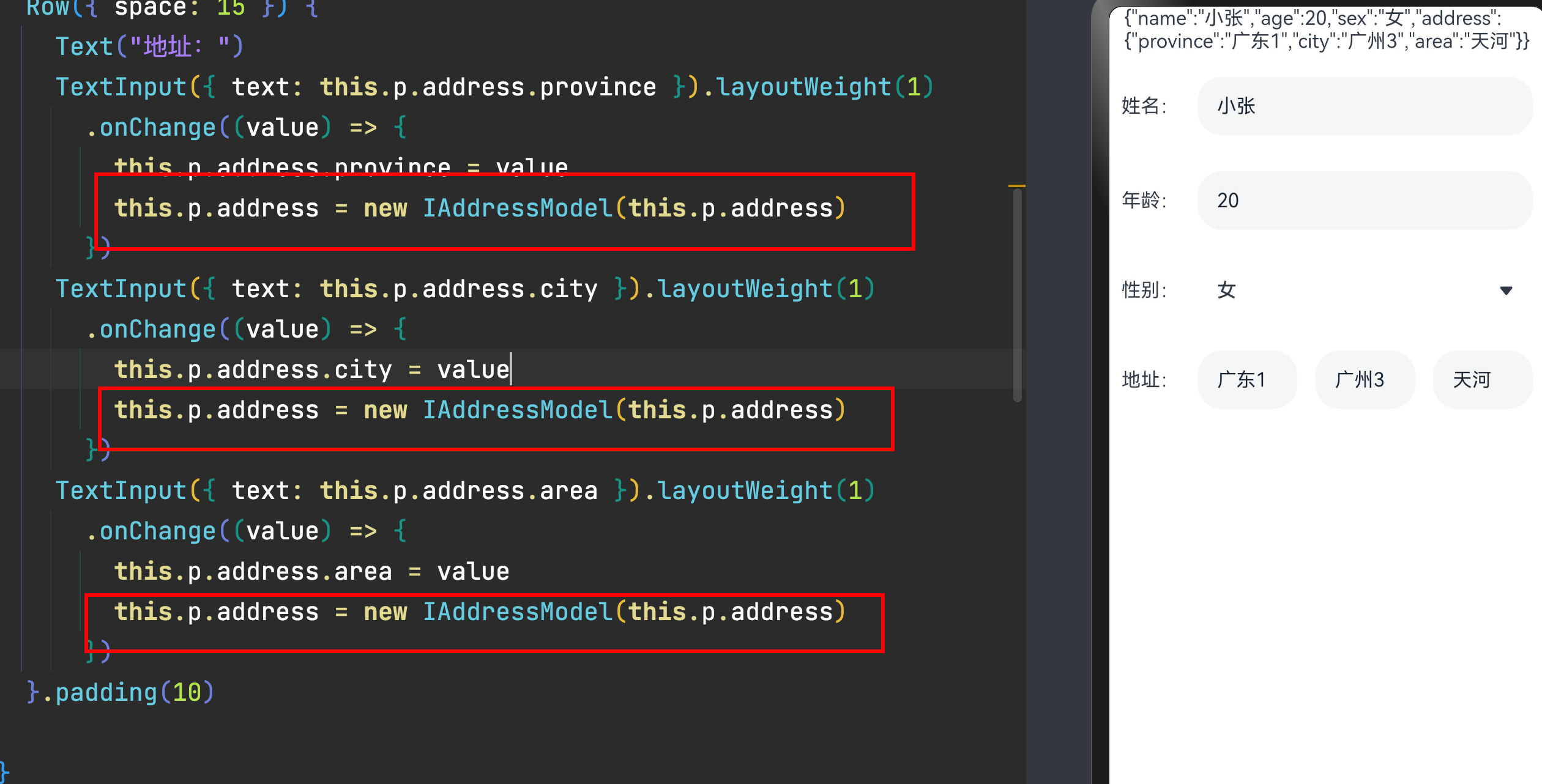
下方列出系统可观测的数据和行为变化


组件-双向绑定
-
双向绑定
info
数据-视图 -
数据驱动视图
-
视图中的内容发生变化-数据也会同步修改
-
MVVM-M-V-VM
-
Model数据模型
-
V-View视图
-
VM- ViewModel 桥梁
在鸿蒙Next版本中,推出了一系列双向绑定的组件
-
双向绑定- 数据和视图双向同步-数据变化-视图更新,视图更新,-数据更新
-
鸿蒙Next版本所支持的所有双向绑定组件
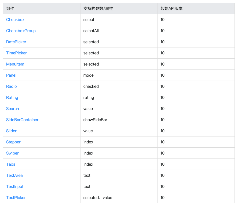

- 双向绑定语法
$$语法:内置组件双向同步
- 当前$$支持基础类型变量,以及@State、@Link和@Prop装饰的变量。
如果绑定TextInput组件,如 TextInput({ text: $$this.xxx })
danger
值得注意的是:上述组件中有的双向组件是属性,有的双向绑定是参数
-
参数是在组件({ text: $$this.xx })
-
属性是在组件().text($$this.xxx)
-
不支持嵌套数据的双向绑定如 组件({ text: $$this.xx.xx })
-
测试几个正常的双向绑定
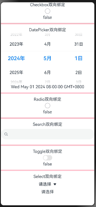
@Entry
@Component
struct MvvmCase {@StateisChecked: boolean = false@StatemyDate: Date = new Date('2024-05-01')@StatemyRatio: boolean = false@StatemySearch: string = ''@StatemyToggle: boolean = false@StatemySelect: string = '请选择'build() {Column({ space: 12 }) {Column() {Text('Checkbox双向绑定')Checkbox().select($$this.isChecked)Text('' + this.isChecked)}MyDivider()Column() {Text('DatePicker双向绑定')DatePicker({selected: $$this.myDate})Text('' + this.myDate)}MyDivider()Column() {Text('Radio双向绑定')Radio({ value: 'radio', group: 'radioSelect' }).checked($$this.myRatio)Text('' + this.myRatio)}MyDivider()Column() {Text('Search双向绑定')Search({value:$$this.mySearch})Text('' + this.mySearch)}MyDivider()Column() {Text('Toggle双向绑定')Toggle({ type: ToggleType.Switch,isOn:$$this.myToggle})Text('' + this.myToggle)}MyDivider()Column() {Text('Select双向绑定')Select([{ value: 'aaa' },{ value: 'bbb'},{ value: 'ccc'},{ value: 'ddd'}]).value($$this.mySelect)Text('' + this.mySelect)}}.width("100%").height("100%")}
}@Component
struct MyDivider {build() {Divider().height(5).backgroundColor(Color.Pink)}
}
样式
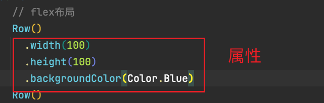
样式-语法(链式&枚举)
ArkTS以声明方式组合和扩展组件来描述应用程序的UI;
同时还提供了基本的属性、事件和子组件配置方法,帮助开发者实现应用交互逻辑。
1)样式属性:通用属性 和 组件属性
- 属性方法以
.链式调用的方式配置系统组件的样式和其他属性
@Entry
@Component
struct Index {build() {Text('演示').backgroundColor('red').fontSize(50).width('100%').height(100)}
}
2)枚举值
- 对于系统组件,ArkUI还为其属性预定义了一些枚举类型。文档链接
@Entry
@Component
struct Index {build() {Text('演示').fontSize(50).width('100%').height(100).backgroundColor(Color.Blue).textAlign(TextAlign.Center).fontColor(Color.White)}
}
info
- 样式相关属性通过链式函数的方式进行设置
- 如果类型是枚举的,通过枚举传入对应的值
注意: 有的属性强烈建议使用枚举(大部分枚举值都是数字,但是数字无法体现代码含义)
有的组件如fontColor可以使用系统自带颜色枚举,也可以使用色值
样式-单位px/vp/fp/lpx
官方定义
使用虚拟像素,使元素在不同密度的设备上具有一致的视觉体量。
1) vp 是什么?virtual pixel
- 屏幕密度相关像素,根据屏幕像素密度转换为屏幕物理像素,当数值不带单位时,默认单位
vp;在实际宽度为1440物理像素的屏幕上,1vp约等于3px(物理像素)
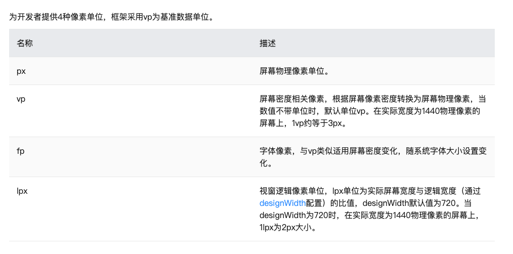
- 系统还提供了对应的像素转化方法
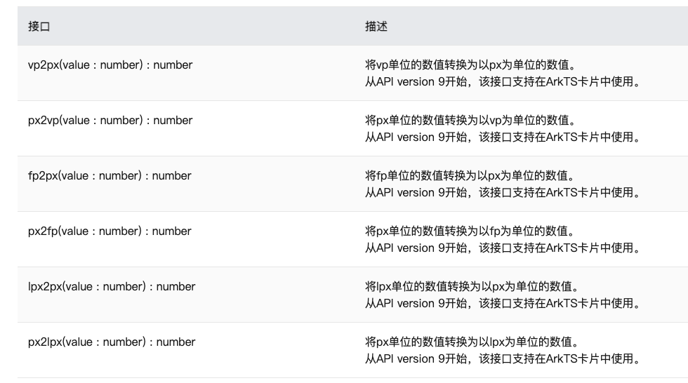
info
在样式中,我们如果写px,那么px直接表示的是物理像素,也就是分辨率,那么我们的手机分辨率密度各有不同,无法针对这种密度写一个固定值,所以vp会自动根据手机密度去进行适配,所以vp它提供了一种灵活的方式来适应不同屏幕密度的显示效果。
设计图按照1080设计- 换算成360写vp就可以了
- 上图的意思是,使用这个单位在不同屏幕物理分辨率的实际尺寸一致(A设备1英寸,B设备1英寸)。
2)在不同屏幕物理分辨率下,要想实现等比例适配, 可以吗?
如下图:
info
设置lpx基准值 - resources/base/profile/main-pages.json
添加window属性,设置desigWidth,不设置也可以使用lpx,默认720
@Entry
@Component
struct PXCase {build() {Row() {Column() {Text('375lpx').width('375lpx').height('72lpx').textAlign(TextAlign.Center).backgroundColor(Color.Red)Divider().strokeWidth(2)Row(){Text('72lpx')}.width('72lpx').height('25lpx').backgroundColor(Color.Brown)}.width('100%')}.height('100%')}
}
danger
伸缩布局的方案
- 设定基准值,使用lpx,类似于前端的rem
- 监听元素的变化-可以拿到宽高-重新计算
- layoutWeight(number)- 剩余资源再分配
伸缩 layoutWeight(flex: number) 占剩余空间多少份,可以理解成CSS的 flex: 1
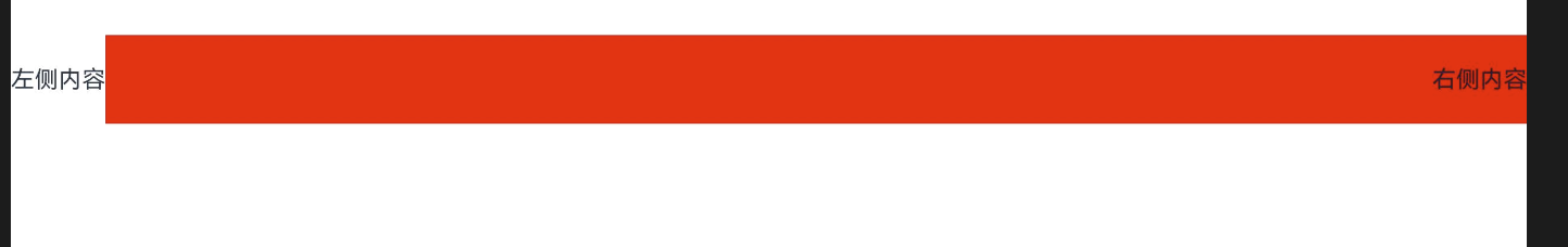
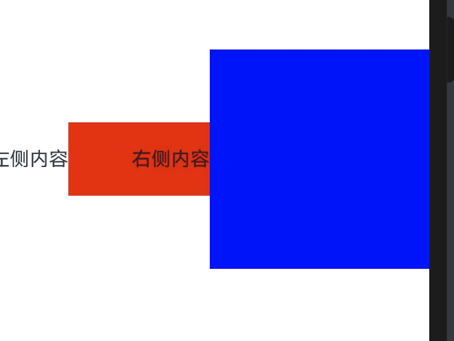
如图-手机端
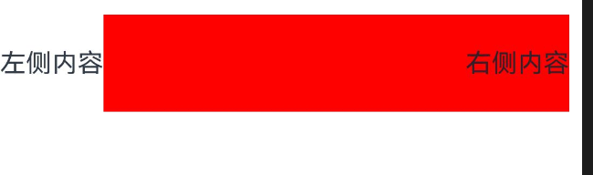
-pad
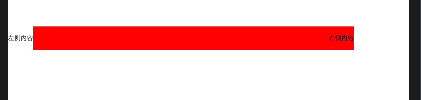
我们可以使用layoutWeight属性,让右侧内容去占满剩余宽度
build() {Row() {Text("左侧内容")Text("右侧内容").textAlign(TextAlign.End).width('80%').height(60).backgroundColor('red').layoutWeight(1)}.width('100%').height('100%')}
@Entry
@Component
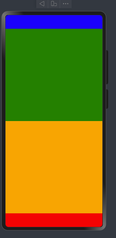
struct LayoutCase {@State message: string = 'Hello World';build() {Column() {Row() {}.width('100%').height(50).backgroundColor(Color.Blue)Column() {}.width('100%').backgroundColor(Color.Green).layoutWeight(1) // Grid中的columnsTemplate 1fr 1frColumn() {}.width('100%').backgroundColor(Color.Orange).layoutWeight(1)Row() {}.width('100%').height(50).backgroundColor(Color.Red)}.height("100%").width("100%").justifyContent(FlexAlign.SpaceBetween)}
}
info
瓜分当前组件的剩余空间
Row() {
Text().width(10)
Text().width(10)
Text().layoutWeight(5) //表示这个元素占据剩余所有的空间 (100 - 10 - 10)* (5/(5 + 1))
Text().layoutWeight(1) //表示这个元素占据剩余所有的空间 100 - 10 - 10
}.width(100)
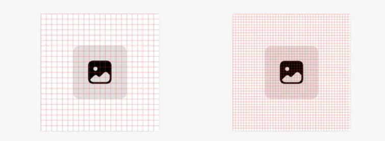
- 内容等比例缩放-可以使用aspectRatio属性设置宽高比
设置元素宽高比 aspectRatio(ratio: number)
如我们如果希望一个元素始终占整个屏幕宽度的50%,且为一个正方形
Column().width('50%').height('50%').backgroundColor('blue').aspectRatio(1)
@Entry
@Component
struct Index {build() {Text('left').width('50%')// 宽高比例.aspectRatio(1).backgroundColor('red')}
}
info
- vp 是鸿蒙默认单位,和屏幕像素有关,最终表现视觉大小在任何设备一致(屏幕越大看的越多)
- 鸿蒙一般以伸缩
layoutWeight、网格、栅格进行布局适配,如要等比例缩放可以设置高宽比aspectRatio(屏幕越大内容越大)
Image和资源Resource
info
项目开发离不开图片-图片在页面中必须使用Image/ImageSpan/动画图片组件
Image为图片组件,常用于在应用中显示图片。Image支持加载string、PixelMap和Resource类型的数据源,支持png、jpg、bmp、svg和gif类型的图片格式。
- 1.使用本地图片-拖一张图片放置到ets目录下-比如assets文件下
info
命名不要出现中文、空格、括号等特殊符号!
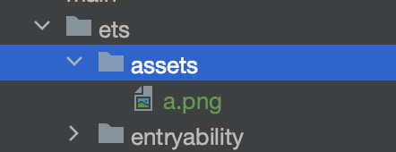
Image('/assets/a.png').width(100).height(100)
- 2.使用Resource下的图片-media
//不需要图片后缀
Image($r('app.media.a')).width(100).height(100)
- 3.使用Resource下的图片-rawfile
Image($rawfile('a.png')).width(100).height(100)

- 4.使用网络图片
Image("https://foruda.gitee.com/avatar/1705232317138324256/1759638_itcast_panpu_1705232317.png").width(100).height(100)
info
尤其注意: 使用网络图片时,在preview中时,可以预览,但是在模拟器和真实项目中,必须申请网络权限
"requestPermissions": [{"name":"ohos.permission.INTERNET"
}],
- 5.使用字体图标
阿里巴巴矢量图标库 iconfont
华为官方图标下载 链接
info
搜索下载需要的图标,下载类型为SVG,使用fillColor()可以进行图标颜色修改
部分图标不能修改,需要手动添加fill属性才能生效

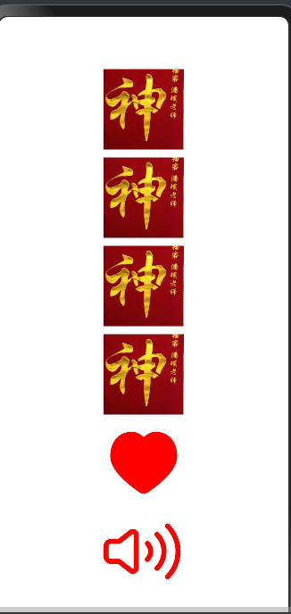
Image($r('app.media.ic_like')).width(100).height(100).fillColor(Color.Red)

- 6.使用系统内置图标
//有的图标必须给大小Image($r('sys.media.ohos_ic_public_sound')).width(100).height(100).fillColor(Color.Red)

@Entry
@Component
struct ImageCase {build() {Row() {Column({space:10}) {// 本地自建目录Image('/assets/a.png').width(100).height(100)// 推荐目录Image($r('app.media.a')).width(100).height(100)// 源文件目录Image($rawfile('a.png')).width(100).height(100)// 网络图片Image("https://foruda.gitee.com/avatar/1705232317138324256/1759638_itcast_panpu_1705232317.png").width(100).height(100)// 字体图标用法Image($r('app.media.ic_like')).width(100).height(100).fillColor(Color.Red)// 系统内置图标用法Image($r('sys.media.ohos_ic_public_sound')).width(100).height(100).fillColor(Color.Red)}.width('100%')}.height('100%')}
}
info
我们已经知道resources/base下media和profile的作用了,那么element是干嘛的呢?
- 自定义资源颜色-在color.json中定义一个颜色
{"color": [{"name": "start_window_background","value": "#FFFFFF"},{"name": "my_first_color","value": "#FF00FF0F"}]
}
在页面使用这个颜色
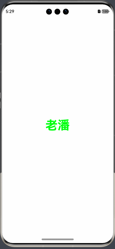
Text(this.message).fontSize(50).fontWeight(FontWeight.Bold).fontColor($r('app.color.my_first_color'))
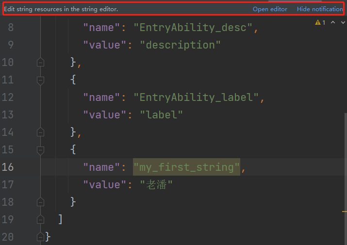
- 自定义资源文字-在string.json中定义一个文字
{"string": [{"name": "module_desc","value": "module description"},{"name": "EntryAbility_desc","value": "description"},{"name": "EntryAbility_label","value": "label"},{"name": "my_first_string","value": "老潘"}]
}
在页面上使用这个文字
Text($r('app.string.my_first_string')).fontSize(50).fontWeight(FontWeight.Bold).fontColor($r('app.color.my_first_color'))

- 国际化处理
danger
需要注意的是,手动添加虽然可以使用,但是会引起警告
推荐编辑添加,除了添加base/string.json,对en_US和zh_CN也进行添加
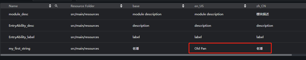
添加后运行到模拟器,改变系统语言会发现,呈现文字也会跟随改变
info
写一个知乎的评论练习练习排版布局和图片样式等

@Entry
@Component
struct ZHCase {build() {Column() {// 1.标题Row() {Row() {Image($r('sys.media.ohos_ic_public_arrow_left')).width(24).height(24)}.width(30).height(30).backgroundColor('#f4f4f4').borderRadius(15).justifyContent(FlexAlign.Center)Text('评论回复').layoutWeight(1).textAlign(TextAlign.Center).margin({right: 30})}.width('100%').padding(16).border({width: {bottom: 1},color: '#f4f5f6'})// 2.评论Row({space:16}){Image('https://foruda.gitee.com/avatar/1705232317138324256/1759638_itcast_panpu_1705232317.png').width(60).borderRadius(30)Column({space:16}){Text('潘神').fontSize(20).fontWeight(FontWeight.Bold)Text('写布局的口诀是从上到下,从左到右,从大到小,从外往里!🔥').width('100%')Row(){Text('10-21·IP:北京').fontSize(12).fontColor('#ccc')Row({space:4}){Image($r('app.media.ic_like')).width(16).fillColor('#ccc')Text('100').fontSize(12).fontColor('#ccc')}}.width('100%').justifyContent(FlexAlign.SpaceBetween)}.layoutWeight(1).alignItems(HorizontalAlign.Start)}.padding(16).alignItems(VerticalAlign.Top)}.width('100%').justifyContent(FlexAlign.Start)}
}
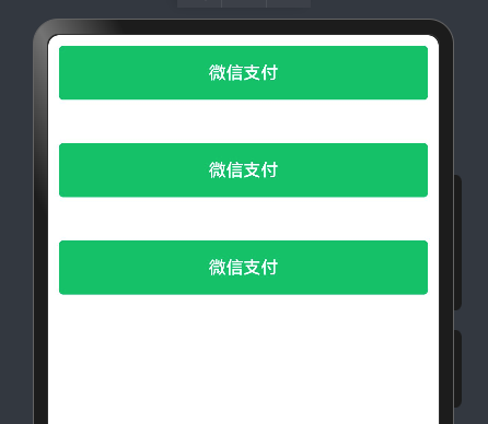
样式-@Styles 复用
注意: Styles和Extend均只支持在当前文件下的全局或者组件内部定义,如果你想要在其他文件导出一个公共样式,导出公共使用,ArtTS是不支持的,这种方式还是需要考虑组件复用。
在开发过程中会出现大量代码在进行重复样式设置,
@Styles可以帮我们进行样式复用
info
通用属性 通用事件
在Styles修饰的函数中能够点出来就是通用属性和事件-Text的字体颜色-字体大小不属于通用属性
Styles修饰的函数不允许传参数
- 当前
@Styles仅支持 通用属性 和 通用事件。
info
全局Styles不支持箭头函数语法
warning
注意: 全局Styles扩展符只能和使用它的组件位于同一个文件,不允许导入导出,导入导出也使用不了
- 支持 全局 定义和 组件内 定义,同时存在组件内覆盖全局生效。
import { promptAction } from '@kit.ArkUI'@Styles
function payStyle () {.width('100%').height(50).borderRadius(4).backgroundColor("#00c168").onClick(() => {promptAction.showToast({ message: '微信支付成功' })})
}@Entry
@Component
struct StyleCase {@StylespayStyle() {.width('100%').height(50).borderRadius(4).backgroundColor("#ff1256e0").onClick(() => {promptAction.showToast({ message: '支付宝支付成功' })})}build() {Column({ space: 20 }) {Row() {Button("微信支付", { type: ButtonType.Normal }).payStyle().fontColor(Color.White)}.padding(10)Row() {Button("微信支付", { type: ButtonType.Normal }).payStyle().fontColor(Color.White)}.padding(10)Row() {Button("微信支付", { type: ButtonType.Normal }).payStyle().fontColor(Color.White)}.padding(10)}}
}
样式-@Extend 复用
info
假设我们就想针对 Text进行字体和样式的复用,此时可以使用Extend来修饰一个全局的方法
- 使用
@Extend装饰器修饰的函数只能是 全局 - 函数可以进行 传参,如果参数是状态变量,状态更新后会刷新UI
- 且参数可以是一个函数,实现复用事件且可处理不同逻辑
warning
注意: Extend扩展符只能和使用它的组件位于同一个文件,不允许导入导出,导入导出也使用不了
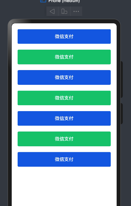
import { promptAction } from '@kit.ArkUI'@Entry
@Component
struct ExtendCase {build() {Column({ space: 20 }) {Button("微信支付").payButton("alipay")Button("微信支付").payButton("wechat")Button("微信支付").payButton("alipay")Button("微信支付").payButton("wechat")Button("微信支付").payButton("alipay")Button("微信支付").payButton("wechat")Button("微信支付").payButton("alipay")}.padding(20).width('100%')}
}// 不允许导出
@Extend(Button)
function  payButton (type: "alipay" | "wechat") {.type(ButtonType.Normal).fontColor(Color.White).width('100%').height(50).borderRadius(4).backgroundColor(type === "wechat" ? "#00c168" : "#ff1256e0").onClick(() => {if(type === "alipay") {promptAction.showToast({ message: '支付宝支付成功' })}else {promptAction.showToast({ message: '微信支付成功' })}})
}
多态样式stateStyles
@Styles和@Extend仅仅应用于静态页面的样式复用,stateStyles可以依据组件的内部状态的不同,快速设置不同样式。这就是我们本章要介绍的内容stateStyles(又称为:多态样式)。
ArkUI 提供以下五种状态:
- focused:获焦态。
- normal:正常态。
- pressed:按压态。
- disabled:不可用态。
- selected: 选中态
warning
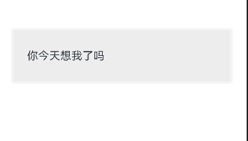
假设我们想做一个微信中点击的选中状态, 如图
该图在点击时会有变色,抬起时消失,此时就可以利用多态样式进行设置
- 实现一个基本的Row样式
@Entry
@Component
struct StateStylesCase {build() {Column({ space: 20 }) {Row() {Text("你今天想我了吗")}.padding(20).height(80).border({color: '#f3f4f5',width: 3}).borderRadius(4)// 多态样式.stateStyles({// 正常态normal: {.backgroundColor(Color.White)},pressed: {.backgroundColor("#eee")}}).width('100%')}.padding(20).justifyContent(FlexAlign.Center).width('100%').height('100%')}
}
info
按钮时,出现变色,需要同时设置pressed和normal两个属性, 如果只设置pressed,松手之后样式无法恢复
info
注意- 多态样式只能设置通用属性
-
禁用状态样式
warning
鸿蒙所有组件都会有一个enable属性,enable为true时表示该组件可用,为false时,表示该组件禁用,禁用态就表示组件禁用时的样式 -
设置Row禁用时的状态背景为灰背景
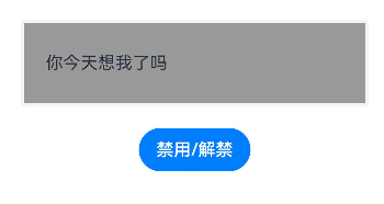
@Entry
@Component
struct StateStylesCase {@StatebtnEnable: boolean = truebuild() {Column({ space: 20 }) {Row() {Text("你今天想我了吗")}.padding(20).height(80).border({color: '#f3f4f5',width: 3}).borderRadius(4)// 多态样式.stateStyles({// 正常态normal: {.backgroundColor(Color.White)},pressed: {.backgroundColor("#eee")},disabled: {.backgroundColor("#999")}}).enabled(this.btnEnable).width('100%')Button("禁用/解禁").onClick(() => {this.btnEnable = !this.btnEnable})}.padding(20).justifyContent(FlexAlign.Center).width('100%').height('100%')}
}
- 获焦状态
info
假设我们有个账号和密码输入框,需要在聚焦态时设置选中样式,同样可以使用多态样式来设置
但是在预览器和真机中,有个非常诡异的设计,只能通过tab键切换才可以使得输入框进入聚焦态
如图
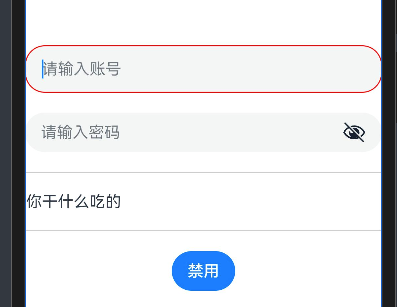
TextInput({placeholder: '请输入账号'}).stateStyles({focused: {.border({color: Color.Red,width: 1})},normal: {.border({width: 0})}})TextInput({placeholder: '请输入密码',}).stateStyles({focused: {.border({color: Color.Red,width: 1})},normal: {.border({width: 0})}}).type(InputType.Password).showPasswordIcon(true)
- 全部代码
@Entry
@Component
struct StateStylesCase {@StaterowEnable: boolean = truebuild() {Row() {Column({ space: 20 }) {TextInput({placeholder: '请输入账号'}).stateStyles({focused: {.border({color: Color.Red,width: 1})},normal: {.border({width: 0})}})TextInput({placeholder: '请输入密码',}).stateStyles({focused: {.border({color: Color.Red,width: 1})},normal: {.border({width: 0})}}).type(InputType.Password).showPasswordIcon(true)Row() {Text("你干什么吃的")}.height(60).width('100%').border({color: '#ccc',width: 1}).stateStyles({pressed: {.backgroundColor(Color.Gray)},normal: {.backgroundColor(Color.White)},disabled: {.backgroundColor("#f3f4f5")}}).enabled(this.rowEnable)Button("禁用").onClick(() => {this.rowEnable = !this.rowEnable})}}.height('100%')}
}
info
- 使用比较多的应该是
normalpressed结合下的按压效果 enabled(true|false)开启|禁用
界面渲染
渲染-条件渲染
info
在ArkTS中 我们要根据某个状态来控制元素或者组件的显示隐藏 可以采用条件渲染
-
if/else(创建销毁元素)
-
元素高宽-透明度-位置控制 (属性控制)
-
visibility属性控制
-
使用if/else
通过一个switch开关来控制图片的显示隐藏

@Entry
@Component
struct ConditionCase {@State isShow: boolean = false;build() {Row() {Column() {Toggle({type: ToggleType.Switch,isOn: $$this.isShow})// 1.控制是否渲染// if(this.isShow){//   Image($r('app.media.b')).width(100)// }else{// Image($r('app.media.b')).width(100)// }// 2.控制是否展示Image($r('app.media.b')).width(100)// 展示// .visibility(Visibility.Visible)// 隐藏(不显示也会占位置,不影响其他元素排列的话优先使用这个,性能高)// .visibility(this.isShow?Visibility.Visible:Visibility.Hidden)// 隐藏(不显示就不占位置,和if else一样).visibility(this.isShow ? Visibility.Visible : Visibility.None)}.width('100%')}.height('100%')}
}
- 多种条件控制
info
分析:
1.页面排版布局样式实现
2.下拉框的双向绑定
3.条件渲染
@Entry
@Component
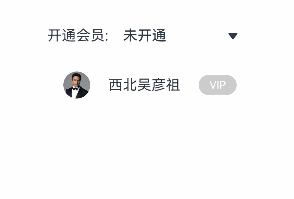
struct ConditionCase02 {@State myVip: number = 0;@State optionValue:string = '暂不开通'build() {Row() {Column({space:20}) {Row(){Text('开通会员:')Select([{value:'暂不开通'},{value:'VIP'},{value:'SVIP'}]).width('50%').selected($$this.myVip).value($$this.optionValue)}Row({ space: 20 }) {Image($r('app.media.b')).width(30).borderRadius(30)Text('西北吴彦祖')if (this.myVip === 0) {Text('VIP').VIPStyle(this.myVip).backgroundColor('#ccc')} else if (this.myVip === 1) {Text('VIP').VIPStyle(this.myVip).backgroundColor('#ffffb803')} else if (this.myVip === 2) {Text('SVIP').VIPStyle(this.myVip).backgroundColor('#ffb00909')}}.width('100%').justifyContent(FlexAlign.Center)}.width('100%').padding(20)}.height('100%')}
}
@Extend(Text)
function VIPStyle(type: number) {.padding({left: 12,right: 12,bottom: 4,top: 4}).fontColor('#fff').borderRadius(20).fontSize(12)
}
- 案例-实现加载数据的loading效果
warning

- 封装loading组件
@Preview // 表示该组件可预览 Preview只能看效果 没有交互
@Component
export struct HmLoading {@State // 响应式驱动视图value: number = 0timer: number = -1  // 显示声明aboutToAppear(): void {this.timer = setInterval(() => {if(this.value === 100) {this.value = 0}this.value++}, 10)}aboutToDisappear(): void {clearInterval(this.timer)}build() {Progress({total: 100,value: this.value,type: ProgressType.Ring})}
}// 默认导出
export default HmLoading  // 一个文件只能有一个默认导出
// 按需导出
// export { HmLoading, HmLoading1, HmLoading3 }- 在LoadingCase中使用
import HmLoading from './Components/HmLoading';
import { promptAction } from '@kit.ArkUI';@Entry
@Component
struct LoadingCase {@State showLoading: boolean = false;// 页面刚进入 应该去获取数据  等待的过程中 显示进度 数据获取完 进度消失// 钩子函数aboutToAppear(): void {// 请求数据// setTimeout/setIntervalthis.showLoading = truesetTimeout(() => {this.showLoading = false},10000)}build() {Row() {Column() {if(this.showLoading) {HmLoading()}}.width('100%')}.height('100%')}
}// 封装一个Loading组件
渲染-循环渲染
- ForEach-最常用的
- LazyForEach-懒加载渲染(复杂-后面讲)
info
循环渲染使用 ForEach方法来进行
ForEach接口基于数组类型数据来进行循环渲染,需要与容器组件配合使用。
ForEach(// 数据源arr: Array,// 组件生成函数itemGenerator: (item: 单项, index?: number) => void,// 键值生成函数keyGenerator?: (item: 单项, index?: number): string => string
)
- 定义数据类型
interface PayRecord {OrderName:stringOrderDate:DateOrderAmount:number
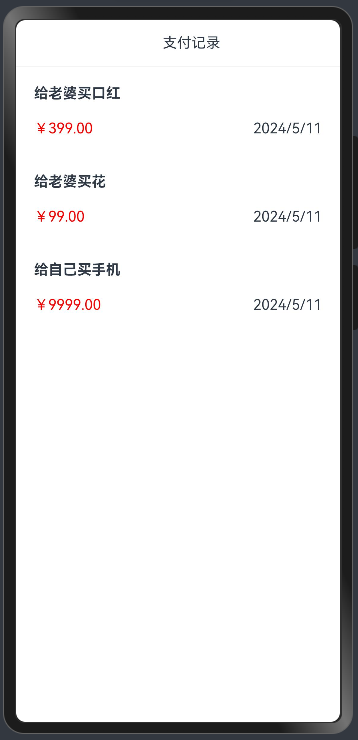
}
@State PayRecordList: PayRecord[] = [{OrderName: '给老婆买口红',OrderDate: new Date('2024/05/11'),OrderAmount: 399.00},{OrderName: '给老婆买花',OrderDate: new Date('2024/05/11'),OrderAmount: 99.00},{OrderName: '给自己买手机',OrderDate: new Date('2024/05/11'),OrderAmount: 9999.00}
]
- 在页面中生成数据,用ForEach循环
interface PayRecord {OrderName:stringOrderDate:DateOrderAmount:number
}
@Entry
@Component
struct ForEachCase {@State showDialog: boolean = false@State PayRecordList: PayRecord[] = [{OrderName: '给老婆买口红',OrderDate: new Date('2024/05/11'),OrderAmount: 399.00},{OrderName: '给老婆买花',OrderDate: new Date('2024/05/11'),OrderAmount: 99.00},{OrderName: '给自己买手机',OrderDate: new Date('2024/05/11'),OrderAmount: 9999.00}]build() {Stack() {Column() {// 标题Row() {Text('支付记录').layoutWeight(1).textAlign(TextAlign.Center).margin({left: 30})}.width('100%').padding(16).border({width: {bottom: 1},color: '#f4f5f6'})// 列表Column() {// 要循环的结构体// Column({ space: 20 }) {//   Text('给老婆买了一朵花')//     .fontWeight(FontWeight.Bold)//     .width('100%')//   Row() {//     Text('¥43.00')//     Text('2024/5/11')//   }//   .width('100%')//   .justifyContent(FlexAlign.SpaceBetween)// }// .width('100%')// .padding(20)// 使用循环组件,依次生成结构体ForEach(this.PayRecordList, (item: PayRecord) => {Column({ space: 20 }) {Text(item.OrderName).fontWeight(FontWeight.Bold).width('100%')Row() {Text('¥' + item.OrderAmount.toFixed(2)).fontColor(Color.Red)Text(item.OrderDate.toLocaleDateString())}.width('100%').justifyContent(FlexAlign.SpaceBetween)}.width('100%').padding(20)})}.justifyContent(FlexAlign.Start).width('100%').layoutWeight(1)}.width('100%').height('100%')}}
}

- 新建一个list数据,进行循环
warning
使用下面的接口
interface GoodItem {goods_name: stringgoods_price: numbergoods_img: stringgoods_count: numberid: number
}
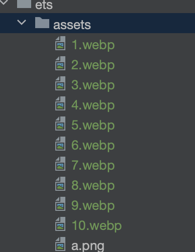
- 拷贝图片到assets
图片.zip
- 声明数据
@State list: GoodItem[] = [{"id": 1,"goods_name": "班俏BANQIAO超火ins潮卫衣女士2020秋季新款韩版宽松慵懒风薄款外套带帽上衣","goods_img": "assets/1.webp","goods_price": 108,"goods_count": 1,},{"id": 2,"goods_name": "嘉叶希连帽卫衣女春秋薄款2020新款宽松bf韩版字母印花中长款外套ins潮","goods_img": "assets/2.webp","goods_price": 129,"goods_count": 1,},{"id": 3,"goods_name": "思蜜怡2020休闲运动套装女春秋季新款时尚大码宽松长袖卫衣两件套","goods_img": "assets/3.webp","goods_price": 198,"goods_count": 1,},{"id": 4,"goods_name": "思蜜怡卫衣女加绒加厚2020秋冬装新款韩版宽松上衣连帽中长款外套","goods_img": "assets/4.webp","goods_price": 99,"goods_count": 1,},{"id": 5,"goods_name": "幂凝早秋季卫衣女春秋装韩版宽松中长款假两件上衣薄款ins盐系外套潮","goods_img": "assets/5.webp","goods_price": 156,"goods_count": 1,},{"id": 6,"goods_name": "ME&CITY女装冬季新款针织抽绳休闲连帽卫衣女","goods_img": "assets/6.webp","goods_price": 142.8,"goods_count": 1,},{"id": 7,"goods_name": "幂凝假两件女士卫衣秋冬女装2020年新款韩版宽松春秋季薄款ins潮外套","goods_img": "assets/7.webp","goods_price": 219,"goods_count": 2,},{"id": 8,"goods_name": "依魅人2020休闲运动衣套装女秋季新款秋季韩版宽松卫衣 时尚两件套","goods_img": "assets/8.webp","goods_price": 178,"goods_count": 1,},{"id": 9,"goods_name": "芷臻(zhizhen)加厚卫衣2020春秋季女长袖韩版宽松短款加绒春秋装连帽开衫外套冬","goods_img": "assets/9.webp","goods_price": 128,"goods_count": 1,},{"id": 10,"goods_name": "Semir森马卫衣女冬装2019新款可爱甜美大撞色小清新连帽薄绒女士套头衫","goods_img": "assets/10.webp","goods_price": 153,"goods_count": 1,}]
使用ForEach遍历
import { GoodItem } from './models'@Entry
@Component
struct ForEachGoodCase {@State list: GoodItem[] = [{"id": 1,"goods_name": "班俏BANQIAO超火ins潮卫衣女士2020秋季新款韩版宽松慵懒风薄款外套带帽上衣","goods_img": "assets/1.webp","goods_price": 108,"goods_count": 1,},{"id": 2,"goods_name": "嘉叶希连帽卫衣女春秋薄款2020新款宽松bf韩版字母印花中长款外套ins潮","goods_img": "assets/2.webp","goods_price": 129,"goods_count": 1,},{"id": 3,"goods_name": "思蜜怡2020休闲运动套装女春秋季新款时尚大码宽松长袖卫衣两件套","goods_img": "assets/3.webp","goods_price": 198,"goods_count": 1,},{"id": 4,"goods_name": "思蜜怡卫衣女加绒加厚2020秋冬装新款韩版宽松上衣连帽中长款外套","goods_img": "assets/4.webp","goods_price": 99,"goods_count": 1,},{"id": 5,"goods_name": "幂凝早秋季卫衣女春秋装韩版宽松中长款假两件上衣薄款ins盐系外套潮","goods_img": "assets/5.webp","goods_price": 156,"goods_count": 1,},{"id": 6,"goods_name": "ME&CITY女装冬季新款针织抽绳休闲连帽卫衣女","goods_img": "assets/6.webp","goods_price": 142.8,"goods_count": 1,},{"id": 7,"goods_name": "幂凝假两件女士卫衣秋冬女装2020年新款韩版宽松春秋季薄款ins潮外套","goods_img": "assets/7.webp","goods_price": 219,"goods_count": 2,},{"id": 8,"goods_name": "依魅人2020休闲运动衣套装女秋季新款秋季韩版宽松卫衣 时尚两件套","goods_img": "assets/8.webp","goods_price": 178,"goods_count": 1,},{"id": 9,"goods_name": "芷臻(zhizhen)加厚卫衣2020春秋季女长袖韩版宽松短款加绒春秋装连帽开衫外套冬","goods_img": "assets/9.webp","goods_price": 128,"goods_count": 1,},{"id": 10,"goods_name": "Semir森马卫衣女冬装2019新款可爱甜美大撞色小清新连帽薄绒女士套头衫","goods_img": "assets/10.webp","goods_price": 153,"goods_count": 1,}]build() {List({ space: 20 }) {ForEach(this.list, (item: GoodItem) => {ListItem() {Row({ space: 10 }) {Image(item.goods_img).borderRadius(8).width(120).height(200)Column() {Text(item.goods_name).fontWeight(FontWeight.Bold)Text("¥ "+item.goods_price.toString()).fontColor(Color.Red).fontWeight(FontWeight.Bold)}.padding({top: 5,bottom: 5}).alignItems(HorizontalAlign.Start).justifyContent(FlexAlign.SpaceBetween).height(200).layoutWeight(1)}.width('100%')}})}.padding(20)}
}
- 练习两列布局
warning

import { GoodItem } from './models'
import { SegmentButton, SegmentButtonOptions } from '@ohos.arkui.advanced.SegmentButton'@Entry
@Component
struct ForEachGoodCase {@State tabOptions: SegmentButtonOptions = SegmentButtonOptions.tab({buttons: [{ text: '单列' }, { text: '双列' }]})@StatetabSelectedIndexes: number[] = [0]@State list: GoodItem[] = [{"id": 1,"goods_name": "班俏BANQIAO超火ins潮卫衣女士2020秋季新款韩版宽松慵懒风薄款外套带帽上衣","goods_img": "assets/1.webp","goods_price": 108,"goods_count": 1,},{"id": 2,"goods_name": "嘉叶希连帽卫衣女春秋薄款2020新款宽松bf韩版字母印花中长款外套ins潮","goods_img": "assets/2.webp","goods_price": 129,"goods_count": 1,},{"id": 3,"goods_name": "思蜜怡2020休闲运动套装女春秋季新款时尚大码宽松长袖卫衣两件套","goods_img": "assets/3.webp","goods_price": 198,"goods_count": 1,},{"id": 4,"goods_name": "思蜜怡卫衣女加绒加厚2020秋冬装新款韩版宽松上衣连帽中长款外套","goods_img": "assets/4.webp","goods_price": 99,"goods_count": 1,},{"id": 5,"goods_name": "幂凝早秋季卫衣女春秋装韩版宽松中长款假两件上衣薄款ins盐系外套潮","goods_img": "assets/5.webp","goods_price": 156,"goods_count": 1,},{"id": 6,"goods_name": "ME&CITY女装冬季新款针织抽绳休闲连帽卫衣女","goods_img": "assets/6.webp","goods_price": 142.8,"goods_count": 1,},{"id": 7,"goods_name": "幂凝假两件女士卫衣秋冬女装2020年新款韩版宽松春秋季薄款ins潮外套","goods_img": "assets/7.webp","goods_price": 219,"goods_count": 2,},{"id": 8,"goods_name": "依魅人2020休闲运动衣套装女秋季新款秋季韩版宽松卫衣 时尚两件套","goods_img": "assets/8.webp","goods_price": 178,"goods_count": 1,},{"id": 9,"goods_name": "芷臻(zhizhen)加厚卫衣2020春秋季女长袖韩版宽松短款加绒春秋装连帽开衫外套冬","goods_img": "assets/9.webp","goods_price": 128,"goods_count": 1,},{"id": 10,"goods_name": "Semir森马卫衣女冬装2019新款可爱甜美大撞色小清新连帽薄绒女士套头衫","goods_img": "assets/10.webp","goods_price": 153,"goods_count": 1,}]build() {Column() {SegmentButton({ options: this.tabOptions, selectedIndexes: $tabSelectedIndexes  })if(this.tabSelectedIndexes.includes(0)) {List({ space: 20 }) {ForEach(this.list, (item: GoodItem) => {ListItem() {Row({ space: 10 }) {Image(item.goods_img).borderRadius(8).width(120).height(200)Column() {Text(item.goods_name).fontWeight(FontWeight.Bold)Text("¥ "+item.goods_price.toString()).fontColor(Color.Red).fontWeight(FontWeight.Bold)}.padding({top: 5,bottom: 5}).alignItems(HorizontalAlign.Start).justifyContent(FlexAlign.SpaceBetween).height(200).layoutWeight(1)}.width('100%')}})}.padding(20)}else if(this.tabSelectedIndexes.includes(1)) {Grid() {ForEach(this.list, (item: GoodItem) => {GridItem() {Column() {Image(item.goods_img).height(200)Row({ space: 2 }) {Text("¥ " +item.goods_price).fontWeight(FontWeight.Bold).fontColor(Color.Red)Text(item.goods_name).maxLines(1).layoutWeight(1).fontWeight(FontWeight.Bold)}}}})}.columnsGap(20).rowsGap(20).columnsTemplate("1fr 1fr").padding(20)}}}
}// 750 -UIios  30px * (720/750)
// 720 1080
- key的推荐建议
ForEach的第三个属性是一个回调,它是生成唯一key的, 不传的话会帮助我们生成独一无二的key
index_ + JSON.stringify(item)鸿蒙更新的原理:循环的比较-比较你的key存在不,0_“zhangsan” 如果存在相同的key,则不更新
只改动了某一条数据,可能所有列表都会更新
ForEach的第三个参数 宁可不给 也不要瞎给
warning
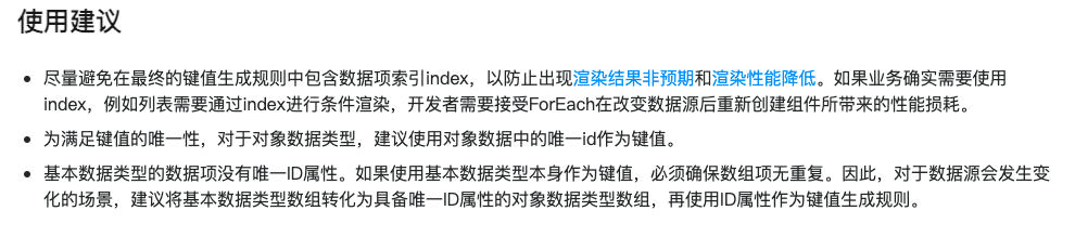
info
如果数组会发生插入,删除的操作,不要使用index作为key的值,不给key渲染也是正常的,但是可能会造成渲染性能降低
- 下面是使用Index作为key的案例
@Entry
@Component
struct Parent {@State simpleList: Array<string> = ['one', 'two', 'three'];build() {Column() {Button() {Text('在第1项后插入新项').fontSize(30)}.onClick(() => {this.simpleList.splice(1, 0, 'new item');})ForEach(this.simpleList, (item: string) => {ChildItem({ item: item })}, (item: string, index: number) => index.toString())}.justifyContent(FlexAlign.Center).width('100%').height('100%').backgroundColor(0xF1F3F5)}
}@Component
struct ChildItem {@Prop item: string;build() {Text(this.item).fontSize(30)}
}
info
我们发现虽然数据是正确的,但是由于鸿蒙针对组件的创建原则,因为key值是索引,发现key值存在的组件存在,并不会重新创建,所以会导致数据渲染非预期限制,要想改正这个问题,要保证key的唯一性,去掉key生成器可以保证唯一性
今日案例-知乎评论
拆解组件
- 新建ZhiHu的文件夹,新建page
- 新建components, 里面新建 HmNavBar和HmCommentItem
@Preview
@Component
struct HmNavBar {title: string = "标题"build() {Row() {// 返回键Row() {Image($r('app.media.ic_public_left_arrow')).width(16).height(16)}.width(30).height(30).borderRadius(15).backgroundColor("#f4f4f4").justifyContent(FlexAlign.Center).margin({left: 20})Text(this.title).layoutWeight(1).textAlign(TextAlign.Center).margin({right: 50})}.width('100%').height(50).border({color: "#f4f5f6",width: {bottom: 1}})}
}
export { HmNavBar }
- HmCommentItem
@Component
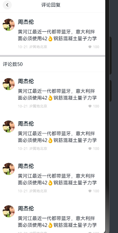
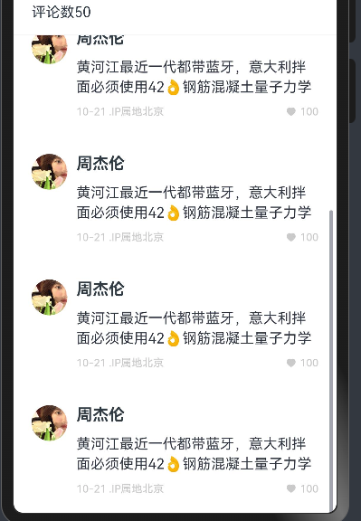
struct HmCommentItem {build() {Row({ space: 10 }) {Image("https://gimg2.baidu.com/image_search/src=http%3A%2F%2Fsafe-img.xhscdn.com%2Fbw1%2F1bad8264-7428-44cf-a92d-3016a2de537b%3FimageView2%2F2%2Fw%2F1080%2Fformat%2Fjpg&refer=http%3A%2F%2Fsafe-img.xhscdn.com&app=2002&size=f9999,10000&q=a80&n=0&g=0n&fmt=auto?sec=1711626934&t=5478cb3adef5d3e29e6952934797ca39").width(40).height(40).borderRadius(20)Column({ space: 10 }) {Text("周杰伦").fontColor("#303a43").fontSize(18).fontWeight(FontWeight.Bold)Text("黄河江最近一代都带蓝牙,意大利拌面必须使用42👌钢筋混凝土量子力学").fontColor("#2f3642").lineHeight(22)Row() {Text("10-21 .IP属地北京").fontColor("#cacaca").fontSize(12)Row({ space: 4 }) {Image($r("app.media.ic_public_like")).width(12).height(12).fillColor("#cacaca")Text("100").fontColor("#cacaca").fontSize(12)}}.justifyContent(FlexAlign.SpaceBetween).width('100%')}.alignItems(HorizontalAlign.Start).layoutWeight(1)}.alignItems(VerticalAlign.Top).padding(20).width('100%')}
}
export { HmCommentItem }
- 在components/index.ets统一导出
export * from './HmCommentItem'
export * from './HmNavBar'
- 在ZhiHU/ZHihu.ets中使用
import { HmCommentItem, HmNavBar } from './components'@Entry
@Component
struct ZhiHu {build() {Column() {HmNavBar({ title: '评论回复'  })HmCommentItem()Divider().strokeWidth(6)Row() {Text("评论数50")}.width('100%').height(50).padding({left: 20}).border({color: '#f3f4f5',width: {bottom: 1}})ForEach([1,2,3,4,5,6], () => {HmCommentItem()})}}
}
需要出现滚动区域。
使用了List组件,子组件必须有ListItem/ListItemGroup
List() {ForEach([1,2,3,4,5,6], () => {ListItem() {HmCommentItem()}})}.layoutWeight(1)
评论列表
在ZhiHu/models/index.ets下建立如下类型
- 定义一个评论的interface
export interface ReplyItem {avatar: ResourceStr // 头像author: string   // 作者id: number  // 评论的idcontent: string // 评论内容time: string // 发表时间area: string // 地区likeNum: number // 点赞数量likeFlag: boolean | null // 当前用户是否点过赞
}
info
用i2c生成对应的class
- 我们前面的循环为什么没有用i2c,直接用的接口呢,因为这里涉及到后续的点赞和其他业务,所以这里直接用class更新起来会更方便
export class ReplyItemModel implements ReplyItem {id: number = 0avatar: string | Resource = ''author: string = ''content: string = ''time: string = ''area: string = ''likeNum: number = 0likeFlag: boolean | null = nullconstructor(model: ReplyItem) {this.id = model.idthis.avatar = model.avatarthis.author = model.authorthis.content = model.contentthis.time = model.timethis.area = model.areathis.likeNum = model.likeNumthis.likeFlag = model.likeFlag}
}
- 定义一个评论列表数据- 在Entry组件中
info
因为我们需要的是class对象,所以每个对象都需要new一下
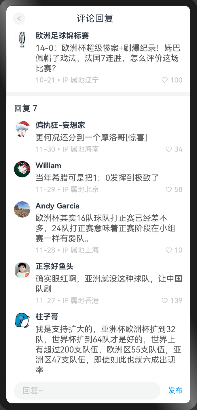
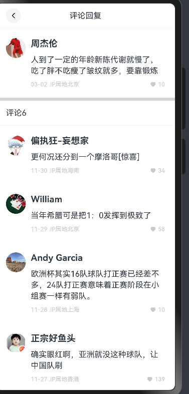
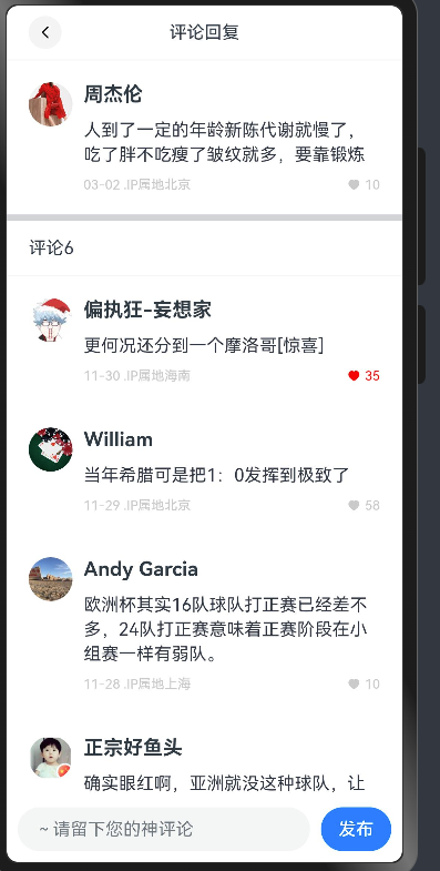
@State commentList: ReplyItemModel[] = [new ReplyItemModel({id: 1,avatar: 'https://picx.zhimg.com/027729d02bdf060e24973c3726fea9da_l.jpg?source=06d4cd63',author: '偏执狂-妄想家',content: '更何况还分到一个摩洛哥[惊喜]',time: '11-30',area: '海南',likeNum: 34,likeFlag: false}) ,new ReplyItemModel({id: 2,avatar: 'https://pic1.zhimg.com/v2-5a3f5190369ae59c12bee33abfe0c5cc_xl.jpg?source=32738c0c',author: 'William',content: '当年希腊可是把1:0发挥到极致了',time: '11-29',area: '北京',likeNum: 58,likeFlag: false}),new ReplyItemModel({id: 3,avatar: 'https://picx.zhimg.com/v2-e6f4605c16e4378572a96dad7eaaf2b0_l.jpg?source=06d4cd63',author: 'Andy Garcia',content: '欧洲杯其实16队球队打正赛已经差不多,24队打正赛意味着正赛阶段在小组赛一样有弱队。',time: '11-28',area: '上海',likeNum: 10,likeFlag: false}),new ReplyItemModel({id: 4,avatar: 'https://picx.zhimg.com/v2-53e7cf84228e26f419d924c2bf8d5d70_l.jpg?source=06d4cd63',author: '正宗好鱼头',content: '确实眼红啊,亚洲就没这种球队,让中国队刷',time: '11-27',area: '香港',likeNum: 139,likeFlag: false}),new ReplyItemModel({id: 5,avatar: 'https://pic1.zhimg.com/v2-eeddfaae049df2a407ff37540894c8ce_l.jpg?source=06d4cd63',author: '柱子哥',content: '我是支持扩大的,亚洲杯欧洲杯扩到32队,世界杯扩到64队才是好的,世界上有超过200支队伍,欧洲区55支队伍,亚洲区47支队伍,即使如此也就六成出现率',time: '11-27',area: '旧金山',likeNum: 29,likeFlag: false}),new ReplyItemModel({id: 6,avatar: 'https://picx.zhimg.com/v2-fab3da929232ae911e92bf8137d11f3a_l.jpg?source=06d4cd63',author: '飞轩逸',content: '禁止欧洲杯扩军之前,应该先禁止世界杯扩军,或者至少把亚洲名额一半给欧洲。',time: '11-26',area: '里约',likeNum: 100,likeFlag: false})]- 在主页中渲染
List() {ForEach(this.commentList, (item: ReplyItemModel) => {ListItem() {HmCommentItem({ item })}})}.layoutWeight(1)
- CommentItem组件接收传入数据
import { ReplyItem, ReplyItemModel } from '../models'@Component
struct HmCommentItem {// 接收渲染的选项item: ReplyItemModel = new ReplyItemModel({} as ReplyItem) // 初始值 只是为了语法不报错build() {Row({ space: 10 }) {Image(this.item.avatar).width(40).height(40).borderRadius(20)Column({ space: 10 }) {Text(this.item.author).fontColor("#303a43").fontSize(18).fontWeight(FontWeight.Bold)Text(this.item.content).fontColor("#2f3642").lineHeight(22)Row() {Text(`${this.item.time} .IP属地${this.item.area}`).fontColor("#cacaca").fontSize(12)Row({ space: 4 }) {Image($r("app.media.ic_public_like")).width(12).height(12).fillColor("#cacaca")Text(this.item.likeNum.toString()).fontColor("#cacaca").fontSize(12)}}.justifyContent(FlexAlign.SpaceBetween).width('100%')}.alignItems(HorizontalAlign.Start).layoutWeight(1)}.alignItems(VerticalAlign.Top).padding(20).width('100%')}
}
export { HmCommentItem }
- 顶部组件同样需要new 对象传入过去
HmCommentItem({item: new ReplyItemModel({id: 999,author: '周杰伦',avatar: $r("app.media.10"),likeNum: 10,likeFlag: false,time: '03-02',area: '北京',content: '人到了一定的年龄新陈代谢就慢了,吃了胖不吃瘦了皱纹就多,要靠锻炼 '})})
底部回复按钮
封装底部的回复组件
Zhihu/components/HmReplyInput.ets
@Component
struct HmReplyInput {@Statecontent: string = ""build() {Row({ space: 10 }) {TextInput({ text: $$this.content, placeholder: '~请留下您的神评论' }).layoutWeight(1).height(40)Button("发布")}.padding({ left: 10, right: 10 }).width('100%').height(60)}
}
export { HmReplyInput }
- 组件在主页中使用
List() {ForEach(this.commentList, (item: ReplyItemModel) => {ListItem() {HmCommentItem({ item })}})}.layoutWeight(1)HmReplyInput() // 在此刻显示
实现点赞
子组件如何调用父组件的函数
- 子组件要声明一个函数
test: () => void = () => {} // test:变量类型 = 初始值
- 父组件需要给子组件传入这个参数
Child({test: () => {this.abc()}
})
- 实现点赞
changeLike: () => void = () => {}- 注册点击事件
Row({ space: 4 }) {Image($r("app.media.ic_public_like")).width(12).height(12).fillColor(this.item.likeFlag ? Color.Red : "#cacaca")Text(this.item.likeNum.toString()).fontColor(this.item.likeFlag ? Color.Red :"#cacaca").fontSize(12)}.onClick(() => {this.changeLike()})
- 父组件定义函数,传入函数
changeLike (item: ReplyItemModel) {// 需要拿到点击的数据 拿到数据更新数据即可// item.likeNum// item.likeFlagif(item.likeFlag) {// 点过赞item.likeNum--}else {// 没有点过赞item.likeNum++}item.likeFlag = !item.likeFlag // 取反// State的修饰符的更新机制// 只能监测到第一层const index = this.commentList.findIndex(obj => obj.id === item.id)//this.commentList[index] = item // 这么写为什么不行 // 引用类型 基础类型this.commentList[index] = new ReplyItemModel(item)}- 传入子组件
List() {ForEach(this.commentList, (item: ReplyItemModel) => {ListItem() {HmCommentItem({item,changeLike: () => {this.changeLike(item)}})}})}.layoutWeight(1)
更新的秘密
- 鸿蒙里面的所有的更新都只能监测到一层的更新
- 如果要更新数组里面的某一项的话
- this.list[index] = 新值
- this.list.splice(index, 1, 新值)
- 关于key的秘密
尝试给了一个id作为key,为什么没有更新
因为鸿蒙会根据key的不同来更新的内容,如果key前后一样,它认为你没有变,那就不更新
提交代码
顶部的点赞
- 将顶部的数据抽提出来
  @StateshowTop: boolean = true
@StatecurrentComment: ReplyItemModel = new ReplyItemModel({id: 999,author: '周杰伦',avatar: $r("app.media.10"),likeNum: 10,likeFlag: false,time: '03-02',area: '北京',content: '人到了一定的年龄新陈代谢就慢了,吃了胖不吃瘦了皱纹就多,要靠锻炼 '})
- 赋值
if(this.showTop) {HmCommentItem({item: this.currentComment,changeLike: () => {this.changeLike(this.currentComment, "top")this.showTop = falsesetTimeout(() => {this.showTop = true}, 100)}})}
- 改造点赞的方法
changeLike (item: ReplyItemModel, type?: "top" | "bottom") {// 需要拿到点击的数据 拿到数据更新数据即可// item.likeNum// item.likeFlagif(item.likeFlag) {// 点过赞item.likeNum--}else {// 没有点过赞item.likeNum++}item.likeFlag = !item.likeFlag // 取反// promptAction.showToast({ message: JSON.stringify(item), duration: 300000 })if(type !== "top") {// State的修饰符的更新机制// 只能监测到第一层const index = this.commentList.findIndex(obj => obj.id === item.id)//this.commentList[index] = item // 这么写为什么不行 // 引用类型 基础类型// this.commentList[index] = new ReplyItemModel(item)this.commentList.splice(index, 1, new ReplyItemModel(item))}}
提交代码
回复评论
- 底部输入组件双向绑定
import { promptAction } from '@kit.ArkUI'@Component
struct HmReplyInput {@Statecontent: string = ""publishComment: (content: string) => void = () => {}build() {Row({ space: 10 }) {TextInput({ text: $$this.content, placeholder: '~请留下您的神评论' }).layoutWeight(1).height(40).onSubmit(() => {// 键盘的确定事件if(this.content) {this.publishComment(this.content)this.content = ""}})Button("发布").onClick(() => {if(this.content) {this.publishComment(this.content)this.content = ""}})}.padding({ left: 10, right: 10 }).width('100%').height(60)}
}export { HmReplyInput }
- 调用父组件传入的publishComment的方法
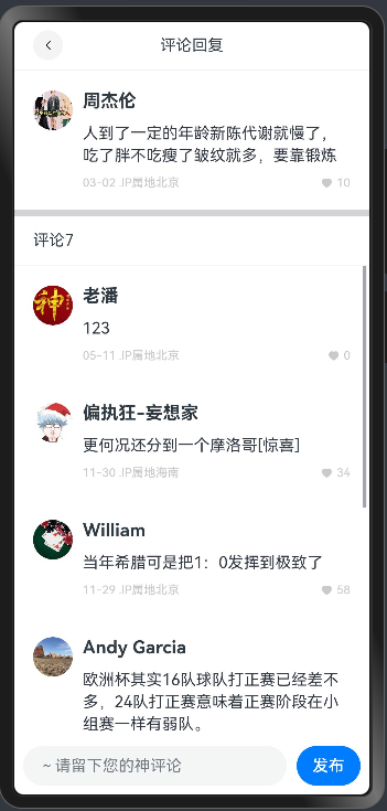
- 父组件实现的方法
addComment(content: string) {this.commentList.unshift(new ReplyItemModel({id: Math.random() ,avatar: 'https://foruda.gitee.com/avatar/1705232317138324256/1759638_itcast_panpu_1705232317.png',author: '老潘',content,time: `${(new Date().getMonth() + 1).toString().padStart(2, "0")}-${new Date().getDate().toString().padStart(2, "0")}`,area: '北京',likeNum: 0,likeFlag: false}))// 控制滚动条this.scroller.scrollEdge(Edge.Top)}
- 实现传入方法
HmReplyInput({publishComment: (content: string) => {this.addComment(content)}})
- 实现滚动顶部
//创建scroller
scroller:Scroller = new Scroller()
//传入scroller
List({ scroller: this.scroller })


)

