文章目录
- 1、Colum和Row——垂直方向容器和水平方向容器
- 2、ColumnSplit和RowSplit——子组件之间插入一条分割线
- 3、Flex——弹性布局子组件的容器
- 4、Grid和GridItem——网格容器和网格容器单元格
- 5、GridRow和GridCol——栅格容器组件和栅格子组件
- 6、List、ListItem、ListItemGroup——列表 、列表单条、列表item分组
- 7、AlphabetIndexer——与容器组件联动进行快速定位
- 8、Badge——信息标记的气泡
- 9、Counter——计算器组件
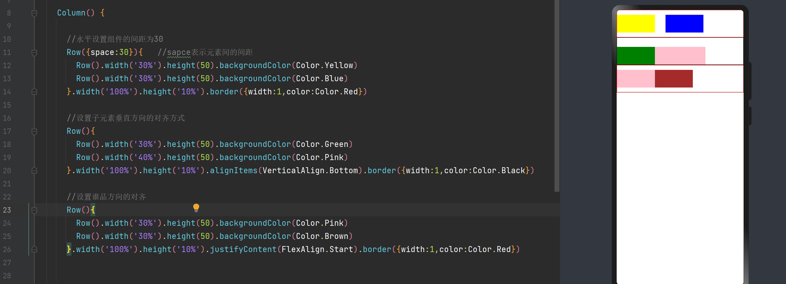
1、Colum和Row——垂直方向容器和水平方向容器
| space | 子组件水平或者垂直方向的间距 |
|---|---|
| alignItem | 水平或者垂直方向的对齐 |
| justifyContent | 水平或者垂直方向的对齐 |
//水平设置组件的间距为30
Row({space:30}){   //sapce表示元素间的间距Row().width('30%').height(50).backgroundColor(Color.Yellow)Row().width('30%').height(50).backgroundColor(Color.Blue)
}.width('100%').height('10%').border({width:1,color:Color.Red})//设置子元素垂直方向的对齐方式
Row(){Row().width('30%').height(50).backgroundColor(Color.Green)Row().width('40%').height(50).backgroundColor(Color.Pink)
}.width('100%').height('10%').alignItems(VerticalAlign.Bottom).border({width:1,color:Color.Black})//设置谁品方向的对齐
Row(){Row().width('30%').height(50).backgroundColor(Color.Pink)Row().width('30%').height(50).backgroundColor(Color.Brown)
}.width('100%').height('10%').justifyContent(FlexAlign.Start).border({width:1,color:Color.Red})
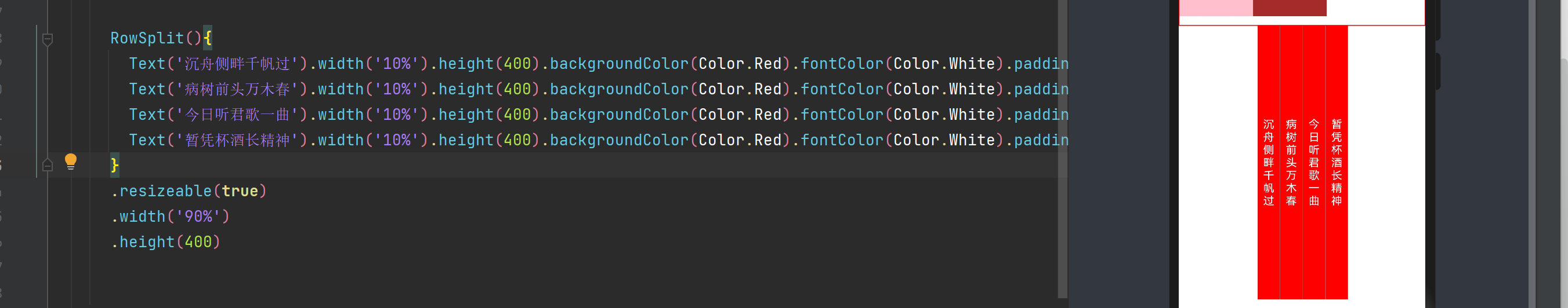
2、ColumnSplit和RowSplit——子组件之间插入一条分割线
ColumnSplit 横向分割线 rowSplit纵向分割线
RowSplit(){Text('沉舟侧畔千帆过').width('10%').height(400).backgroundColor(Color.Red).fontColor(Color.White).padding({left:8,right:8})Text('病树前头万木春').width('10%').height(400).backgroundColor(Color.Red).fontColor(Color.White).padding({left:8,right:8})Text('今日听君歌一曲').width('10%').height(400).backgroundColor(Color.Red).fontColor(Color.White).padding({left:8,right:8})Text('暂凭杯酒长精神').width('10%').height(400).backgroundColor(Color.Red).fontColor(Color.White).padding({left:8,right:8})
}
.resizeable(true)
.width('90%')
.height(400)
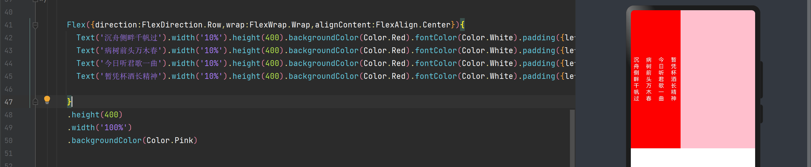
3、Flex——弹性布局子组件的容器
| direction | 子组件在Flex容器上排列的方向,即主轴方向 |
|---|---|
| wrap | Flex容易以单行单列,还是多行多列 |
| justifyContent | 子组件在Flex容器主轴上的对齐格式 |
| alignItems | 子组件在Flex容器交叉轴上的对齐格式 |
| alignContent | 交叉轴中有额外的空间时,多行内容的对齐方式,仅在wrap为wrap或者wrapReverse时生效 |
Flex({direction:FlexDirection.Row,wrap:FlexWrap.Wrap,alignContent:FlexAlign.Center}){Text('沉舟侧畔千帆过').width('10%').height(400).backgroundColor(Color.Red).fontColor(Color.White).padding({left:8,right:8})Text('病树前头万木春').width('10%').height(400).backgroundColor(Color.Red).fontColor(Color.White).padding({left:8,right:8})Text('今日听君歌一曲').width('10%').height(400).backgroundColor(Color.Red).fontColor(Color.White).padding({left:8,right:8})Text('暂凭杯酒长精神').width('10%').height(400).backgroundColor(Color.Red).fontColor(Color.White).padding({left:8,right:8})}
.height(400)
.width('100%')
.backgroundColor(Color.Pink)
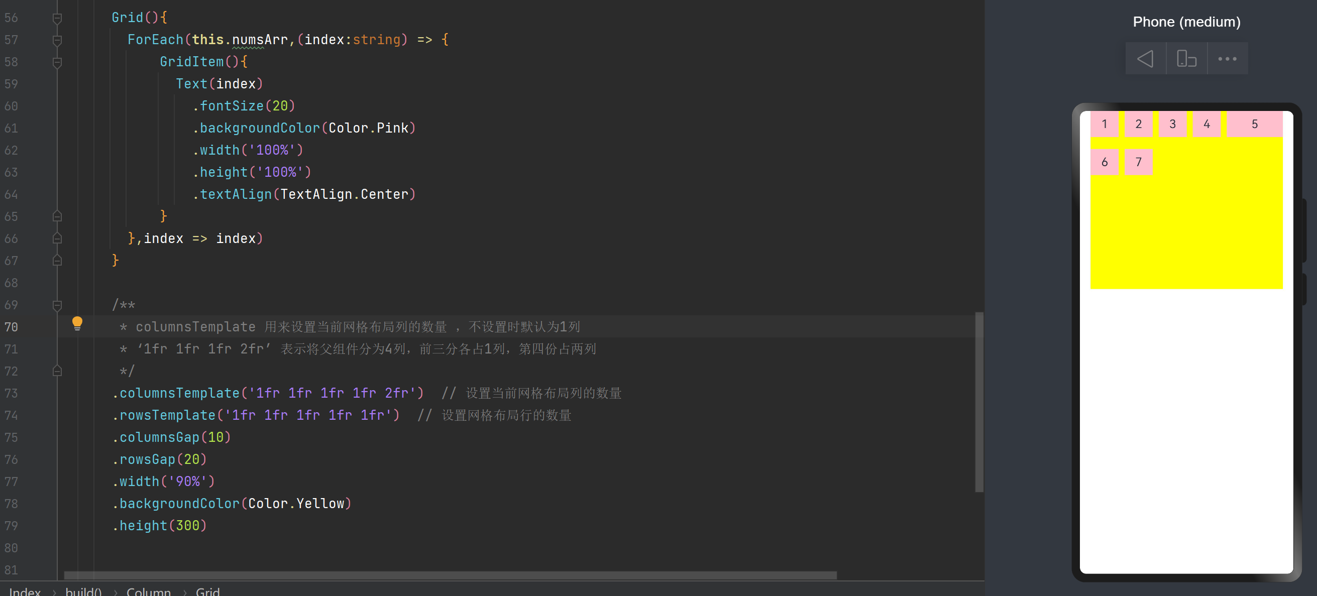
4、Grid和GridItem——网格容器和网格容器单元格
Grid(){ForEach(this.numsArr,(index:string) => {GridItem(){Text(index).fontSize(20).backgroundColor(Color.Pink).width('100%').height('100%').textAlign(TextAlign.Center)}},index => index)}/*** columnsTemplate 用来设置当前网格布局列的数量 ,不设置时默认为1列* ‘1fr 1fr 1fr 2fr’ 表示将父组件分为4列,前三分各占1列,第四份占两列*/.columnsTemplate('1fr 1fr 1fr 1fr 2fr') // 设置当前网格布局列的数量.rowsTemplate('1fr 1fr 1fr 1fr 1fr') // 设置网格布局行的数量.columnsGap(10).rowsGap(20).width('90%').backgroundColor(Color.Yellow).height(300)
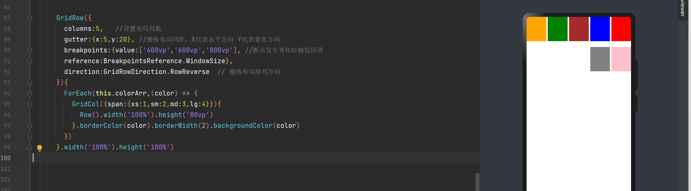
5、GridRow和GridCol——栅格容器组件和栅格子组件
GridRow栅格容器组件 仅可以和栅格子组件GridCol在栅格布局场景中使用
private colorArr: Color[] = [Color.Red,Color.Blue,Color.Brown,Color.Green,Color.Orange,Color.Pink,Color.Grey];GridRow({columns:5,   //设置布局列数gutter:{x:5,y:20}, //栅格布局间距,X代表水平方向 Y代表垂直方向breakpoints:{value:['400vp','600vp','800vp'], //断点发生变化时触发回调reference:BreakpointsReference.WindowSize},direction:GridRowDirection.RowReverse  // 栅格布局排列方向
}){ForEach(this.colorArr,(color) => {GridCol({span:{xs:1,sm:2,md:3,lg:4}}){Row().width('100%').height('80vp')}.borderColor(color).borderWidth(2).backgroundColor(color)})
}.width('100%').height('100%')
6、List、ListItem、ListItemGroup——列表 、列表单条、列表item分组
List可以包含ListItem和ListItemGroup子组件,ListItem用来展示列表具体Item,必须配合List来使用,ListItemGroup组件用来展示列表item分组,宽度默认充满List组件,必须配合List组件来使用。
private classListData: any = [{title:'周一',projects:['语文','数学','音乐']},{title:'周二',projects:['化学','政治','地理']},{title:'周三',projects:['体育','计算机','数学']},{title:'周四',projects:['音乐','美术','历史']}]List({space:2}){ForEach(this.classListData,(item) => {ListItemGroup(){ForEach(item.projects,(projects) => {ListItem(){Text(projects).width('100%').height(30).fontSize(20).textAlign(TextAlign.Center)}}, item => item)}.borderRadius(2).divider({strokeWidth:2,color:Color.Blue})  //ListItemGroup分割线})
}
.divider({strokeWidth:5,color:Color.Red}) //List分割线
.width('100%')

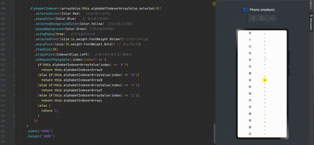
7、AlphabetIndexer——与容器组件联动进行快速定位
AlphabetIndexer是可以与容器组件联动用于按逻辑结构快速定位容器显示区域的组件。
private alphabetIndexerArrayA: string[] = ['安']
private alphabetIndexerArrayB: string[] = ['卜', '白', '包', '毕', '丙']
private alphabetIndexerArrayC: string[] = ['曹', '成', '陈', '催']
private alphabetIndexerArrayL: string[] = ['刘', '李', '楼', '梁', '雷', '吕', '柳', '卢']
private alphabetIndexerArrayValue: string[] = ['#', 'A', 'B', 'C', 'D', 'E', 'F', 'G','H', 'I', 'J', 'K', 'L', 'M', 'N','O', 'P', 'Q', 'R', 'S', 'T', 'U','V', 'W', 'X', 'Y', 'Z']Row(){List({space:10,initialIndex:0}){ForEach(this.alphabetIndexerArrayA,(item) => {ListItem(){Text(item).width('100%').height('5%').fontSize(20).textAlign(TextAlign.Center)}},item => item)ForEach(this.alphabetIndexerArrayB,(item) => {ListItem(){Text(item).width('100%').height('5%').fontSize(20).textAlign(TextAlign.Center)}},item => item)ForEach(this.alphabetIndexerArrayC,(item) => {ListItem(){Text(item).width('100%').height('5%').fontSize(20).textAlign(TextAlign.Center)}},item => item)ForEach(this.alphabetIndexerArrayL,(item) => {ListItem(){Text(item).width('100%').height('5%').fontSize(20).textAlign(TextAlign.Center)}},item => item)}.width('50%').height('100%')AlphabetIndexer({arrayValue:this.alphabetIndexerArrayValue,selected:0}).selectedColor(Color.Red)   //选中框文本颜色.popupColor(Color.Blue)   // 弹出框文本颜色.selectedBackgroundColor(Color.Yellow)  //选中框北京颜色.popupBackground(Color.Green) //弹出框背景颜色.usingPopup(true)   //是否使用弹出框.selectedFont({size:16,weight:FontWeight.Bolder}) //选中字体设置.popupFont({size:30,weight:FontWeight.Bold}) // 弹出字体设置.itemSize(28).alignStyle(IndexerAlign.Left)   //弹出框在索引条左侧弹出.onRequestPopupData((index:number) => {if(this.alphabetIndexerArrayValue[index] == 'A'){return this.alphabetIndexerArrayA}else if(this.alphabetIndexerArrayValue[index] == 'B'){return this.alphabetIndexerArrayB}else if(this.alphabetIndexerArrayValue[index] == 'C'){return this.alphabetIndexerArrayC}else if(this.alphabetIndexerArrayValue[index] == 'L'){return this.alphabetIndexerArrayL}else {return []}})}.width('100%').height('100%')
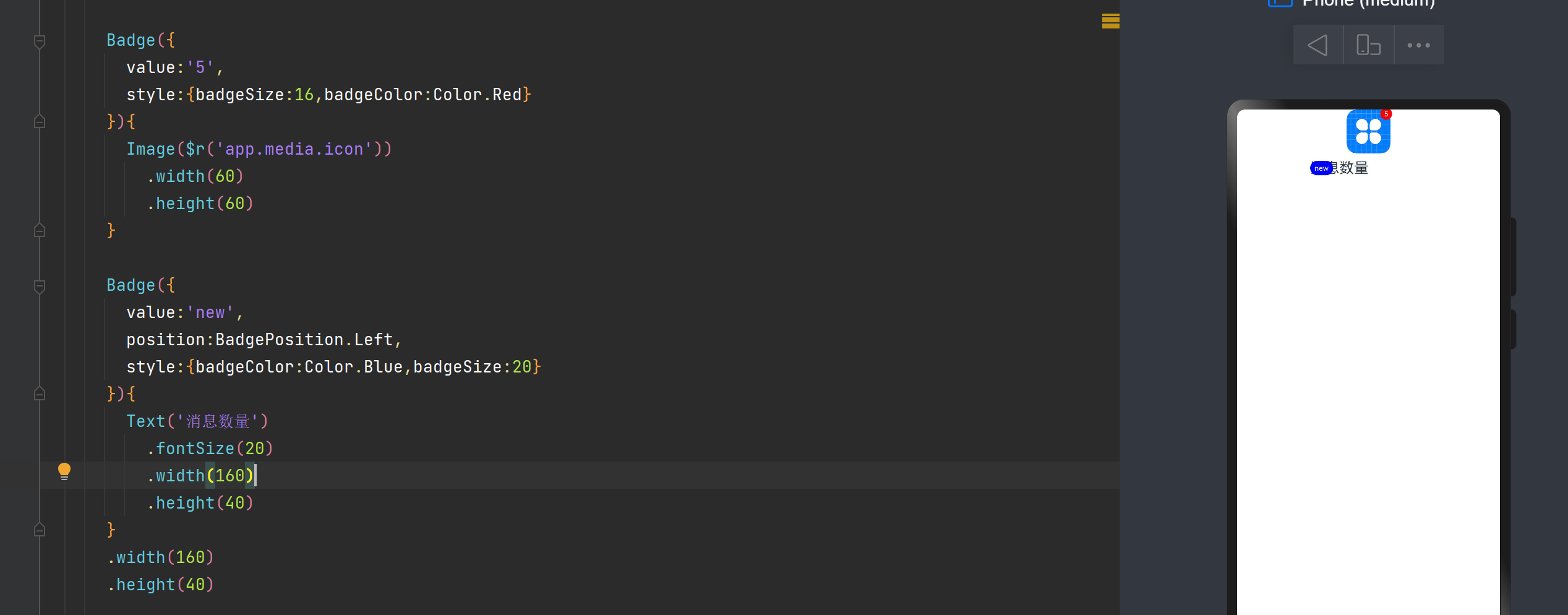
8、Badge——信息标记的气泡
Badge是可以附加在单个组件上用于信息标记的容器组件
构造函数主要有四个参数
| count | 设置提示消息数 |
|---|---|
| position | 设置提示点的位置(RightTop,Right,Left) |
| maxCount | 最大消息数,超过最大消息数则显示最大消息数 |
| style | 样式,支持文本颜色和尺寸以及圆点颜色和尺寸 |
Badge({value:'5',style:{badgeSize:16,badgeColor:Color.Red}
}){Image($r('app.media.icon')).width(60).height(60)
}Badge({value:'new',position:BadgePosition.Left,style:{badgeColor:Color.Blue,badgeSize:20}
}){Text('消息数量').fontSize(20).width(160).height(40)
}
.width(160)
.height(40)
9、Counter——计算器组件
counter是计数器组件,提供相应的增加或者减少的计数操作
Counter(){Text(this.countNum.toString())
}
.margin(20)
.onInc(() => {   //监听数值增加事件this.countNum++})
.onDec(() => {  //监听数值减小事件this.countNum--
})
】)


