一,效果
二,代码
第 1 步:基础布局
创建一个显示内容的框框。
<!DOCTYPE html>
<html lang="en">
<head><meta charset="UTF-8"><title>Category List</title><style>.category-list-container {padding: 0;max-width: 300px;}.category-list {list-style: none;padding: 0;margin: 0;}.category-item {display: flex;  /* 让子元素使用 Flex 布局 */justify-content: space-between; /* 让 name 靠左,count 靠右 */align-items: center; /* 垂直居中 */padding: 8px 0;font-size: 16px;}</style>
</head>
<body>
<div class="category-list-container"><ul class="category-list"><li class="category-item"><span class="name">Category 1</span><span class="count">12</span></li><li class="category-item"><span class="name">Category 2</span><span class="count">34</span></li></ul>
</div>
</body>
</html>
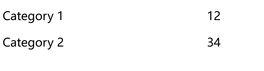
✅ name 靠左
✅ count 靠右
✅ 但中间没有 - 号填充,下一步解决!
第 2 步:添加 - 号的分隔符
👉 在 category-item 内新增 dash 元素,并用 CSS 让它填充 name 和 count 之间的空隙。
<!DOCTYPE html>
<html lang="en">
<head><meta charset="UTF-8"><title>Category List</title><style>.category-list-container {padding: 0;max-width: 300px;}.category-list {list-style: none;padding: 0;margin: 0;}.category-item {display: flex; /* 让子元素使用 Flex 布局 */justify-content: space-between; /* 让 name 靠左,count 靠右 */align-items: center; /* 垂直居中 */padding: 8px 0;font-size: 16px;}.dash {flex-grow: 1; /* 让它填充空隙 */text-align: center; /* 让文本居中 */color: #999;font-weight: bold;margin: 0 8px; /* 控制 name 和 count 之间的间距 */}</style>
</head>
<body>
<div class="category-list-container"><ul class="category-list"><li class="category-item"><span class="name">Category 1</span><span class="dash">-</span><span class="count">12</span></li><li class="category-item"><span class="name">Category 2</span><span class="dash">-</span><span class="count">34</span></li></ul>
</div>
</body>
</html>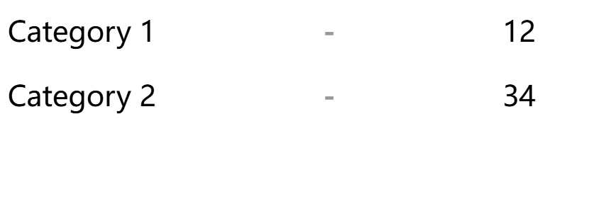
✅ dash 元素填充了 name 和 count 之间的空间
✅ 但目前 - 号数量固定,如果 name 或 count 变长,- 不会自动填充,下一步解决!
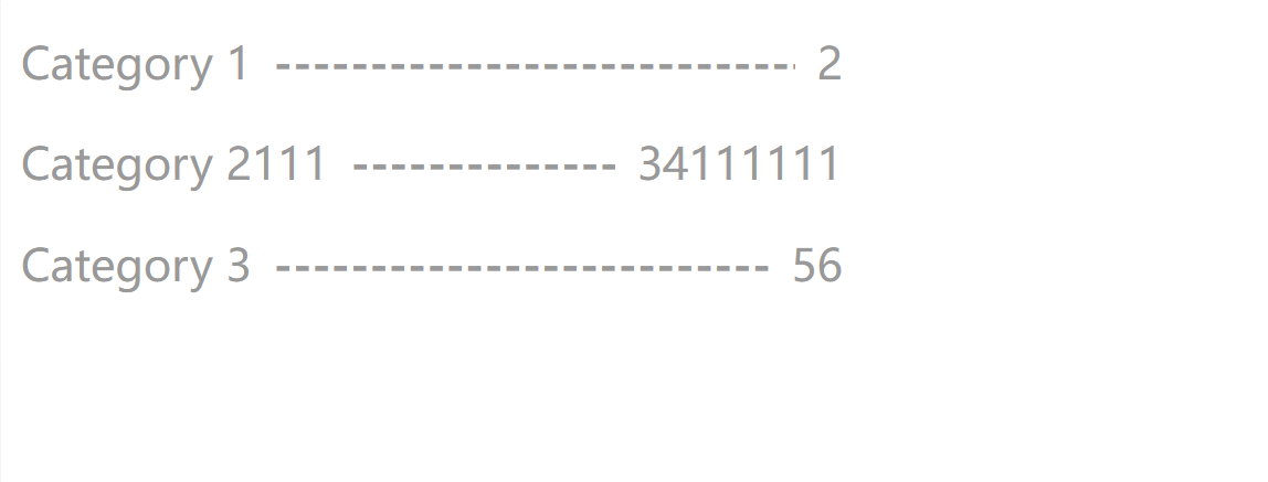
第 3 步:让 - 号自动填充
👉 用 ::before 伪元素,让 dash 内的 - 号动态增长。
<!DOCTYPE html>
<html lang="en">
<head><meta charset="UTF-8"><title>Category List</title><style>.category-list-container {padding: 0;max-width: 300px;}.category-list {color: #9a9999;list-style: none; /* 去掉默认列表样式 */padding: 0;margin: 0;}.category-item {display: flex; /* 使用 Flexbox 布局 */align-items: center; /* 垂直居中 */justify-content: space-between; /* 两端对齐 */padding: 8px 0; /* 调整间距 */font-size: 16px;}.name {flex-shrink: 0; /* 防止被压缩 */transition: transform 0.4s ease-out;}.dash {flex-grow: 1; /* 自动填充空白区域 */text-align: center;color: #999;font-weight: bold;margin: 0 8px; /* 控制分隔符与 name 和 count 的间距 */overflow: hidden;white-space: nowrap;}/* 伪元素创建动态的 '-' */.dash::before {content: "------------------------------------------------"; /* 长度足够的 - 号 */display: block;overflow: hidden;white-space: nowrap;}.count {flex-shrink: 0; /* 防止被压缩 */}</style>
</head>
<body>
<div class="category-list-container"><ul class="category-list"><li class="category-item"><span class="name">Category 1</span><span class="dash"></span><span class="count">2</span></li><li class="category-item"><span class="name">Category 2111</span><span class="dash"></span><span class="count">34111111</span></li><li class="category-item"><span class="name">Category 3</span><span class="dash"></span><span class="count">56</span></li></ul>
</div>
</body>
</html>


