默认格式
<Style x:Key="RadioButtonStyle" TargetType="{x:Type RadioButton}"><Setter Property="FocusVisualStyle" Value="{StaticResource FocusVisual}"/><Setter Property="Background" Value="{StaticResource RadioButton.Static.Background}"/><Setter Property="BorderBrush" Value="{StaticResource RadioButton.Static.Border}"/><Setter Property="Foreground" Value="{DynamicResource {x:Static SystemColors.ControlTextBrushKey}}"/><Setter Property="BorderThickness" Value="1"/><Setter Property="Template"><Setter.Value><ControlTemplate TargetType="{x:Type RadioButton}"><Grid x:Name="templateRoot" Background="Transparent" SnapsToDevicePixels="True"><Grid.ColumnDefinitions><ColumnDefinition Width="Auto"/><ColumnDefinition Width="*"/></Grid.ColumnDefinitions><!--CornerRadius="100"  最大大小就是200 超过200 不是正圆--><Border x:Name="radioButtonBorder"Background="{TemplateBinding Background}"BorderBrush="{TemplateBinding BorderBrush}" BorderThickness="{TemplateBinding BorderThickness}" CornerRadius="100" Grid.Column="0"HorizontalAlignment="{TemplateBinding HorizontalContentAlignment}" Margin="1,1,2,1" VerticalAlignment="{TemplateBinding VerticalContentAlignment}"><Grid x:Name="markGrid" Margin="2"><Ellipse x:Name="optionMark" Fill="{StaticResource RadioButton.Static.Glyph}" MinWidth="6" MinHeight="6" Opacity="0"/></Grid></Border><ContentPresenter x:Name="contentPresenter" Grid.Column="1" Focusable="False" HorizontalAlignment="{TemplateBinding HorizontalContentAlignment}"Margin="{TemplateBinding Padding}" RecognizesAccessKey="True" SnapsToDevicePixels="{TemplateBinding SnapsToDevicePixels}" VerticalAlignment="{TemplateBinding VerticalContentAlignment}"/></Grid><ControlTemplate.Triggers><Trigger Property="HasContent" Value="true"><Setter Property="FocusVisualStyle" Value="{StaticResource OptionMarkFocusVisual}"/><Setter Property="Padding" Value="4,-1,0,0"/></Trigger><Trigger Property="IsMouseOver" Value="true"><Setter Property="Background" TargetName="radioButtonBorder" Value="{StaticResource RadioButton.MouseOver.Background}"/><Setter Property="BorderBrush" TargetName="radioButtonBorder" Value="{StaticResource RadioButton.MouseOver.Border}"/><Setter Property="Fill" TargetName="optionMark" Value="{StaticResource RadioButton.MouseOver.Glyph}"/></Trigger><Trigger Property="IsEnabled" Value="false"><Setter Property="Background" TargetName="radioButtonBorder" Value="{StaticResource RadioButton.Disabled.Background}"/><Setter Property="BorderBrush" TargetName="radioButtonBorder" Value="{StaticResource RadioButton.Disabled.Border}"/><Setter Property="Fill" TargetName="optionMark" Value="{StaticResource RadioButton.Disabled.Glyph}"/></Trigger><Trigger Property="IsPressed" Value="true"><Setter Property="Background" TargetName="radioButtonBorder" Value="{StaticResource RadioButton.Pressed.Background}"/><Setter Property="BorderBrush" TargetName="radioButtonBorder" Value="{StaticResource RadioButton.Pressed.Border}"/><Setter Property="Fill" TargetName="optionMark" Value="{StaticResource RadioButton.Pressed.Glyph}"/></Trigger><Trigger Property="IsChecked" Value="true"><Setter Property="Opacity" TargetName="optionMark" Value="1"/></Trigger><Trigger Property="IsChecked" Value="{x:Null}"><Setter Property="Opacity" TargetName="optionMark" Value="0.56"/></Trigger></ControlTemplate.Triggers></ControlTemplate></Setter.Value></Setter>
</Style>
解释
- Border: 定义了单选按钮的外观,设置了宽度、高度、边框颜色和厚度,并使用圆角(CornerRadius)创建圆形按钮。
- ContentPresenter: 用于显示按钮的内容,可以是文本或其他控件。
- Triggers: 定义了两种触发器,当IsChecked属性为True时,背景颜色变为蓝色;当IsEnabled属性为False时,背景颜色变为灰色。
自定义模板
<Style x:Key="RadioButtonStyleDemo" TargetType="{x:Type RadioButton}"><Setter Property="FocusVisualStyle" Value="{x:Null}"/><Setter Property="Background" Value="Transparent"/><Setter Property="BorderBrush" Value="#333"/><Setter Property="Foreground" Value="#333"/><Setter Property="BorderThickness" Value="1"/><Setter Property="Template"><Setter.Value><ControlTemplate TargetType="{x:Type RadioButton}"><Grid><Grid.ColumnDefinitions><ColumnDefinition Width="auto" /><ColumnDefinition /></Grid.ColumnDefinitions><Border Grid.Column="0" Width="16" Height="16"><Grid><Ellipse x:Name="OuterCircle" Fill="{TemplateBinding Background}" Stroke="{TemplateBinding BorderBrush}" StrokeThickness="1"/><Ellipse x:Name="InnerCircle" Width="8" Height="8" Fill="Blue" Visibility="Hidden"/></Grid></Border><ContentPresenter Margin="4,0,0,0" Grid.Column="1"VerticalAlignment="Center" HorizontalAlignment="Left" RecognizesAccessKey="True"/></Grid><ControlTemplate.Triggers><Trigger Property="IsChecked" Value="True"><Setter TargetName="InnerCircle" Property="Visibility" Value="Visible"/></Trigger><Trigger Property="IsEnabled" Value="False"><Setter TargetName="OuterCircle" Property="Fill" Value="Gray"/></Trigger></ControlTemplate.Triggers></ControlTemplate></Setter.Value></Setter></Style>解释
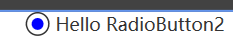
- Grid: 使用Grid容器来包含两个Ellipse元素,一个是外圈(OuterCircle),一个是内圈(InnerCircle)。
- OuterCircle: 定义了单选按钮的外圈,使用Background和BorderBrush属性。
- InnerCircle: 定义了单选按钮的内圈,默认情况下隐藏(Visibility设置为Hidden)。
- Triggers: 当IsChecked属性为True时,显示内圈;当IsEnabled属性为False时,外圈的填充颜色变为灰色。
样式:


