目录
- 引言
- 相关阅读
- 工程结构
- 示例代码详解
- 主窗口(Main.qml)
- 可拖拽列表视图(DraggableListView.qml)
- 基础结构
- 列表项委托
- 拖拽功能实现
- 动画效果
- 运行效果
- 总结
- 下载链接
引言
在现代UI设计中,可拖拽排序的列表视图是一种常见且实用的交互方式。用户可以通过简单的拖拽操作来调整列表项的顺序,从而实现更加直观且高效的数据管理。本文将以一个简单的QML项目为例,详细介绍如何在Qt Quick中实现一个可拖拽排序的ListView组件。通过本文的学习,读者可以掌握Qt中拖放操作的基本原理、状态管理以及动画效果的实现方法。
相关阅读
- QML ListView:列表视图的数据交互与样式定制
- QML与C++:基于ListView调用外部模型进行增删改查(附自定义组件)
- QML与C++:基于ListView调用外部模型进行增删改查(性能优化版)
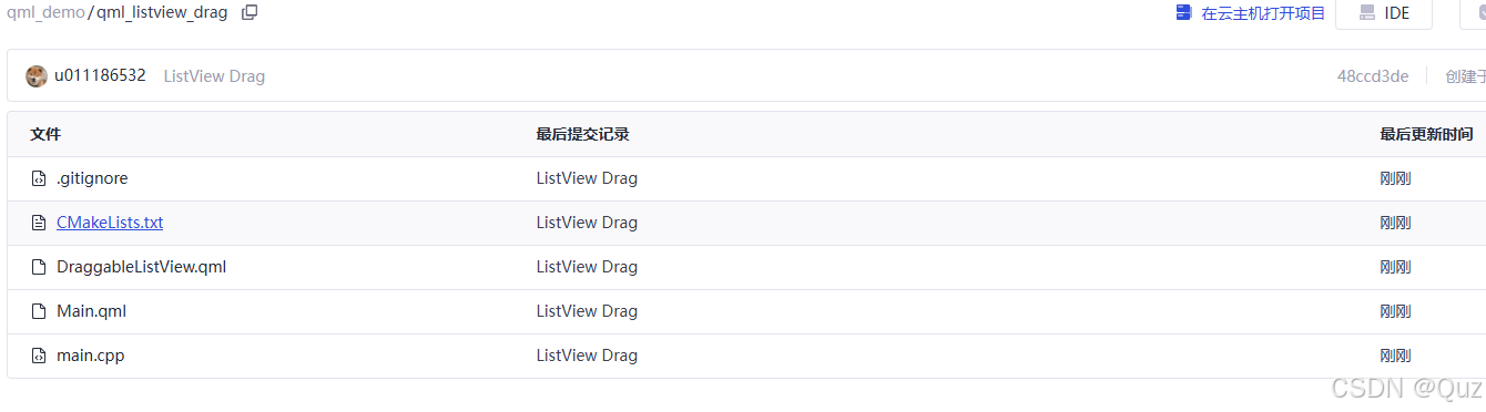
工程结构
该项目采用了Qt的CMake构建系统,主要由QML文件和C++启动代码组成。项目结构如下:
各文件的功能说明:
- main.cpp:程序入口,负责创建Qt应用实例和加载QML模块
- CMakeLists.txt:CMake构建脚本,配置项目编译选项和依赖
- Main.qml:主窗口,包含应用的基本布局
- DraggableListView.qml:自定义可拖拽ListView组件的实现
示例代码详解
主窗口(Main.qml)
import QtQuick
import QtQuick.WindowWindow {width: 400height: 600visible: truetitle: "可拖拽列表示例"DraggableListView {anchors.fill: parentanchors.margins: 10}
}
Main.qml定义了应用程序的主窗口,它非常简洁:
- 导入必要的QtQuick和QtQuick.Window模块
- 窗口中放置一个DraggableListView组件,填充整个窗口区域并设置10像素的边距
可拖拽列表视图(DraggableListView.qml)
import QtQuick
import QtQuick.Controls// 可拖拽列表视图组件
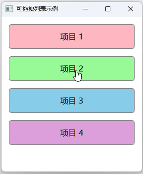
ListView {id: listView// 基础属性设置width: parent.widthheight: parent.heightspacing: 5clip: trueinteractive: true// 列表数据模型model: ListModel {id: listModelListElement { name: "项目 1"; colorCode: "#FFB6C1" }ListElement { name: "项目 2"; colorCode: "#98FB98" }ListElement { name: "项目 3"; colorCode: "#87CEEB" }ListElement { name: "项目 4"; colorCode: "#DDA0DD" }}// 列表项委托delegate: Item {id: delegateItemwidth: listView.widthheight: 60required property int indexrequired property string namerequired property string colorCode// 可拖拽矩形Rectangle {id: dragRectanchors.margins: 5color: colorCoderadius: 5border {color: "gray"width: 1}// 拖拽相关属性Drag.active: dragArea.drag.activeDrag.source: delegateItemDrag.hotSpot {x: width / 2y: height / 2}// 拖拽状态管理states: [State {name: "dragging"when: dragArea.drag.activeParentChange {target: dragRectparent: listView}PropertyChanges {target: dragRectanchors {left: undefinedright: undefinedtop: undefinedbottom: undefined}width: delegateItem.width - 10height: delegateItem.height - 10z: 2}},State {name: "normal"when: !dragArea.drag.activeParentChange {target: dragRectparent: delegateItem}PropertyChanges {target: dragRectanchors {left: parent.leftright: parent.righttop: parent.topbottom: parent.bottommargins: 5}x: 0y: 0}}]// 显示文本Text {anchors.centerIn: parenttext: namefont.pixelSize: 16}// 拖拽区域MouseArea {id: dragAreaanchors.fill: parentdrag.target: dragRectdrag.axis: Drag.YAxiscursorShape: Qt.PointingHandCursorproperty int startIndex: -1property bool held: falseonPressed: {held = truestartIndex = delegateItem.index}onReleased: {held = falsevar dropPos = mapToItem(listView, mouseX, mouseY)var dropIndex = listView.indexAt(dropPos.x, dropPos.y)if (dropIndex >= 0 && dropIndex < listModel.count && dropIndex !== startIndex) {listModel.move(startIndex, dropIndex, 1)}}}}}// 位移动画displaced: Transition {NumberAnimation {properties: "x,y"duration: 200easing.type: Easing.OutQuad}}
}
这是本项目的核心组件,实现了可拖拽排序的ListView。以下是代码详解:
基础结构
- 这个组件继承自Qt Quick的标准ListView控件
- 设置了基本的尺寸、间距和交互属性
- 使用ListModel作为数据源,包含4个示例项目,每个项目有名称和颜色代码两个属性
列表项委托
- 每个列表项都是一个自定义的Item
- 通过required property声明属性,以接收来自模型的数据
- 列表项中包含一个可视化的Rectangle,显示颜色和文本内容
拖拽功能实现
拖拽属性设置:
- 使用Drag.active指定何时处于拖拽状态
- Drag.source指定拖拽源对象
- Drag.hotSpot定义拖拽热点位置
状态管理:
- "dragging"状态:当用户拖拽项目时,重设父对象为ListView,移除锚点约束,调整大小并提高Z轴顺序
- "normal"状态:非拖拽状态下,恢复正常的布局和父子关系
拖拽交互:
- 使用MouseArea实现拖拽行为
- 限制拖拽方向为Y轴(垂直方向)
- 记录拖拽开始时的索引位置
- 在释放时计算拖放位置,通过mapToItem转换坐标系
- 使用ListView.indexAt获取目标索引位置
- 最后调用ListModel.move方法实现列表项的重新排序
动画效果
- 使用ListView的displaced属性定义位移动画
- 当列表项因拖拽操作被移动时应用平滑过渡
- 动画持续200毫秒,使用OutQuad缓动效果
运行效果
总结
本文通过一个简单的例子展示了如何在Qt Quick中实现可拖拽排序的ListView组件。主要技术点包括:
- 使用Qt的拖放(Drag and Drop)机制实现列表项拖拽
- 利用状态(States)管理拖拽过程中的视觉反馈
- 通过坐标映射确定拖放位置
- 使用模型的move方法实现数据重排
- 添加动画效果提升用户体验
这种可拖拽排序的列表视图在许多应用中都有广泛的应用场景,比如待办事项管理、播放列表编辑、文件排序等。
下载链接
完整代码可在以下链接下载:GitCode ListView示例


)


