目录
1、从最基本的页面开始
2、添加图像/浮层部分
3、位置调整
4、添加动效
4.1、添加浮层动效
4.2、添加背景动画
根据前面css的学习,本篇来实践下前面学习的知识,主要实现如下这样的效果。
下面我们一步步实现上面的效果。
1、从最基本的页面开始
如下是最基本的一个页面:
<!DOCTYPE html>
<html><head><meta charset="utf-8"><title>CSS基础学习记录(6)</title><style></style>
</head><body></body></html>
没错,就是啥也没有,只是一个最基本的html框架,接下来我们开始往里面加代码。 首先加了一个盒子(div),代码如下:
<!DOCTYPE html>
<html><head><meta charset="utf-8"><title>CSS基础学习记录(6)</title><style>* {margin: 0;padding: 0;}body {background-color: antiquewhite;}.box {margin: 0 auto;background-color: chartreuse;margin-top: 45px;width: 200px;height: 200px;}</style>
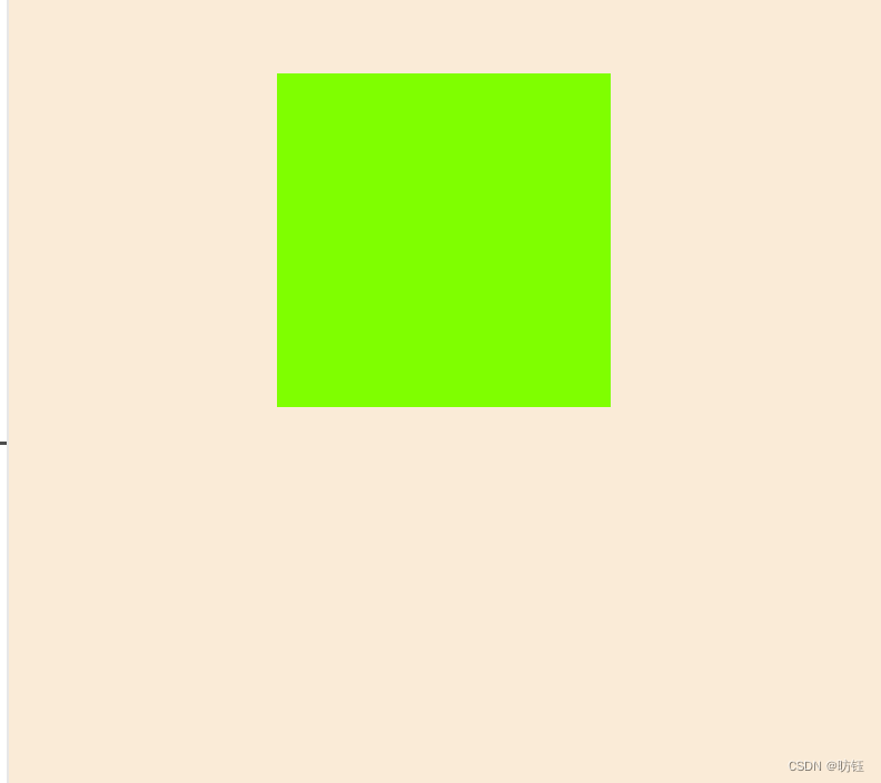
</head><body><div class="box"></div>
</body></html>运行效果如下:
代码分析:
* {margin: 0;padding: 0;}这是一个通用选择器,会匹配所有的html元素,这里把margin、padding都设置为0(默认会有一个padding、maring)。
body {background-color: antiquewhite;}.box {margin: 0 auto;background-color: chartreuse;margin-top: 45px;width: 200px;height: 200px;}首先使用标签选择器(body)设置了body的背景色,然后使用类选择器(.box)创建了一个box类,该选择器的效果是创建了一个宽高都是200px的区域,同时外边距(上边)为45px,水平居中。
2、添加图像/浮层部分
现在将在box里面添加一张图像以及一个浮层,图像是背景,浮层则是可以浮动的,代码如下:
<!DOCTYPE html>
<html><head><meta charset="utf-8"><title>CSS基础学习记录(6)</title><style>* {margin: 0;padding: 0;}body {background-color: antiquewhite;}.box {margin: 0 auto;background-color: chartreuse;margin-top: 45px;width: 200px;height: 200px;}img {width: 200px;height: 200px;}.cover {margin: 0 auto;background-color: rgb(144, 167, 30);width: 200px;height: 200px;}</style>
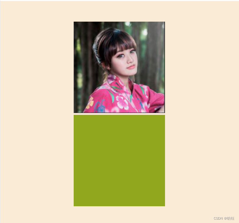
</head><body><div class="box"><img src="./images/1.jpg" /><div class="cover" /></div>
</body></html>运行效果如下:
CSS部分增加了如下代码:
img {width: 200px;height: 200px;}.cover {margin: 0 auto;background-color: rgb(144, 167, 30);width: 200px;height: 200px;}标签选择器img定义了图像的宽高都是200px,.cover类选择器定义了一个宽高都是200px的浮层,该浮层是要覆盖在图片上的,接下来我们调整下浮层的位置,让它覆盖在图像上面。
3、位置调整
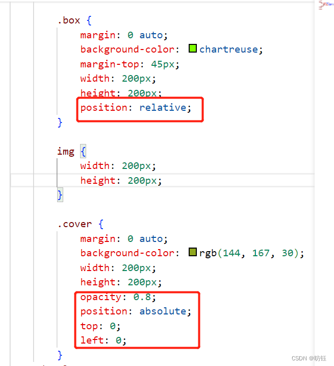
现在把浮层移动到图像上面,为了方便区分,给浮层加了个透明度,以便透出下面的图片,代码如下:
<!DOCTYPE html>
<html><head><meta charset="utf-8"><title>CSS基础学习记录(6)</title><style>* {margin: 0;padding: 0;}body {background-color: antiquewhite;}.box {margin: 0 auto;background-color: chartreuse;margin-top: 45px;width: 200px;height: 200px;position: relative;}img {width: 200px;height: 200px;}.cover {margin: 0 auto;background-color: rgb(144, 167, 30);width: 200px;height: 200px;opacity: 0.8;position: absolute;top: 0;left: 0;}</style>
</head><body><div class="box"><img src="./images/1.jpg" /><div class="cover" /></div>
</body></html>
运行效果如下:
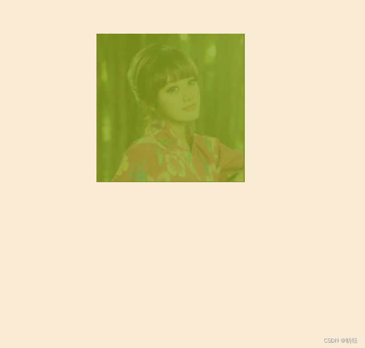
相比之前的代码增加了如下部分定位的代码:
4、添加动效
现在来到精彩部分,我们将添加鼠标移动到图像上时的动效。
4.1、添加浮层动效
添加浮层动效前,我们先调整下浮层的位置,CSS中.cover的left为100%,效果如下:
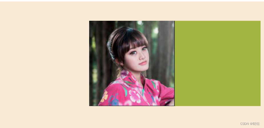
现在我们要实现鼠标移动到box范围时,浮层会执行动画移动到图像上(图像首先会隐藏),代码如下:
<!DOCTYPE html>
<html><head><meta charset="utf-8"><title>CSS基础学习记录(6)</title><style>* {margin: 0;padding: 0;}body {background-color: antiquewhite;}.box {margin: 0 auto;background-color: chartreuse;margin-top: 45px;width: 200px;height: 200px;position: relative;overflow: hidden;}img {width: 200px;height: 200px;}.cover {margin: 0 auto;background-color: rgb(144, 167, 30);width: 200px;height: 200px;opacity: 0.8;position: absolute;top: 0;left: 100%;transition: all 0.5s;}.box:hover .cover{left: 0;}</style>
</head><body><div class="box"><img src="./images/1.jpg" /><div class="cover" /></div>
</body></html>
.box增加了CSS代码overflow: hidden;使得超出box的部分会被隐藏,实现动画主要是新增了如下代码:
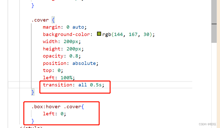
.cover里面新增的transition: all 0.5s;表示所有属性都参与动画,执行时间是0.5秒(不要少了后面的s),选择器 .box:hover .cover表示当鼠标经过box范围时,将会选择后代.cover,而.cover将属性left设置为0,结果是动画从右边出现,移动到与图像重合。
4.2、添加背景动画
添加了背景动效的代码如下:
<!DOCTYPE html>
<html><head><meta charset="utf-8"><title>CSS基础学习记录(6)</title><style>* {margin: 0;padding: 0;}body {background-color: antiquewhite;}.box {margin: 0 auto;background-color: chartreuse;margin-top: 45px;width: 200px;height: 200px;position: relative;overflow: hidden;}img {width: 200px;height: 200px;transition: all 0.5s;}.cover {margin: 0 auto;background-color: rgb(144, 167, 30);width: 200px;height: 200px;opacity: 0.8;position: absolute;top: 0;left: 100%;transition: all 0.5s;}.box:hover .cover {left: 0;}.box:hover img {transform: scale(1.2);}</style>
</head><body><div class="box"><img src="./images/1.jpg" /><div class="cover" /></div>
</body></html>
与添加浮层动效类似,主要是添加了如下CSS代码:
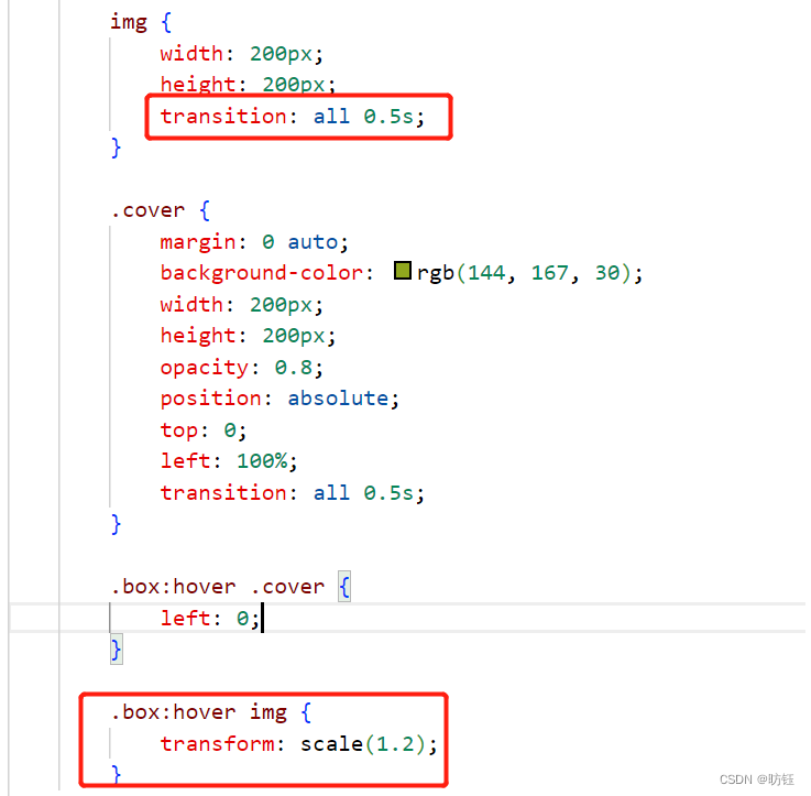
位于img中的CSS代码transition: all 0.5s;表面img的所有属性都参与动画,时间是0.5s,而选择器.box:hover img则表示鼠标经过box范围时触发img的动效,CSS代码transform: scale(1.2);表面图片放大1.2倍。
至此完成了一开始提到了动效。完整代码如下:
<!DOCTYPE html>
<html><head><meta charset="utf-8"><title>CSS基础学习记录(6)</title><style>* {margin: 0;padding: 0;}body {background-color: antiquewhite;}.box {margin: 0 auto;background-color: chartreuse;margin-top: 45px;width: 200px;height: 200px;position: relative;overflow: hidden;}img {width: 200px;height: 200px;transition: all 0.5s;}.cover {margin: 0 auto;background-color: rgb(144, 167, 30);width: 200px;height: 200px;opacity: 0.8;position: absolute;top: 0;left: 100%;transition: all 0.5s;}.box:hover .cover {left: 0;}.box:hover img {transform: scale(1.2);}</style>
</head><body><div class="box"><img src="./images/1.jpg" /><div class="cover" /></div>
</body></html>)

)


