顶部
页面最顶部要获取到手机设备状态栏的高度,避免与状态栏重叠或者被状态栏挡住
// 这是最顶部的父级容器
<view :style="{ paddingTop: `${statusBarHeight + extraPadding}px` }">....
</view>
export default {data() {return {statusBarHeight: 0,extraPadding: 20}},onReady() {uni.getSystemInfo({success: res => {this.statusBarHeight = res.statusBarHeight;}})}
}
使用uni-app自带的uni.getSystemInfo方法获取设备的状态栏高度,除去设备的状态栏高度再额外加上一点高度,这样就避免页面最顶部的内容会被状态栏盖住或者与状态栏重叠.

页面整体高度
当页面出现可滑动区域的时候使用动态计算高度值
// 使用 <scroll-view />
<view><scroll-view scroll-y="true" :style="{ height: scrollHeight + 'px' }">...</scroll-view>
</view>
export default {data() {return {scrollHeight: 0,navBarHeight: 0}},mounted() {const query = uni.createSelectorQuery().in(this);query.select('.ngb').boundingClientRect(data => {if(data) {this.navBarHeight = data.height}}).exec()},onReady() {uni.getSystemInfo({success: res => {this.scrollHeight= res.windowHeight - this.navBarHeight ;}})}
}
获取导航栏的高度,括号里面填的就是你导航栏的CSS名称
res.windowHeight 是这个设备除去底下的ToBar栏的高度 当你有导航栏的时候你要减去导航栏的高度才是你剩下的页面实际高度 只有当你超出scroll-view的高度的时候才会触发滚动,这个样子就可以做到这个页面在每个设备下都可以适配
如果想要隐藏滚动条
<style>/* 取消滚动条 *//deep/ ::-webkit-scrollbar {display: block;width: 0px !important;height: 0px !important;}
</style>
圆角效果
border-radius: 10px; // 大小增加 圆角效果越明显
如果是给图片增加圆角效果但是不生效
overflow: hidden
border-radius: 10px;


层叠关系
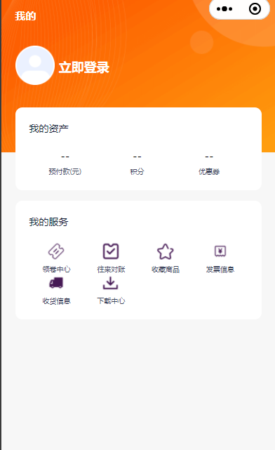
像一些我的页面或者登录页面会遇到这个情况

// 图片的容器
<view class="background-box"><image class="background-image" src="/static/mine-photo/background1.png" mode="widthFix" />
</view>
// 头像与我的资产的容器
<view class="content" :style="{ paddingTop: `${statusBarHeight + extraPadding}px` }"><view class="box-c"><view class="box1"><text>我的</text></view><view class="box2"><view class="box2-1"><image class="box2-image" src="/static/mine-photo/user-not-login.png" mode="widthFix" /></view><view class="box2-2"><text>立即登录</text></view></view><view class="box3-c"><view class="box3-1"><view class="box3-1--1"><text>我的资产</text></view><view class="box3-1--2"><view class="box3-1--box" v-for="(item, index) in zcList" :key="index"><text class="box3-1--box-text1">{{item.text1}}</text><text class="box3-1--box-text2">{{item.text2}}</text></view></view></view></view>
</view>
.background-box {position: relative;width: 100%;
}.content {position: absolute;top: 0;left: 0;width: 100%;display: flex;justify-content: center;
}
内边距
一些卡片或者展示数据的一些容器记得给一点内边距不要让数据贴着容器
padding: 10px 20px 10px 10px;
关系为 上 右 下 左(margin bord-redius 都是同理)
对齐
width: 90%;
margin: 0 auto;
不要将宽度设为100% 两边要留一点 会更美观一点 使用 0 auto 方法来让元素居中显示
或者给 padding: 一个值也可以
padding: 20rpx;
或者使用flex布局, 这个要在元素外面的父容器设置
display: flex;
width: 100%;
justify-content: center;
使用这个方法让元素横向居中显示
)

)


